We are excited to welcome Steven Gentry, collections archivist for the University Archives.
Steven Gentry digs into the archives
Steven grew up in Columbia, Maryland, graduating from St. Mary’s College of Maryland in 2014 with a bachelor’s degree in history. After college, he worked at Howard County Public Library as a circulation clerk, at which time he learned to truly appreciate all the good work public librarians do. He attended Simmons College in Boston, Massachusetts, where he received a Master of Science in Library and Information Science with a focus in archives management in 2018. In 2019, Steven joined the team at the University of Michigan’s Bentley Historical Library as a processing project archivist, where he has been for the last six years.
As an archivist at Iowa, Steven looks forward to collaborating with colleagues to wrangle our backlogs, increase access to the University Archives, and participate in other projects that will meaningfully impact our users.
“I particularly enjoy the connections we make with others—whether with coworkers, researchers, or even the historical agents named in the materials we handle each day, “ says Steven.
When not tackling the archival backlog, you can find Steven and his fiancée, Timi, indulging in TV shows like “Desperate Housewives” or “Below Deck.” He also works on his cocktail-making and cooking game, claiming to make a mean chicken tikka masala pizza (which we are eager to try). But he is also looking for fun things to discover in the Iowa City/Cedar Rapids area. Got an idea of something he should explore? Let him know!
This series features the work and research of UI students. The following is written by Larisa Greway, a museum studies intern at Special Collections and Archives.
If you can read a piece of sheet music, you’ve benefited from over a thousand years of evolution. In the Middle Ages, music not only sounded, but looked much different than it does today. On this whirlwind tour through the medieval music of Special Collections and Archives, we’ll meet a few of the most melodious manuscripts we have to offer.
The development of music notation was a long and complicated process. Most medieval music that we can track the history of is liturgical, meant for use in church. The early liturgy was sung in plainchant, a simple style of chant meant to emphasize the text. Before the ninth century, no pieces of written notation survived. Instead, pieces of music were passed down via oral transmission, and because of this lack of standardization, local variations of chants abounded. But during the Carolingian Renaissance of the ninth century, interest in music theory began to grow, and the liturgy began to introduce multi-voice polyphony and more complicated settings. Systems of notation soon became necessary to record the new forms of music taking root.
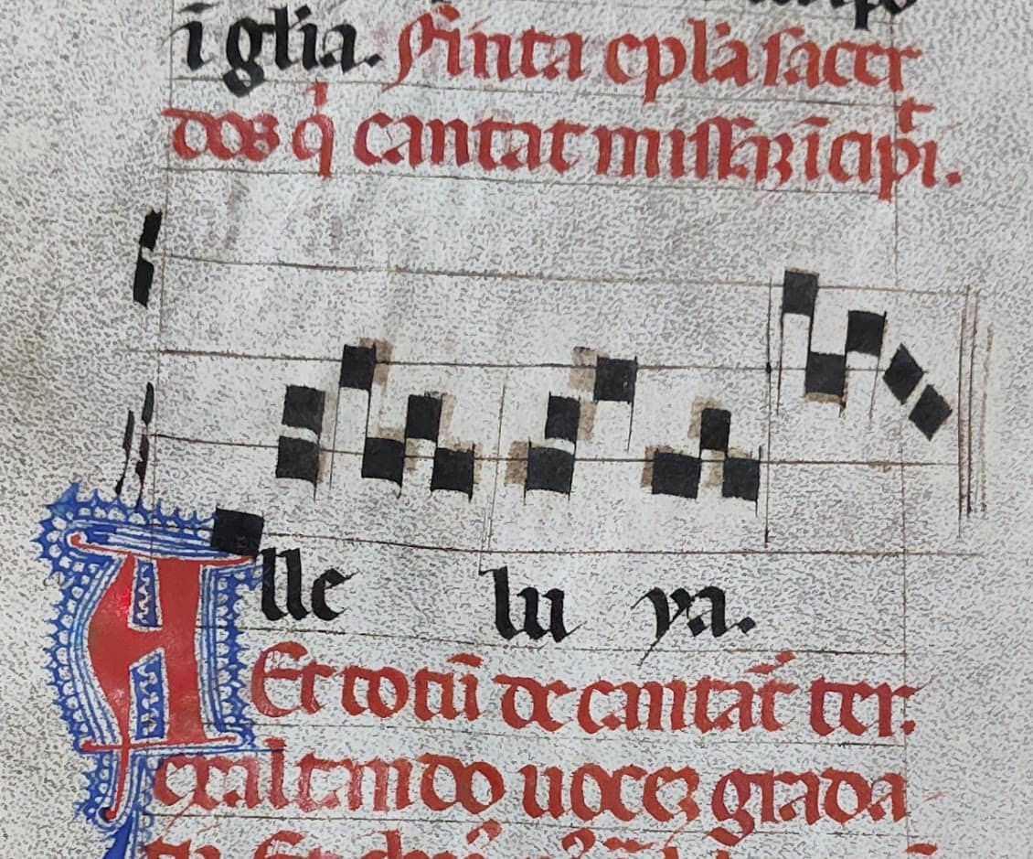
The most popular and enduring system used neumes. Whereas modern musical notes are based on an absolute system of rhythm and pitch, the earliest neumes showed pitch only in relation to each other. Later, heightened neumes were written on four-line staves with added symbols to indicate rhythm. This leaf from a gradual (a book collecting the musical items of the Mass) is the earliest example of neumatic notation in Special Collections and Archives, dating from 1230 in England (fig.1, xfMMs.Gr3).
The neumes are arranged on a staff with base and treble clefs, and the composition is highly melismatic: there are runs of many different notes in quick succession. The short paragraphs in red ink are rubrics, indicating particular directions to the celebrant of the Mass.
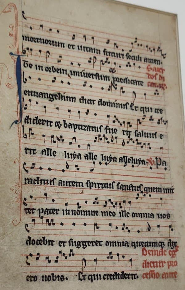
Figure 1: Gradual leaf from 1230, xfMMs. Gr3Figure 2: 15th c. Gradual, xfMMs. Ps4
In contrast, this chant (fig. 2, xfMMs.Ps4) from an early 15th-century gradual is syllabic: except for a couple of melismas, or vocal runs, there is one neume per syllable. It’s hard to get a sense of the size, but this manuscript is about 15 inches wide. It was likely used in a church choir to allow multiple singers to cluster around it. It isn’t quite as big as some of the antiphonals in our collection, though. Terms for medieval manuscripts can be slippery, but graduals were used as part of the regular Mass, while antiphonals were used in Divine Office, the daily round of prayers in monasteries. These various collections of music were often produced for use in monasteries and cathedral churches.
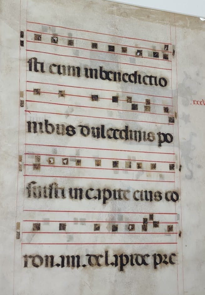
One more place you might find medieval music is in a missal, like this one from the late 14th-century Italy (fig. 3, xfMMs.Miss1). Missals compiled all the texts and instructions necessary to celebrate Mass, making them a handy reference tool or educational book. Missals might be noted or unnoted, depending on the needs of the institution for which it was produced. In this case, the scribe wrote the text first and inserted the music after. But scribes could also make mistakes.
Figure 3: Missale Romanum c. 1400, xfMMs. Miss1
This section of text pictured above contains an Alleluia setting that has run off the edge. You can see places where the scribe erased and rewrote the neumes to better fit the line.
The increasing use of notated chants ensured the proper performance of the Mass: no more forgetting the melody, and no more local variations of now-standardized chants. Neumes themselves would give way to more detailed methods of notation. But their history and the types of books they reside in provide a fascinating window into the musical life of the Middle Ages. View these manuscripts and more in our reading room, and learn even more about early music at the Canter Rare Book Room in the Music Library.
Works cited and further reading:
Bell, Nicolas. Music in Medieval Manuscripts. The British Library, 2001.
Crocker, Richard, and David Hiley, eds. The New Oxford History of Music: The Early Middle Ages to 1300. Oxford University Press, 1990.
Dunlap, Jennifer Rebecca. “A Paleographical Study of the Noted Missal Iowa City, University of Iowa Libraries, Special Collections xfMMS.Miss1.” Master’s Thesis, University of Iowa, 2008).
Seay, Albert. Music in the Medieval World. Prentice-Hall, Inc., 1965.
xfMMs.Gr3. Leaf from a gradual., circa 1230, 8. Medieval Manuscripts, MsC0542. University of Iowa Special Collections.
xfMMs.Ps4. Leaf from a gradual., early 15th century, 8. Medieval Manuscripts, MsC0542. University of Iowa Special Collections.
xfMMs.Miss1 Missale Romanum., circa 1400, 12. Medieval Manuscripts, MsC0542. University of Iowa Special Collections.
This series features the work and research of UI students. The following is written by Calvin Covington, Olson graduate research assistant.
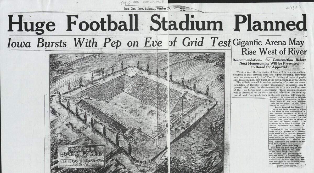
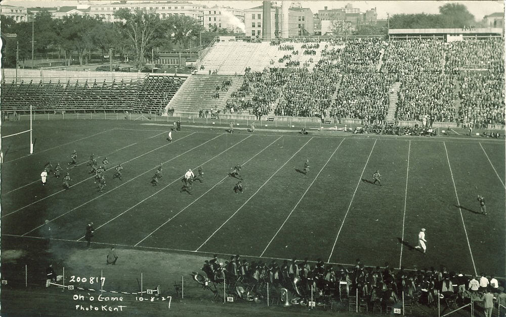
Article from Daily Iowan Oct. 27, 1928 found in RG01.0015.002 under Kinnick Stadium.
I’d wager that, even if they haven’t gone to a game, most of Iowa City’s population has borne witness to the grand Kinnick Stadium, where, every football season, legions of fans flock to watch the Hawks battle their Big Ten rivals in one of America’s favorite games. It’s hard to imagine Iowa City gamedays without swarms of tailgate traffic. However, a century ago, Iowa’s iconic stadium was just a glimmer in the eyes of its athletics department, and it would be a long journey to the Kinnick name.
Before Kinnick Stadium, the Hawkeyes had Iowa Field, a somewhat plainly named stadium with a capacity of 30,000 (less than half the size of modern-day Kinnick), located not on the west side of campus, but on the east side behind the Main Library. You can even see the Pentacrest in the photo below.
Kent, Frederick W. (Frederick Wallace). “Iowa-Ohio State Football Game at Iowa Field, The University of Iowa, October 8, 1927”. Photographs, postcards. Iowa City Town and Campus Scenes. Accessed September 10, 2025. https://digital.lib.uiowa.edu/node/406972.
A century ago, the athletics department wanted a new field, but building a new, larger venue was not an easy task. The stadium was constructed over a period of about seven months during 1929, totaling $484,798, or over $9 million today. Being built a century ago in a rural state, horses and mules (as seen below) were used to excavate and pull heavy equipment, and workers toiled day and night until completion in October 1929.
During the construction, Iowa’s third athletic director, Paul Belting, resigned and the new director, Edward Lauer, was told that Iowa would be suspended from the Big Ten in January 1930 due to recruiting violations. Despite these difficulties, Lauer got the Big Ten decision rescinded in February, and Iowa re-entered the Big Ten with its brand-new stadium—called Iowa Stadium.
Kent, Frederick W. (Frederick Wallace). “Iowa Stadium Construction, The University of Iowa, 1929”. Photographs. Iowa City Town and Campus Scenes. Accessed September 10, 2025. https://digital.lib.uiowa.edu/node/37218.
Kent, Frederick W. (Frederick Wallace). “Aerial View of Iowa Stadium and University of Iowa Hospitals and Clinics, The University of Iowa, 1930”. Photographs. Iowa City Town and Campus Scenes. Accessed September 10, 2025. https://digital.lib.uiowa.edu/node/152398.
But this name lacked inspiration and a legacy. Nile Kinnick, born in 1918, wasn’t even in high school when Iowa Stadium construction was completed. After a historic career, ending with the 1939 Heisman trophy, Kinnick went to law school and coached for a year before enlisting in the Naval Air Reserve, where he would ultimately perish in a training flight off the coast of Venezuela at age 24. After the tragedy, the student body held a vote in 1945 to name the stadium “Nile Kinnick Memorial Stadium.” And then, nothing happened.
The vote was unofficial, and the name didn’t change. In fact, Iowa can’t even claim the first Kinnick stadium. That honor would go to the Meiji Jingu Gaien Stadium in Tokyo, Japan, which was renamed in 1945 by the U.S. occupation force to “Nile Kinnick Stadium.”
It was only, nearly three decades later, in 1972, that support for renaming the stadium drummed up again. Beginning with attorney L. E. Swanson and spreading through the newspapers, the support for the name eventually reached the university administration and President Willard Boyd, who, after some consideration (including deliberations on naming the stadium after both Iowa football stars Kinnick and Duke Slater, who played from 1918–1921 at Iowa, was the NFL’s first Black lineman, and became Chicago’s second Black judge), approved the name change. By the end of the year, “Kinnick” became the official name.
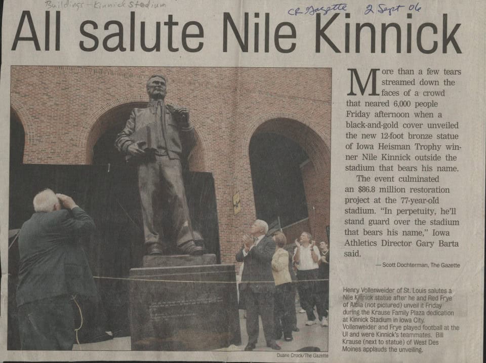
Article from Cedar Rapids Gazette from Sept. 2, 2006. Located in RG01.0015.002 under Kinnick Stadium.
Over the years, Kinnick Stadium has changed a lot. Renovations and expansions since 1929 have far exceeded the initial cost of the stadium, including the $86.8 million restoration project in 2006, culminating in the iconic Kinnick statue that now stands in front of the stadium. Many features of the stadium, from the seats to the scoreboard to the grass of the recently named Duke Slater Field (2021), have all been replaced in the years since. So, next time you go to a football game, think about how much the stadium around you has changed, and consider the ways the devoted fans have remained the same.
Visit Special Collections and Archives to learn more about Nile Kinnick and the stadium named after him. Plan your visit on our website.
This series features the work and research of UI students. The following is written by Brianna Bowers, student worker for Special Collections and Archives.
Have you ever made a New Year’s resolution or used the turning of the calendar to wipe a clean slate for yourself? These resolutions can be effective at creating new habits, but what about when you need to rethink the philosophical underpinnings of your whole life? Or what if you are not actually an individual, but a whole country
If you are France during the French Revolution of 1789, then you are experiencing a massive shift from absolute monarchism to republicanism. Enlightenment values such as reason are in, and monarchical and religious tradition are out. The government is determined to recreate itself according to these new principles. That includes reworking its systems, such as systems of measurement. Measurement is used every day in the arts and sciences, which are the bread and butter of an Enlightenment-influenced revolutionary. So, it is crucial that they are logical and patriotic, after all.
As a result of this, the revolutionary government designed and adopted the metric system. We can all breathe a sigh of relief that a meter is 1/1,000th of a kilometer, 100 centimeters, and 1,000 millimeters. It is clean, orderly, and logical. It is obviously so scientific that even in the United States, where we usually use the customary system, students in science classrooms measure in metric.
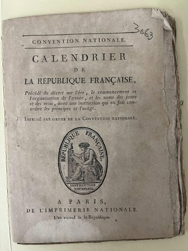
Cover of pamphlet describing the new calendar
But did you know that the revolutionary government also created and used a new calendar? In the Main Library Special Collections and Archives, we have a pamphlet called “calendrier de la république française” (Calendar of the French Republic) printed by the governing legislature of France, the National Convention, that explains this new creation.¹ It cites exactitude, simplicity, independence from religious practices, and reason—a character that suits the Revolution—as important traits of a calendar (pages 8 and 19), and describes how the new French Republican calendar met those goals.
The French Republican calendar did not have some months with 30 days, some with 31, and one with 28 or 29. No, every month of this new calendar, named after its climate and agricultural stage as experienced in the northern hemisphere, had exactly thirty days. Each month was split into three weeks with 10 days each. No week spilled over between months. The days of the week were named after the words for first, second, third, and so on. Within a day, there were ten hours, each hour had one hundred minutes, and each minute had one hundred seconds. (However, the unique hours, minutes, and seconds were not widely used. Their use was made non-obligatory on April 7, 1795.³) It was simple and logical, right?
The extra days at the end of the year were used for Revolution-themed festivals. Instead of the Christmas Eve to New Year’s festivities, you’d get the Sanculotides. The term Sanculotides comes from the sans-culottes, the urban working class of Paris which supported the Revolution. The festivals were for virtue, talent, labor, convictions, and honors, and the leap day attached to the end of the year was Revolution Day.⁴ The years counted up from the all-important establishment of the First French Republic. Crossing off dates and flipping your calendar month was now a patriotic act.
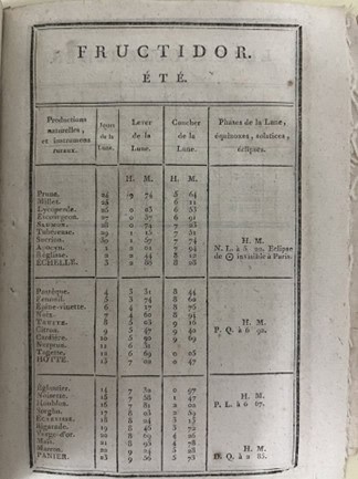
A page for Fructidor, a fruits’ month, that is for summer
If you were a citizen of France when this calendar was in use, you would not make your New Year’s resolutions on the first of January. As the revolutionaries explained in their pamphlet, most civilizations making calendars use seasonal changes or remarkable historical events to fix the date of the changing of the year. (They sharply criticized Charles IX for adopting an illogical calendar, which doesn’t start on one of these natural dates, just because everyone else was doing it (page 10¹)!) The first day of the first month of the French Republican Calendar starts on the fall equinox. The first month is named Vendémiaire, after the grape harvest. Vendémiaire is followed by Brumaire (the foggy month), Frimaire (the cold month), and then the three winter months of Nivôse (the snowy month), Pluviôse (the rainy month), and Ventôse (the windy month). Next are the spring months of Germinal (the developing of sap month), Floréal (the flowering month), and Prairial (the meadow harvest month). The final months are the summer months of Messidor (the wheat harvest month), Thermidor (the hot month), and Fructidor (fruits’ month). The calendar was officially used from the 15th of Vendémiaire, year II of the French Republic, to the 10th of Nivôse year XVI (Oct. 6, 1793, to Dec. 3, 1805).²
This means that the French Republican year CCXXXIV is beginning this Sept. 22! If you want to start your resolutions on Vendémiaire first, you had better get a move on.
———
¹ Pamphlet 3063 in box 3057-3114, “Convention nationale. calendrier de la république française, Précédé du décret sur l’ère, le commencement et l’organisation de l’année, et les noms des jours et des mois, avec une instruction qui en fait connoître les principes et l’usage. Imprimé par ordre de la Convention nationale.” In the University of Iowa Main Library Special Collections [or read it online at https://gallica.bnf.fr/ark:/12148/bpt6k48740w/f9.item].
³ Page 7 of pamphlet 3065 in box 3057-3114, “Loi Relative aux poids et mesures. Du 18 Germinal, an 3.ᵉ de la République française, une et indivisible.” In the University of Iowa Main Library Special Collections [or read it online at https://www.taieb.net/auteurs/poidsmes/1795_04_17_loi.html]
⁴ For the festival name translations, see https://everything.explained.today/Sansculottides/
We are happy to introduce Laura Michelson as the new curator of rare books and maps at the University of Iowa Libraries.
Laura previously served as the Maps Collection librarian, a term position funded by the Roy J. Carver Charitable Trust. Prior to coming to UI Libraries, Laura worked for four years as project archivist of the Salisbury House Library Collection. In this role she curated all aspects of that collection, including collections management, instruction, outreach, and research.
Laura received a BA in medieval and early modern studies from Cornell College and an MLS from the UI with a certificate in book studies from the Center for the Book.
“I’m really honored to be working as curator of rare books and maps, particularly focused on book and material history before 1900, artists’ books, and cartography—genuinely my areas of greatest interest in the special collections world,” says Laura. “My own research interests are in book and map history, craft and materiality, book arts, and culture surrounding book collecting—all of which have rich connections to the university’s holdings and I’m excited to work with researchers and students on. Right away this fall, I’m looking forward to instruction and thinking creatively alongside scholars, stewarding acquisitions, supporting interpretation, and fostering research and exploration into materials.”
As curator of rare books and maps, Laura is excited to work with new colleagues, researchers, and the community to “illuminate areas to explore deeper in our holdings and new paths to explore … I’m excited about our collections’ roots continuing to strengthen and bolster the richness of our collections.” One of her favorite items in our collection so far is our medieval manuscript of Pharsalia (xMMs. Hi1), “which brings together some of [her] favorite things: marginalia, a manuscript from a cheeky scribe, and an early map.”
When not toiling away in our stacks, you can find Laura curating new playlists, immediately running to Letterboxd after a movie at FilmScene, or plotting a way to get outside. She loves hikes, camping, and being outside (as long as Midwest weather cooperates) with her rambunctious rescue pup, Ember. “I’m also a big thrifter! Drop by my office and you’ll see new thrifted oddities popping in, like a feed sack stuffed chicken and needlepoint frog doorstop.” And we got to say, it is a pretty amazing stuffed chicken.
The following is written by Olson Graduate Research Assistant Anne Moore.
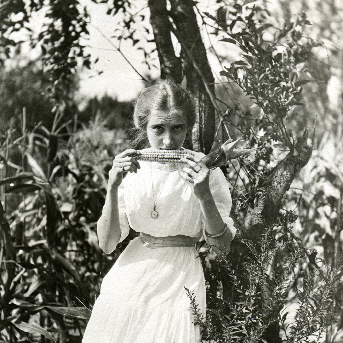
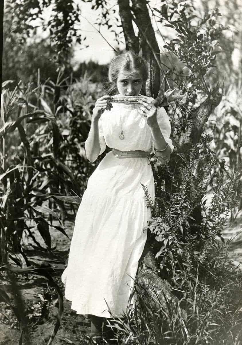
“Esther eating corn on edge of field, early 1900s” from the Noble Photograph collection, IWA0031
It’s corn sweat season! Check out this top 10 list of corn-themed materials from Special Collections and Archives, which were on display last month at the Iowa Memorial Union (IMU)’s Lunch with the Chefs. This event is a special, themed lunch hosted by University Dining at the IMU. Originally introduced in 1995 by Chef Barry Greenberg, it has continued due to popularity. Special Collections often brings materials to these lunches, due to their Szathmary Culinary Manuscripts and Cookbooks collection providing a plethora of relevant options.
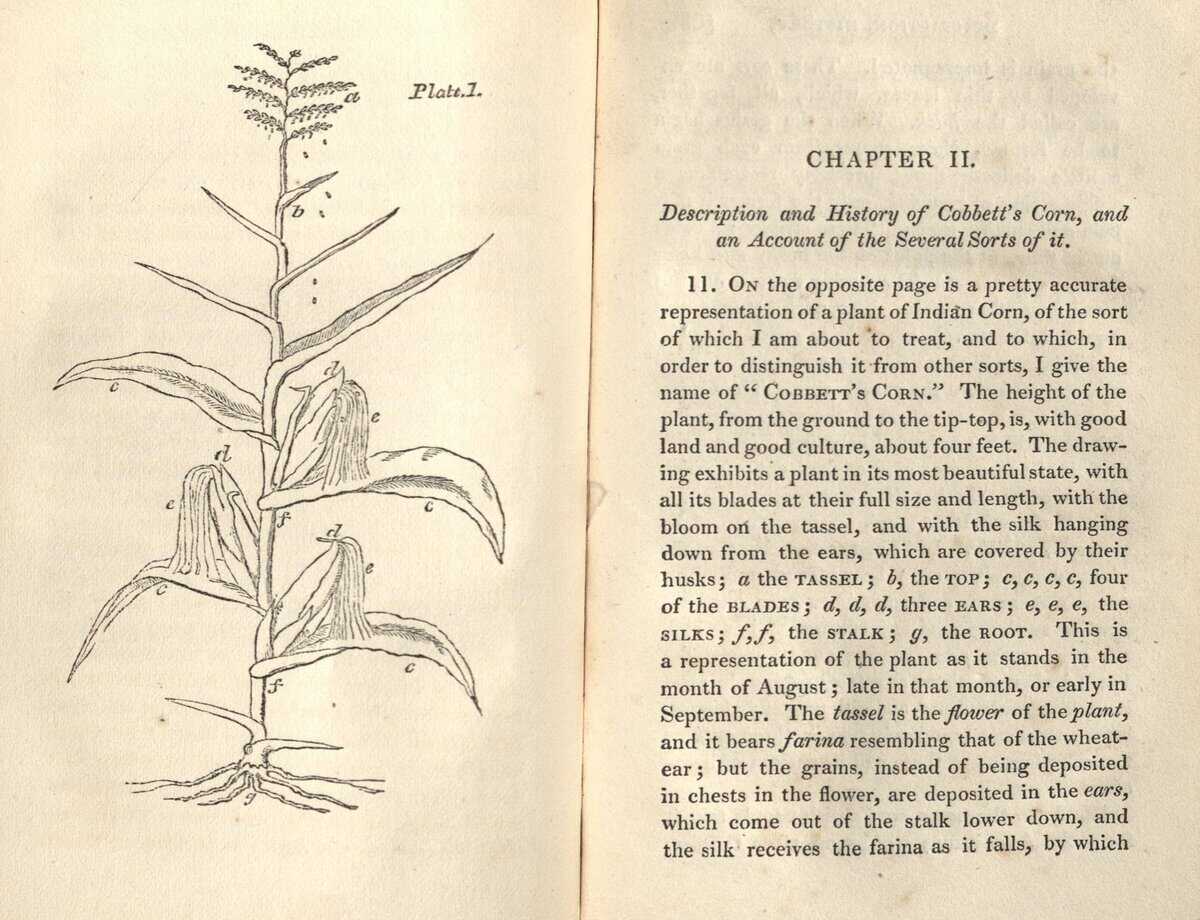
Illustration of corn stalk in Cobbett’s book, Szathmary Collection SB191.M2 C62
1. A Treatise on Cobbett’s Corn, Containing Instructions for Propagating and Cultivating the Plant, and for Harvesting and Preserving the Crop (1828)
Printed in 1828, this book by William Cobbett discusses the cultivation of American corn, while also taking a look at American agriculture and customs of the time. What makes this book extra cool is that the first two leaves of the book are printed on corn paper. (Szathmary Collection SB191.M2 C62)
Cover of pamphlet, Szathmary Collection D522.25.H377 1918
2. “Wholesome-nutritious foods from corn” (ca. 1918)
During World War I, the U.S. Food Administration encouraged Americans on the home front to replace wheat products with corn to conserve the more expensive grain for troops abroad. This pamphlet by Lloyd Harrison helps promote new recipes that utilize corn. (Szathmary Collection D522.25.H377 1918)
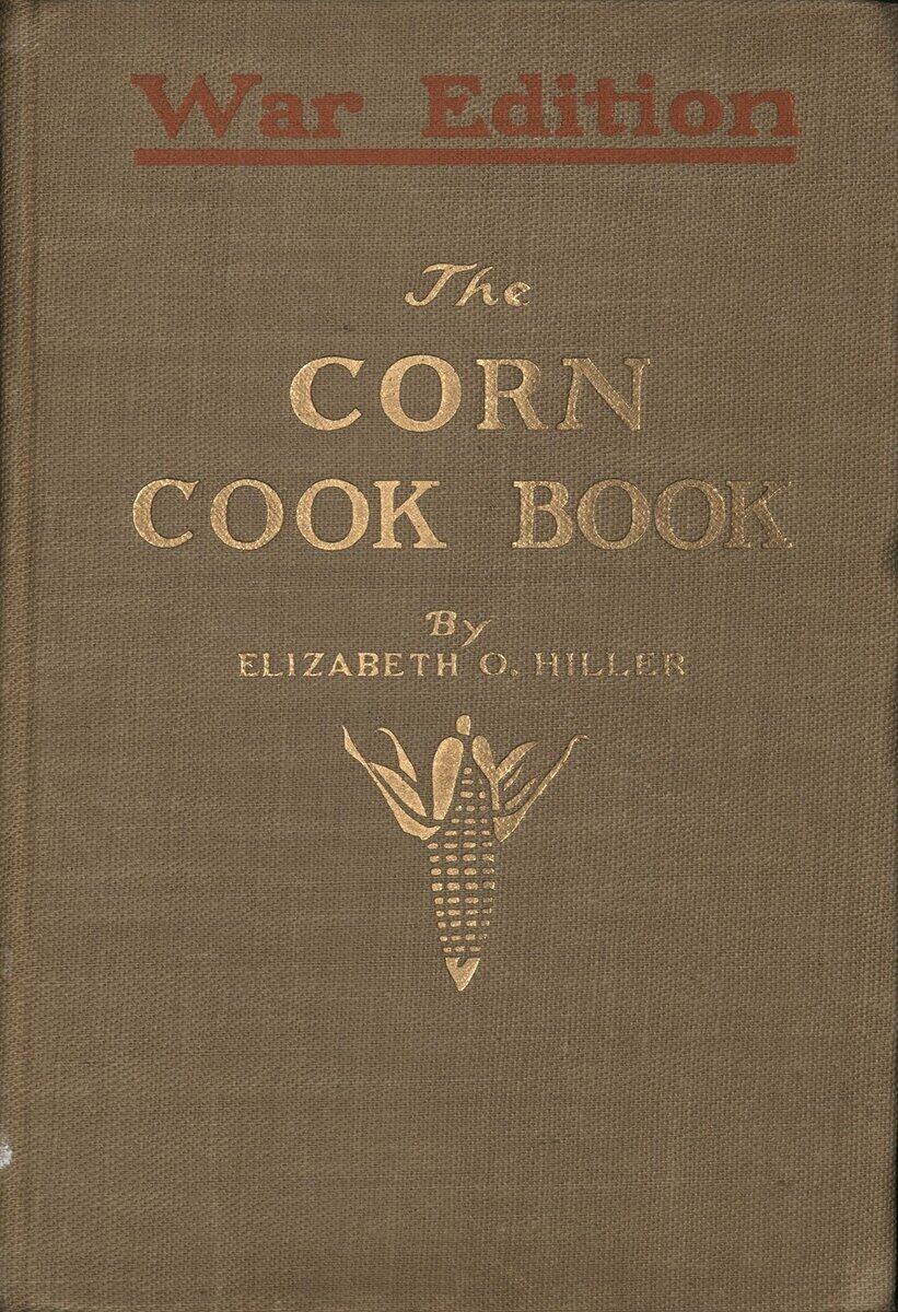
Cover of The Corn Cook Book, Szathmary Collection TX809.M2 H6 1918
3. The Corn Cook Book: War Edition (1918)
Responding to the call to use more corn products, cookbooks, such as this one by Elizabeth O. Hiller, provided recipes that utilized corn in a variety of households staples and promoted food conservation. (Szathmary Collection TX809.M2 H6 1918)
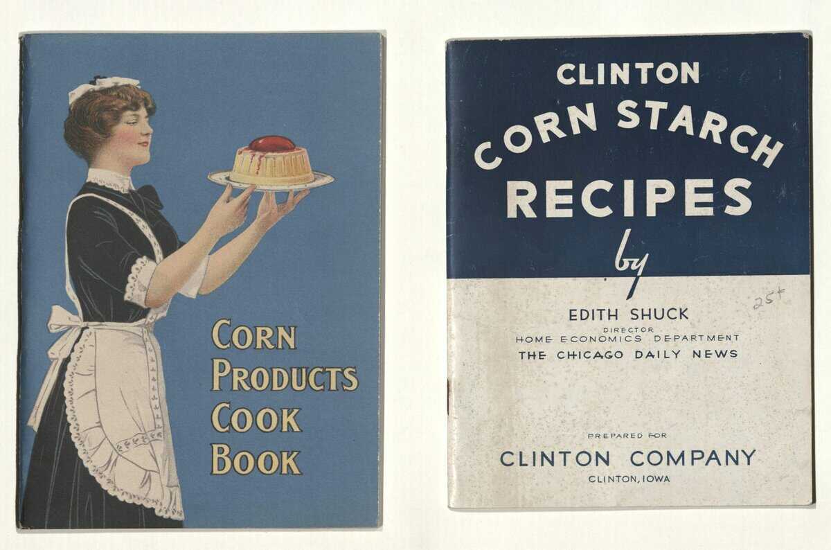
“Corn Products Cook Book,” ca. 1910, Emma Churchman Hewitt for Corn Products Refining Company (left). “Clinton Corn Starch Recipes,” 1934, Clinton Corn Processing Company (right) from the Szathmary Recipe Pamphlet collection, MsC1018
4. Szathmary Recipe Pamphlets
We might be cheating a bit here by bunching a few recipe pamphlets together as one item on this list, but we could not resist showing just a few of the pamphlets we have in Szathmary that promote corn and corn products. Find more of these pamphlets on Iowa Digital Library. (MsC1018)
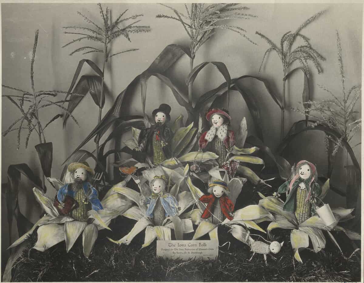
Iowa Corn Folk, Shambaugh Family Papers RG99.0152
5. “Iowa Corn Folk, at the Sesqui-Centennial International Exposition in Philadelphia” (1926)
These Corn Folk were created by Bertha Shambaugh for the Iowa Federation of Women’s Clubs and were chosen to represent Iowa in a doll exhibit at the 1926 World’s Fair. We have to say that they are absolutely a-maize-ing. (Shambaugh Family Papers, RG99.0152)
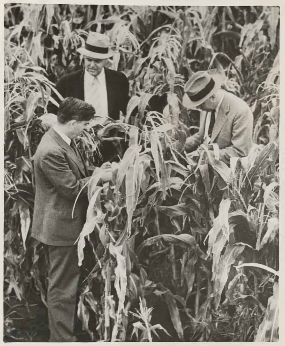
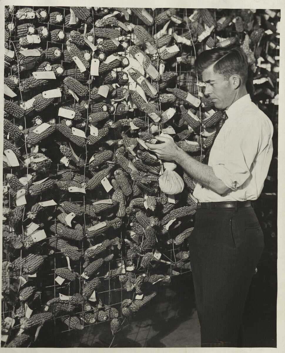
Henry A. Wallace, ‘Spike’ Evans, and Jim Russell in cornfield (1933)Henry A. Wallace with Ears of Corn at Clyde Herring’s Garage, Des Moines, Iowa (1920s)
6. Henry Agard Wallace Papers
Henry A. Wallace was the 33rd Vice President of the United States, and an important Secretary of Agriculture in U.S. history. Serving under Franklin D. Roosevelt, he was a proponent of the New Deal and progressive agricultural policies aimed at alleviating the farm crisis and rural poverty. He was also a writer, farmer, and businessman, and developed several varieties of hybrid corn. View the finding aid for the Henry Agard Wallace papers online. (MsC0177)
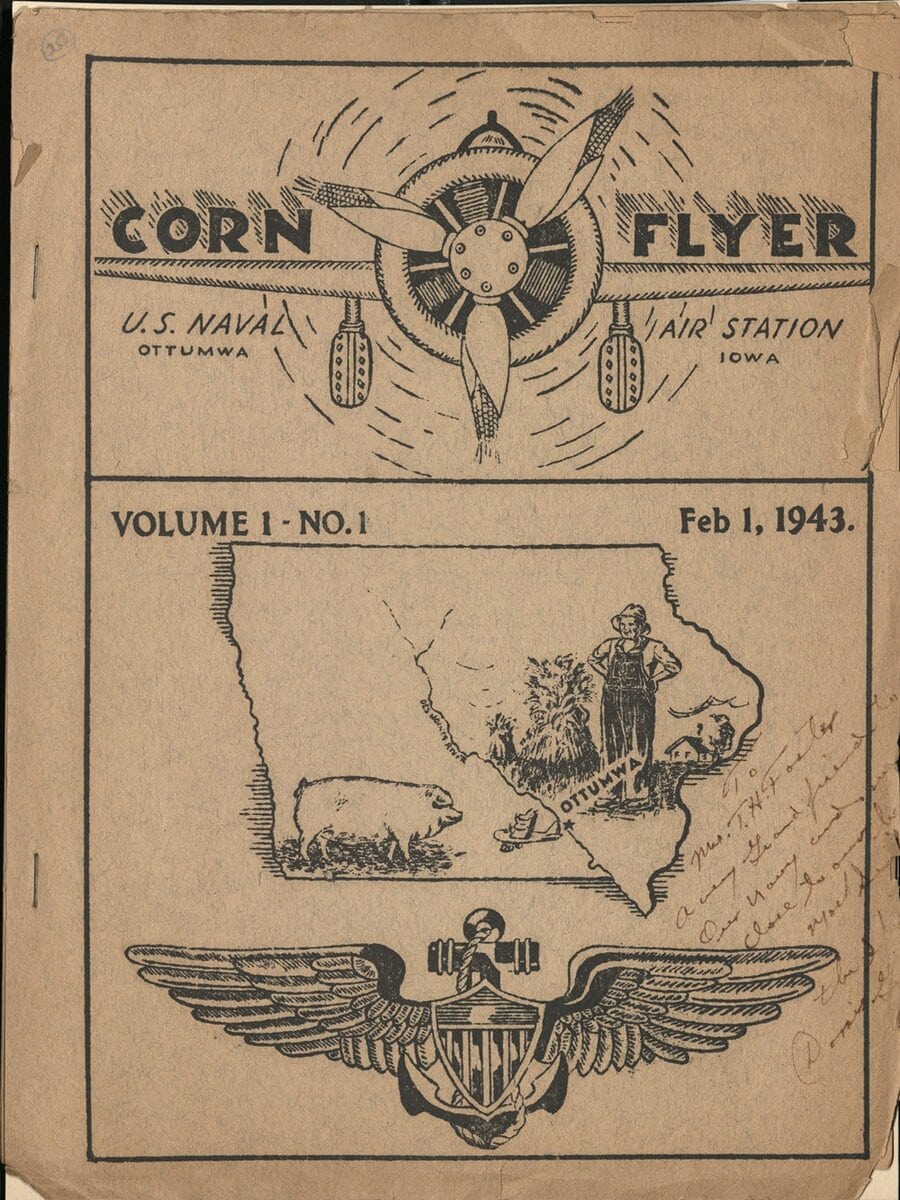
Cover of Corn Flyer, x-Collection VG94.5.O66 C6
7. Corn Flyer V. 1 No.1 (1943)
Corn Flyer was a publication of the U.S Naval Air Station in Ottumwa, Iowa, which served as a pilot training base during World War II. Future President Richard M. Nixon was stationed there for nine months, before being shipped out to the South Pacific in May of 1943. Over 4,600 cadets completed flight school at the station, surrounded by Iowa corn fields. (x-Collection VG94.5.O66 C6)
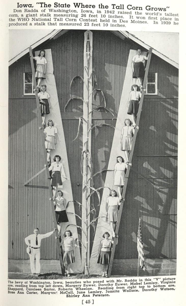
Page from tourist pamphlet that features an impressive corn stalk, x-Collection F619.3.S73 1945
8. Greetings: the State of Iowa Welcomes You (1945)
In this Iowa tourism pamphlet from 1945, potential visitors can marvel at the tallest corn stalk in Iowa recorded at that time. (x-Collection F619.3.S73 1945)
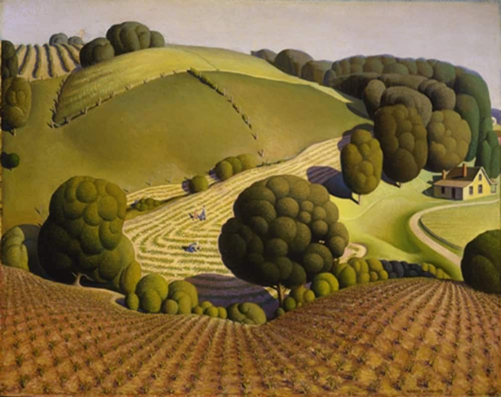
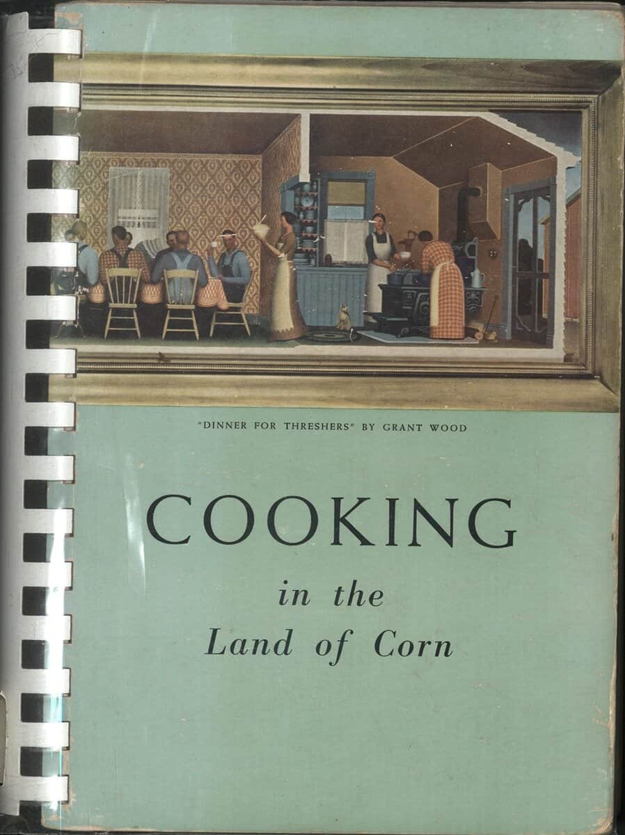
Young Corn (1931), Grant Wood. This painting is owned by the Cedar Rapids Community School District and is on loan to the Cedar Rapids Museum of Art, Iowa.Cover of Cooking in Land of Corn, Szathmary Collection TX715.C759137
9. Cooking in the Land of Corn (1945)
This is a collection of recipes from the ladies of St. Edward’s Parish in Waterloo, Iowa. Drawing on Iowa flavor, the cookbook also features reproductions of paintings by Grant Wood. Wood was an American painter known for his depictions of rural landscapes and farm life in the Midwest. Works such as “Young Corn” (1931) are prominent examples of the American Regionalism art movement. (Szathmary Collection TX715 .C759137 1950)
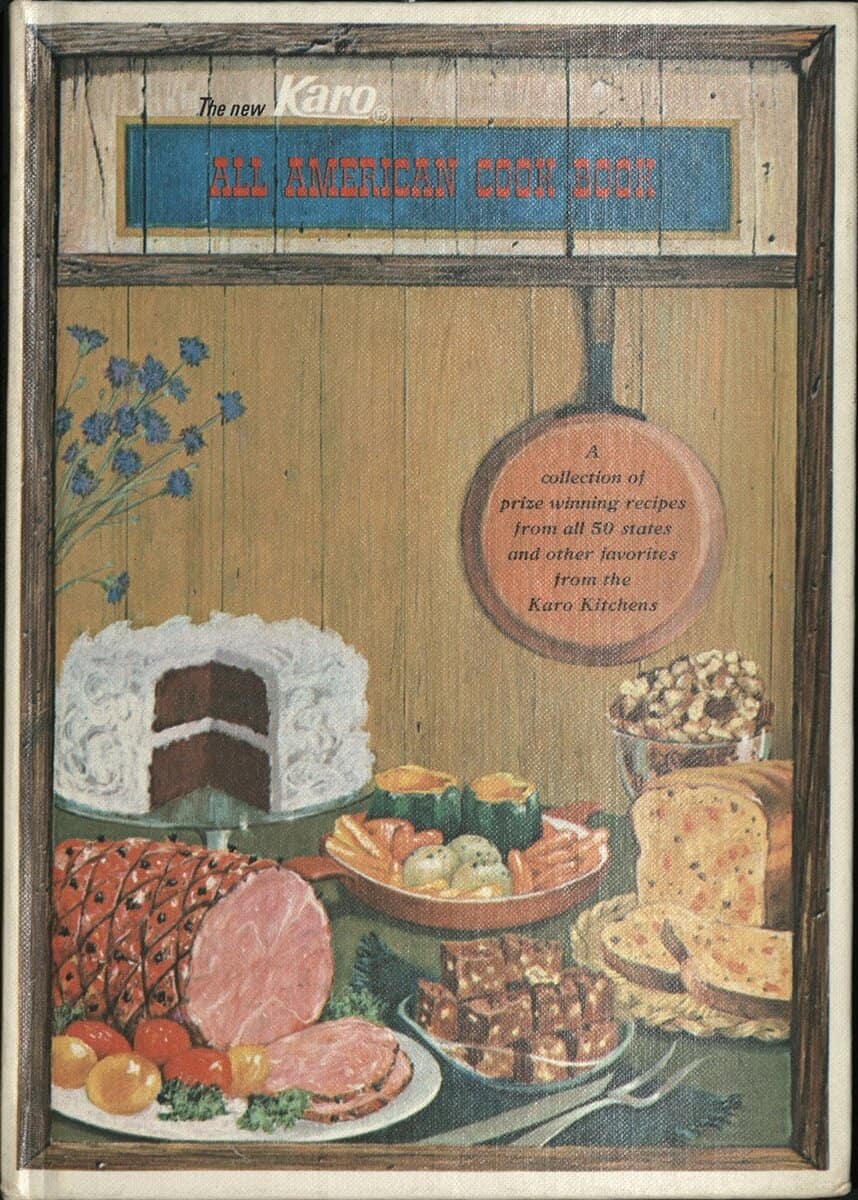
Cover of the New Karo All American Cook Book, Szathmary Collection TX715.N52195 1960
10. The New Karo All American Cook Book (1960s)
Karo Corn Syrup was first introduced by the Corn Products Refining Company in 1902. A massive and unprecedent marketing campaign followed, with full page adds for Karo published in the Ladies Home Journal, and free corn product cookbooks distributed nationwide. In the 1930s, the wife of an executive developed a recipe for pecan pie using Karo, and the dish became a national favorite. By the middle of the 20th century, Karo was a household name and corn syrup was a staple of the modern American diet. (Szathmary Collection TX715 .N52195 1960)
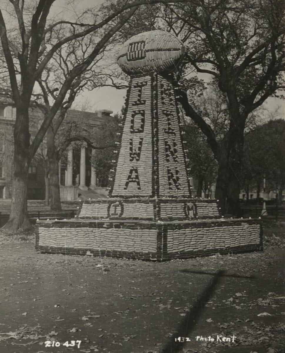
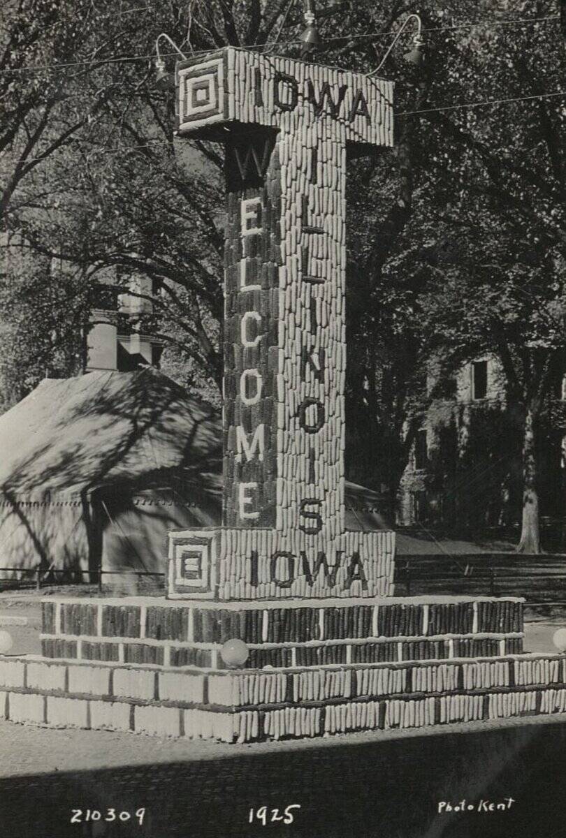
Bonus Item! Homecoming Corn Monuments
1932 Corn Monument1925 Corn Monument
We could not resist adding just one more item that is close to our hearts. Corn monuments are a long-standing Hawkeye tradition dating back to the early 20th century. Every year, engineering students design and construct monuments made of corn to be displayed for homecoming. (Frederick W. Kent Photograph Collection, RG30.0001.001)
“From the Classroom” is a series that features some of the great work and research from students who visit Special Collections and Archives at the University of Iowa Libraries. Below is a blog by Andrew Newell from Dr. Jennifer Burek Pierce’s class “Reading Culture History & Research in Media” (SLIS:5600:0EXW).
Newell explores the history, use, and art of tarot cards by looking at the examples found in Special Collection and Archives.
In a 78-card tarot deck, there are more unique deck permutations than there are atoms in the known universe. The number of unique permutations is 78 factorials (notated as 78! and representing the equation 78 x 77 x 76 x 75… etc. x 2 x 1), yielding a number that is 116 digits long, whereas the universe can only muster a measly 79- or 83-digit-long number of atoms by some estimates. Even in the face of this absurd variety, there are still more ways in which one can read a spread of tarot cards depending on the deck you use. The Pam Spitzmueller Collection’s (MsC1230) in Special Collections and Archives offers a selection of tarot cards that offers insight into this world of vast possibilities.
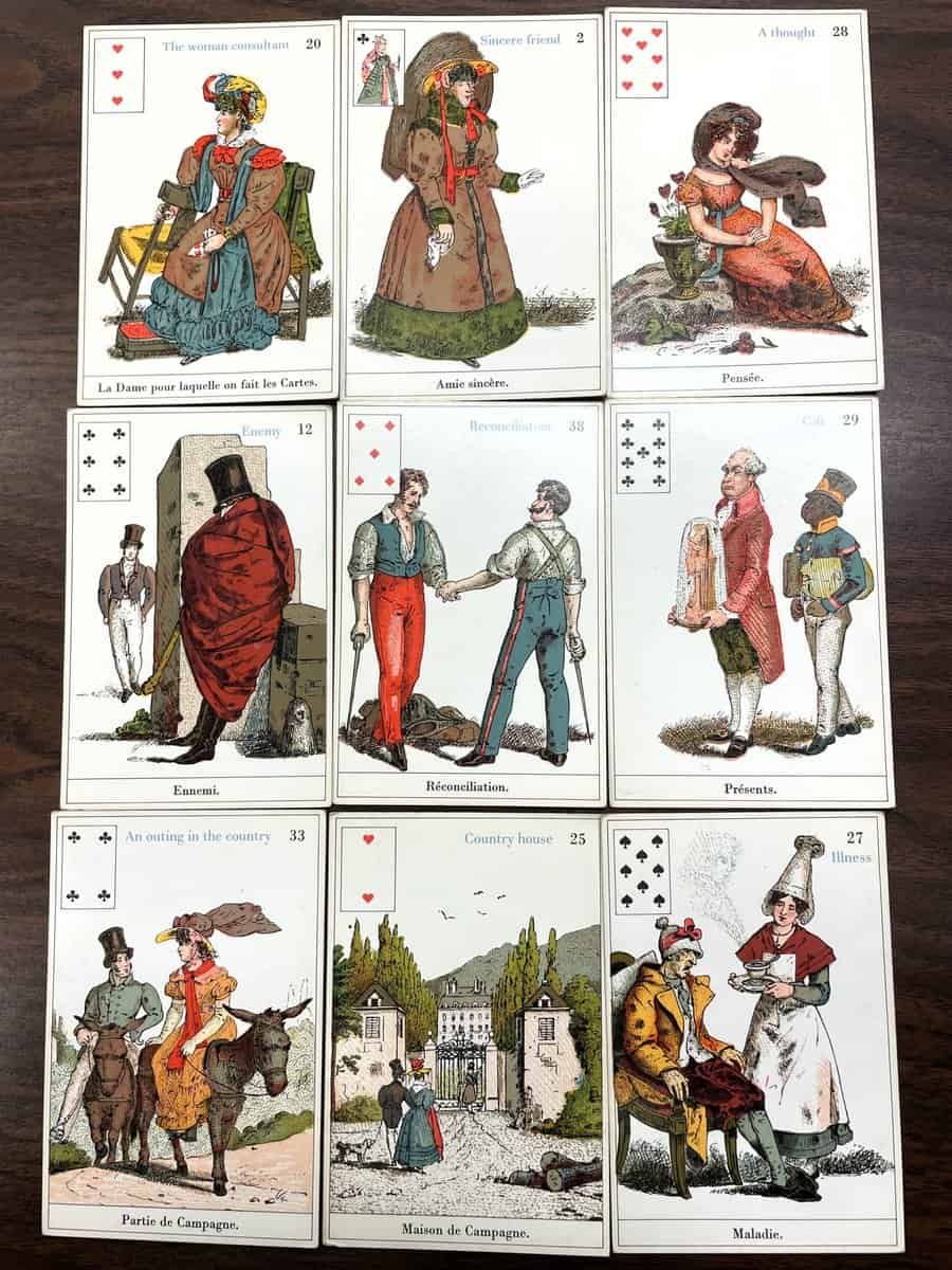
Tarot as a game predates tarot as an oracle method by several centuries. Italians have been playing a 78-card trick-taking game called “tarrochi” since the early Renaissance with 56 cards in four suits and 22 trump cards numbered 0–21, ascending in power that can win hands over normal suit cards. Tarrochi-style decks would spread across Central and Western Europe in the following centuries under German names like “Tarock” and French names like “tarot,” but their use as an oracle would not become widespread until the late 18th century in France as French fortune tellers, such as Jean-Baptiste Alliette, moved from smaller 32-card piquet decks to the much larger 78-card decks. Decks such as the Parlour Sybil (figure 1) serve as a sign of the diversity of methods, images, and deck builds across that history.
Figure 1: Selections from the Parlour Sybil. This deck is a 20th-century reprint of the popular 19th century deck.
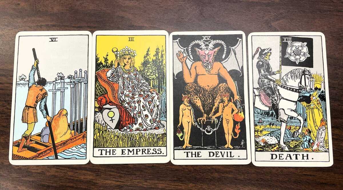
Historically, oracles are tools that play important roles in religious and spiritual traditions across the planet as forms of fortune telling and contemplation. Famous examples of oracles include casting straw or sticks to read the Chinese divination text I Ching, swinging pendulums for guidance to questions, and casting bones or chips inscribed with runes to read their symbols and positions on a table or altar. Perhaps the most famous tarot pack used as an oracle is the Rider deck, sometimes called the Rider-Waite or Rider-WaiteSmith deck (figure 2). Popularized by occultist figures in the late 19th century, such as famed Aleister Crowley, this deck condenses the symbolism of a long history of Western esoteric traditions and contains many Orientalist and often ahistorical connections to Jewish Kabbalah, Egyptian cartomancy, and Romani cultures. The deck itself continues to be important in new age spiritual movements and referenced in pop culture as a site of intrigue and magic in movies such as 2024’s Tarot and in popular games such as Balatro and The Binding of Isaac.
Figure 2: Selections from the Rider Tarot
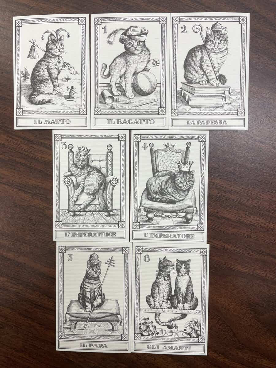
Tarot readings are performed by drawing a set number of cards from a shuffled deck and forming a narrative or answer to a query based on the images and position (upright or upside-down/reversed). Upright cards often represent the image or emotion assigned to a card as it is, and reversed cards can be taken as either opposites or delays. Manuals are often included in newer printings of oracle decks with instructions on specific kinds of readings. The Rider deck is meant to portray both mundane events and emotions through the suit cards or “Minor Arcana” and more abstract, spiritual themes through the trump cards or “Major Arcana.” Some decks such as the I Gatti (figure 3) are meant to be novelty products that aren’t made for readings, but other decks have innovated and commented on tarot through changes in form and imagery.
Figure 3: Selections from the I Gatti
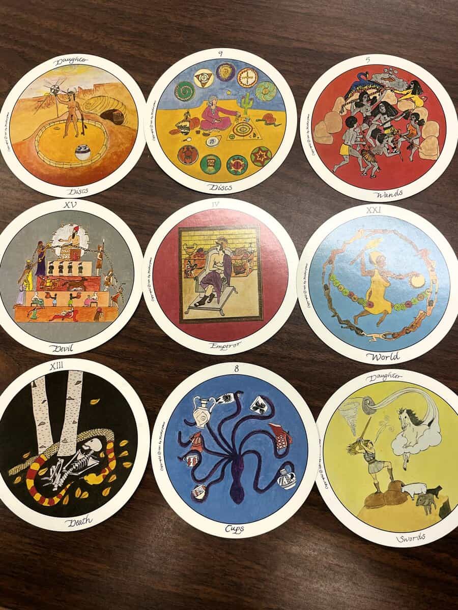
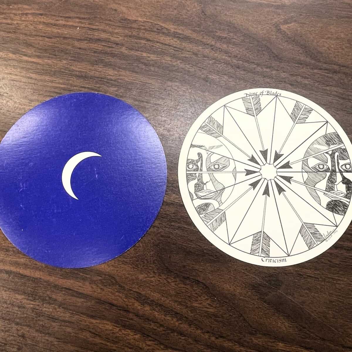
The three remaining decks in Pam Spitzmueller’s collection illustrate these changes in interesting ways. Two decks, the Motherpeace Round Deck printed in 1981 (figure 4) and the Daughters of the Moon Tarot from 1990 (figure 5), are printed as circular cards. Both decks center feminist and Indigenous imagery to combat the often racist and Orientalist themes and images of historical tarot decks. The Motherpeace Round offers a manual, showing how to read cards based on where they are in their clockwise rotation. Finally, the Fantod Pack printed in 1995 by Edward Gorey (figure 6) leans into parody, sparse imagery, and stark black/white contrast in a much smaller deck to create a whimsical and darkly comedic experience.
Figure 4: Selections from the Motherpeace Round TarotFigure 5: Selections from the Daughters of the Moon TarotFigure 6: Selections from the Fantod Pack
Further Reading
Bogdan, Henrik, and Martin P. Starr, ed., Aleister Crowley and Western Esotericism. New York: Oxford University Press, 2012.
Dummett, Michael A.E., and John MacLeod. A History of Games Played with the Tarot Pack. New York: The Edwin Mellen Press, 2004.
Dummett, Michael A.E., and Ronald Decker. A History of the Occult Tarot: 1870-1970. London: Duckworth Overlook, 2002.
Hanegraaff, Wooter J., Western Esotericism: A Guide for the Perplexed. London: Bloomsbury Academic, 2013.
Magee, Glenn Alexander, ed., The Cambridge Handbook of Western Mysticism and Esotericism. New York: Cambridge University Press, 2016.
Pollack, Rachel, Seventy-Eight Degrees of Wisdom: A Book of Tarot. London: HarperCollins, 1997.
The following is written by Libraries student employee Brianna Bowers.
The few short months from the fall of 1792 to January 1793, in which heated debate and a final vote decided that Louis XVI would be guillotined, held centuries of progress. Our world would not be recognizable without the French Revolution. The University of Iowa has thousands of pamphlets from this exciting, tumultuous period, and many of the pamphlets are still being processed. As a student worker in Special Collections and Archives, I am currently taking down the information on each pamphlet to upload them into InfoHawk+, and I have come across some interesting things along the way. The collection of speeches given at the National Convention, debating what to do about Louis XVI, has no standardized way to refer to the man on trial. As his royal title was thrown into uncertainty, new names abounded. Below are 10 names that delegates called their ex-king, from clever to boring and from ruthless to obvious, ranked from awesome to awful.
Louis le dernier [Louis the Last]
This is alliterative in English—“Louis the Last.” It seems like the French had enough by their sixteenth Louis. Louis le dernier wasn’t actually the last king Louis, but the effect of calling him “the last” did implicitly condemn the following reigns as illegitimate.
You can find this name on the above pamphlet: (box 79:1-80:10 item 79:44), “Convention nationale. opinion de lanjuinais, Député d’Ille et Vilaine, Sur Louis le dernier. Imprimée par ordre de la Convention nationale. Nunquam de morte hominis cunctatio longa est. 31 Décembre 1792, l’an premier de la République.”
Louis Capet
Referring to royalty with a common first and last name was a slight, implying that their status was reduced to be equal with everyone else’s. This last name did come from Louis’ family history. Louis was part of the Bourbon dynasty, which derived from the Capetian dynasty. The Capetian dynasty was founded by Hugues Capet (c. 940-996 ᴄ.ᴇ.). There isn’t consensus on how Hugues Capet got his last name. The heraldist Hervé Pinoteau is credited with finding the first use of Capet as a dynasty name in the writings of Ralph de Diceto, from about 200 years after Hugues Capet’s death, with Capet possibly deriving from the “cappa” (a kind of cape) of St Martin of Tours. Other theories derive Capet from words meaning small head, stubborn, or to torment/harass.
You can find a pamphlet with this nickname in the image above: (box 79:1-80:10, item 79:57), “Convention nationale. opinion de laurent lecointre, Député du département de Seine & Oise, à la Convention Nationale; Sur le jugement de Louis Capet. Imprimée par ordre de la Convention Nationale. Quant à moi, je ne connois pas cette justice qui frappe, en souriant, un coupable obscur, & qui se prosterne devant un illustre criminel.”
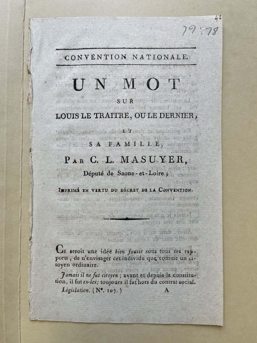
Louis le traître [Louis the Traitor]
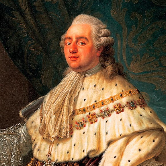
A few years before his trial and execution, Louis was widely seen as a father to his people, divinely ordained, and even a protector of the common people against the aristocracy. His resistance to the Revolution and attempt to flee to Austria in 1791 to raise an army to restore his throne to its former power turned the people against him. His fall from “long live the king” to the guillotine was hard, fast, and avertable.
You can find a pamphlet that uses this name in the image above and in Special Collections: (box 79:1-80:10, item 79:78), “Convention nationale. un mot sur louis le traitre, ou le dernier, et sa famille, Par c. l. masuyer, Député de Saone-et-Loire; Imprimé en vertu du décret de la Convention.”
dernier roi [last king]
This name is reaching for what “Louis le dernier” achieved in condemning Louis to be the last king. However, it isn’t quite as striking. The lack of his first name, Louis, makes the title feel impersonal, and it was already untrue since there were kings alive and kicking in other countries.
Find this name in the pamphlet above: (box 79:1-80:10, item 80:5), “Convention nationale. mon avis sur le jugement du dernier roi; Imprimé par ordre de la Convention nationale. Je dis ce qui se passe dans mon ame Et ce que je crois être la vérité. J. J. Rousseau.”
Capet
A man in this time would often be referred to by only his last name. So, like Louis Capet, this name is intended to lower his status. It strips him of his first name, which had been used by French kings for centuries and was what people knew him as. However, I’m docking a few points for a lack of specificity.
You can find an example on a pamphlet that uses this name in the image above and in Special Collections: (box 81:14-82:27, item 81:33), “Convention nationale. opinion de louis turreau, Député du Département de l’Yonne, Sur Capet; Imprimée par ordre de la convention nationale.”
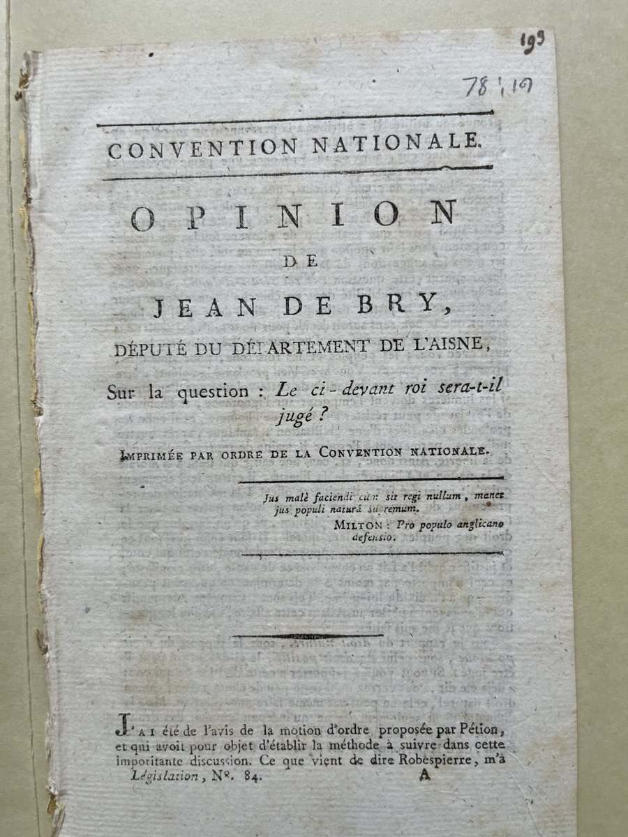
le ci-devant roi [The former King]
This one does its duty. It’s specific enough that we all know who we are talking about. No frills, no nonsense.
Discover this nickname in the above pamphlet: (box 77:76-78:80, item 78:19), “Convention nationale. opinion de jean de bry, député du département de l’aisne, Sur la question: Le ci-devant roi sera-t-il jugé? Imprimée par ordre de la Convention nationale. Jus malè faciendi cùm sit regi nullum, manet jus populi naturá supremum. Milton: Pro populo anglicano defensio.”
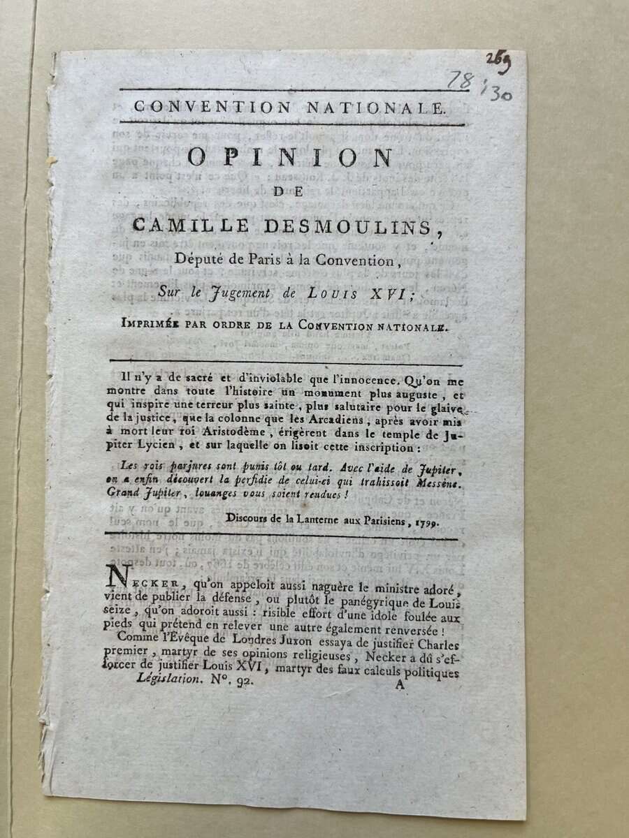
Louis XVI
A classic. This is Louis’s royal title. But as much as it is classic, it is also basic. This is a counter-revolutionary and a former monarch at that. Show some disrespect!
(Box 77:66-78:80, item 78:30), “Convention nationale. opinion de camille desmoulins, Député de Paris à la Convention, Sur le Jugement de Louis XVI; Imprimée par ordre de la Convention nationale. Il n’y a de sacré et d’inviolable que l’innocence. Qu’on me montre dans toute l’histoire un monument plus auguste, et qui inspire une terreur plus sainte, plus salutaire pour le glaive de la justice, que la colonne que les Arcadiens, après avoir mis à mort leur roi Aristodème, érigèrent dans le temple de Jupiter Lycien, et sur laquelle on lisoit cette inscription: Les rois parjures sont punis tôt ou tard. Avec l’aide de Jupiter, on a enfin découvert la perfidie de celui-ci qui trahissoit Messène. Grand Jupiter, louanges vous soient rendues! Discours de la Lanterne aux Parisiens, 1790.” (This pamphlet is not from 1790, Camille is quoting a speech he made previously in the title.)
Roi [king]
This isn’t a terribly specific nickname. Which king? There were many other countries that had kings at the time after all. Besides, doesn’t this imply that Louis is still the rightful king? A virtuous revolutionary would never endorse the existence of a king, even in a nickname.
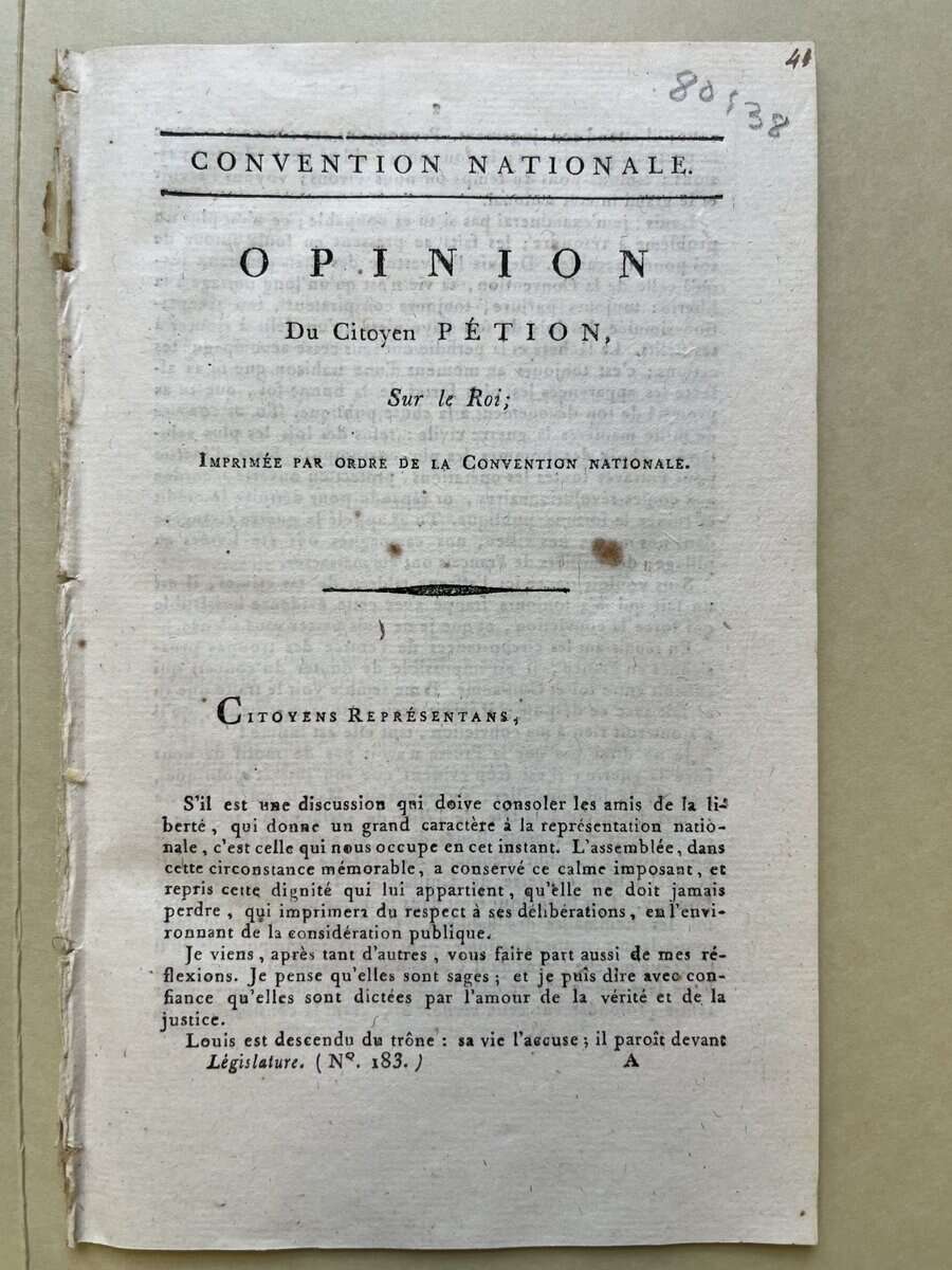
Find this pamphlet that uses the name in the image above and in Special Collections: (box 80:11-81:13, item 80:38), “Convention nationale. opinion Du Citoyen pétion, Sur le Roi; Imprimée par ordre de la Convention nationale.”
Louis
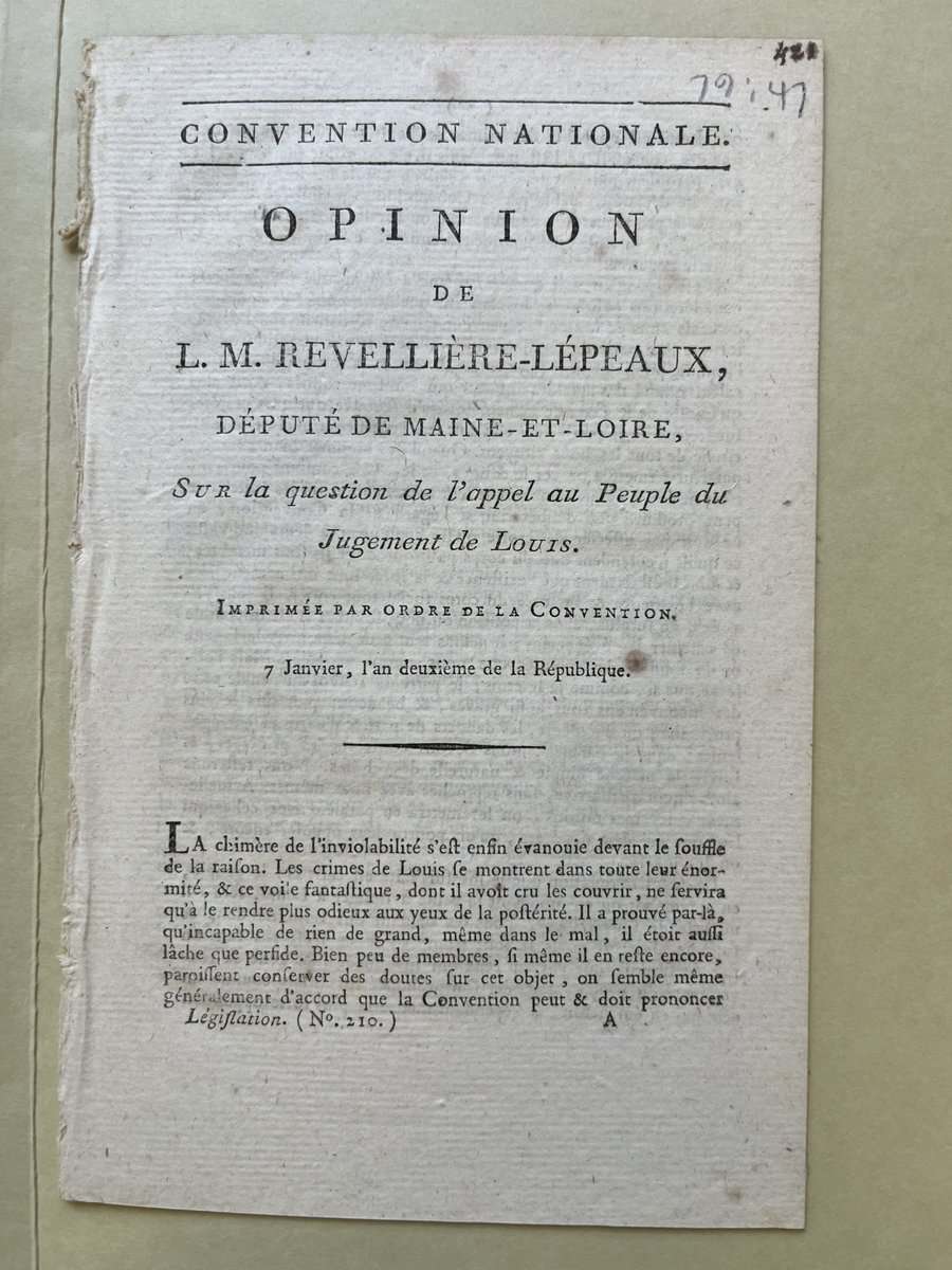
And if there were other kings, there were certainly other people named Louis. The briefest glance at members of the National Convention, the body putting Louis on trial, gives us Louis Portiez, Louis-Antoine Saint-Just, Louis Turreau, Louis Louchet, and Louis-Marie Réveillère-Lepaux, the very man who wrote the pamphlet calling the former king just plain Louis. Calling him just Louis is so basic, not to mention a logistical nightmare. Seriously, there were so many French men named Louis from 1792 to 1793! While we’re on the topic of his given name, Louis means famous in battle or loot bringer, and is derived from Old German.
You can find a pamphlet that uses this name in the image above and in Special Collections: (box 79:1-80:10, item 79:47), “Convention nationale. opinion de l. m. revellière-lépeaux, député de maine-et-loire, Sur la question de l’appel au Peuple du Jugement de Louis. Imprimée par ordre de la Convention. 7 Janvier, l’an deuxième de la République.”
Louis Hugues
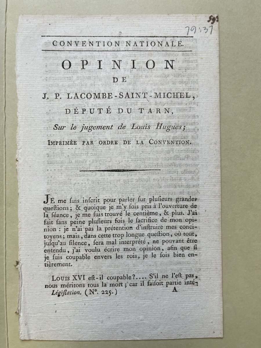
This is a full name just like the names of normal plebeians. It is the same idea as calling him Louis Capet. Perhaps the name Hugues was derived from the same ancestor, Hugues Capet. But it wasn’t as popular because the people were already using Louis Capet. When I hear the name Louis Hugues, I think, “Louis Who?”
You can find a pamphlet that uses this name in the image above and in Special Collections: (box 79:1-80:10, item 79:37), “Convention nationale. opinion de j. p. lacombe-saint-michel, député du tarn, Sur le jugement de Louis Hugues; Imprimée par ordre de la Convention.”
“From the Classroom” is a series that features some of the great work and research from students who visit Special Collections and Archives at the University of Iowa Libraries. Below is a blog by Casie Minot from Dr. Jennifer Burek Pierce’s class “Reading Culture History & Research in Media” (SLIS:5600:0EXW).
Minot explores the paratext of the serialized version of Bleak House found in Special Collection and Archives. The novel by English author Charles Dickens follows a family who become embroiled in a long-running lawsuit over a disputed inheritance and is one of the author’s most acclaimed novels.
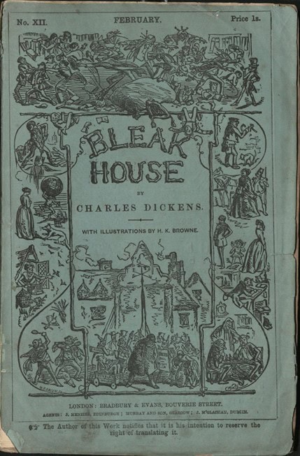
Front Cover of the February 1853 Edition of Bleak House
By the time the serial edition of Charles Dickens’ Bleak House concluded in September of 1853, the Illustrated London News reported that, “‘What do you think of Bleak House?’” was about as regular a question as “‘How are you?’” (Hayward 31). The main difference between the two was that “a great number of people who ask how you do, make a practice of neither waiting for, nor listening to, your reply.… But, on the contrary, those who inquire for your ideas about Bleak House, think of Bleak House; and, if they do not really want to know your opinion, want you to at least listen to theirs” (Hayward 31). Throughout its release, newspapers and readers alike agreed that Bleak House was London’s premiere literary social event.
Yet, one need not be a Victorian reader to experience the Bleak House buzz. By flipping through the original Bleak House serials, current readers can catch a glimpse at how the pamphlets functioned as a town square of sorts, where communities of readers from different class and gender backgrounds shopped through, learned from, and consumed novels and goods alike.
Nineteenth-century readers listened to Dickens’ stories read aloud in social settings, such as amongst family, neighbors, and friends of all sorts of classes. This especially enhanced the reading experiences of lower classes. At one shilling a piece, Dickens’ serials radically made historically expensive novels widely accessible to lower-class readers. Still, a shilling was a full day’s worth of wages for some readers, which led many lower-class families and communities to buy one representative pamphlet and hold communal recitations (Hayward 35). Moreover, literacy levels were low amongst lower class readers, making “listen[ing] to recitals of texts” an especially viable reading option (Lai-Ming 185). The prevalence of recitation even influenced Dickens’ craft: by using phonetic spellings and punctuation to emphasize speech patterns, Dickens’ prose enhanced the oral performance of the “reader-aloud” and catered to the aural entertainment of “reader-listeners” (Lai-Ming). From Dickens’ writing desk to the homes of readers, serialized novels like Bleak House encouraged communities from diverse class and literacy backgrounds to read each monthly installment.
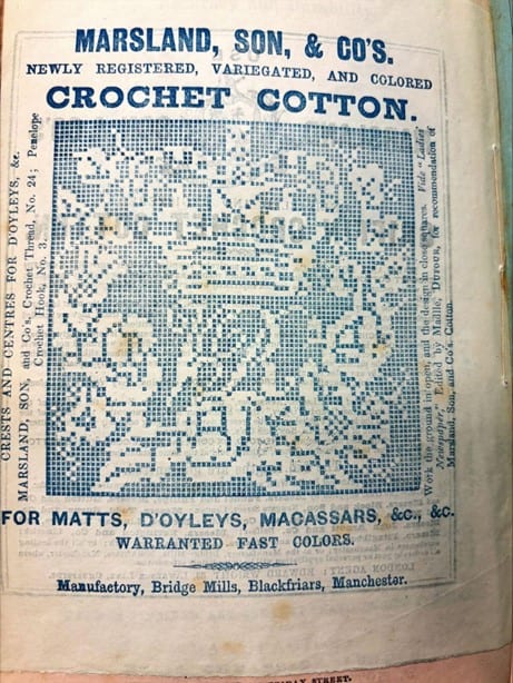
Marsland, Son, & Co.’s Doily Template and Advertisement in the December 1852 Edition of Bleak House
The original 1852 and 1853 serials of Bleak House, a part of the Leigh Hunt collection, further animate how Dickens’ first readers might have participated in this highly social reading process. While the pamphlet’s latter half contains four Bleak House chapters, the first half features a wealth of advertisements, such as funeral services, toupees, pills for ailments, and dress fashions. The array of advertisements encouraged readers to leisurely “loiter” through ad after ad as if readers were window shopping (Andrews 24). One notable advertisement is Marsland, Son, & Co.’s crochet cotton thread. Each monthly advertisement featured one new doily pattern adorned with avian, floral, or even royal motifs. Readers could easily collect the patterns for themselves or offer them to loved ones. Perhaps a reader perfected their stitching while listening to protagonist Esther and her friend, Caddy, perfect theirs in the story. Advertisements like the Marsland, Son, & Co. doily patterns illustrate the “arcade” of leisurely activities at readers’ disposal inside Bleak House serials (Andrews 24).
Bleak House’s advertisements also offer insights into Dickens’ diverse reading demographics. The inclusion of crochet advertisements gestures towards Dickens’ female readership, but many of the advertisements also targeted their respective families, which included a wide variety of socioeconomic classes. On their way to Bleak House, parents and children strolled through advertisements for expensive waterproof overcoats for their family patriarch as well as lists suggesting Christmas gifts for family reading. While such lists feature more costly novels, the overall serials also offer a variety of newspapers and reading lists advertised at cheaper prices.
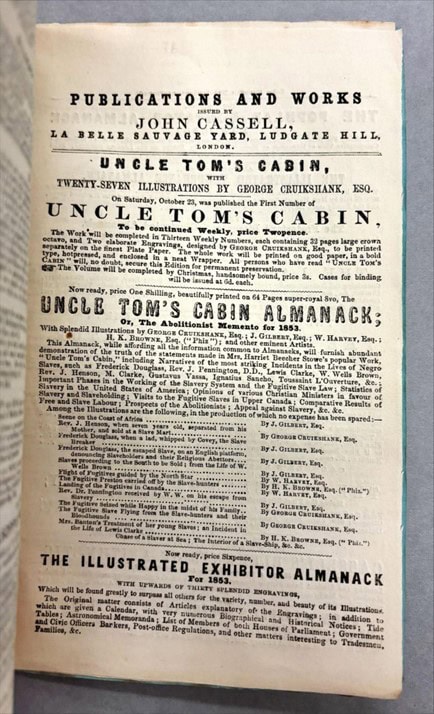
Uncle Tom’s Cabin Advertisement in the November 1852 Edition of Bleak House
Not only did the advertisements appeal to women and their families across class boundaries, but they also appealed to women active outside the home. For instance, published one week after Bleak House’s first release in March of 1852, readers saw Harriet Beecher Stowe’s sentimental protest novel against enslavement—Uncle Tom’s Cabin—explode both in popularity and in the number of advertisements. Stowe’s blockbuster novel meant to stir sympathy in its female readership while mobilizing readers to take action to support the Abolitionist movement in the United States, and that stirring rippled to Victorian England (Fekete Trubey 62). Selling one million copies across the pond within its first nine months of publication, the novel inspired English women to organize the “largest-scale, traditionally political mobilization” in the form of the Stafford House Address (Fekete Trubey 64-65). Signed by 563,000 British women and gifted to Stowe herself, the 1853 petition implored American women to take action against enslavement in the United States, where the novel only sold 300,000 copies in its first year (“Stowe’s Global Impact”). However, one wonders what these British women readers experienced when confronted with Bleak House’s Mrs. Jellyby and Mrs. Pardiggle, whose respective portrayals expose their inability to address complex social issues as well as their consequential distractedness from domestic duties, such as the sewing tasks Esther and Caddy perform. Thus, the advertisements of Dickens’ serials appealed to certain demographics, though these demographics, at times, clashed with the social themes of Dickens’ novel.
Contemporary readers can come in today to leisurely peruse through the same avenues of advertisement that entertained readers of the past. Moreover, current readers can indulge in the “arcades” of activities within Bleak House’s narrative (Andrews 24). As a part of the University of Iowa’s Leigh Hunt collection, present-day readers can gawk at Dickens’ defamatory caricature of Leigh Hunt and his decadent lifestyle in the form of Bleak House’s Harold Skimpole. Readers can learn more about the complicated friendship between Hunt and Dickens through this caricature alongside other artifacts within the collection, such as Dickens’ correspondence with Hunt prior to and after Bleak House’s publication. Researchers can also explore the exciting, new avenues of research present in these serials. Each advertisement acts as a window into the past, unlocking new insights into readership demographics and reading practices of Dickens’ time.
The original serialization of Bleak House and its advertisements invites scholars and enthusiastic readers alike to explore the avenues of readership it inspired. In doing so, readers of today can learn more about the endless possible ways readers might have listened to, read aloud, multi-tasked along to, shopped through, gawked at, and tore parts out of arguably Dickens’ best novel.
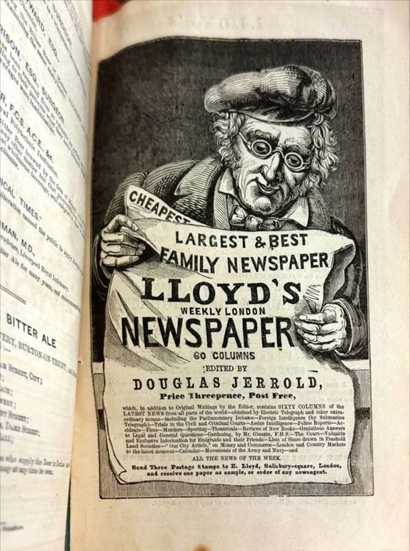
“Lloyd’s Weekly London Newspaper” Advertisement in the July 1852 Edition of Bleak House
Works Cited
Andrews, Malcolm. “Dickens and the Serial Flâneur.” The Dickensian, vol. 114, no. 504, 2018, pp. 21-25.
Fekete Trubey, Elizabeth. “‘Success Is Sympathy’: Uncle Tom’s Cabin and the Woman Reader.” Reading Women: Literary Figures and Cultural Icons from the Victorian Age to the Present, edited by Janet Badia and Jennifer Phegley, University of Toronto Press, 2005, pp. 53–76.
Hayward, Jennifer. Consuming Pleasures: Active Audiences and Serial Fictions from Dickens to Soap Opera, University of Kentucky Press, 1997.
Lai-ming, Tammy Ho. “Reading Aloud in Dickens’ Novels.” Oral Tradition, vol. 23, no. 2, 2008, pp. 185-199.
“Stowe’s Global Impact.” Harriet Beecher Stowe Center. https://www.harrietbeecherstowecenter.org/harriet-beecher-stowe/her-global-impact/
Further Reading:
Burek-Pierce, Jennifer. “‘Knit and the World Knits with You’: Studying Participatory Culture in the U.S. Newspapers through World War I.” Annual Review of Cultural Heritage Informatics, Rowman & Littlefield Publishing Group, Inc., 2015, pp. 73-83.
Price, Leah. How to Do Things with Books in Victorian Britain. Princeton University Press, 2012.
Thornton, Sara. “Reading the Dickens Advertiser: Merging Paratext and Novel.” Advertising, Subjectivity and the Nineteenth-Century Novel, Palgrave Studies in Nineteenth-Century Writing and Culture, Palgrave Macmillan, 2005, pp. 119-171.
The following is written by Museum Studies Intern Joy Curry
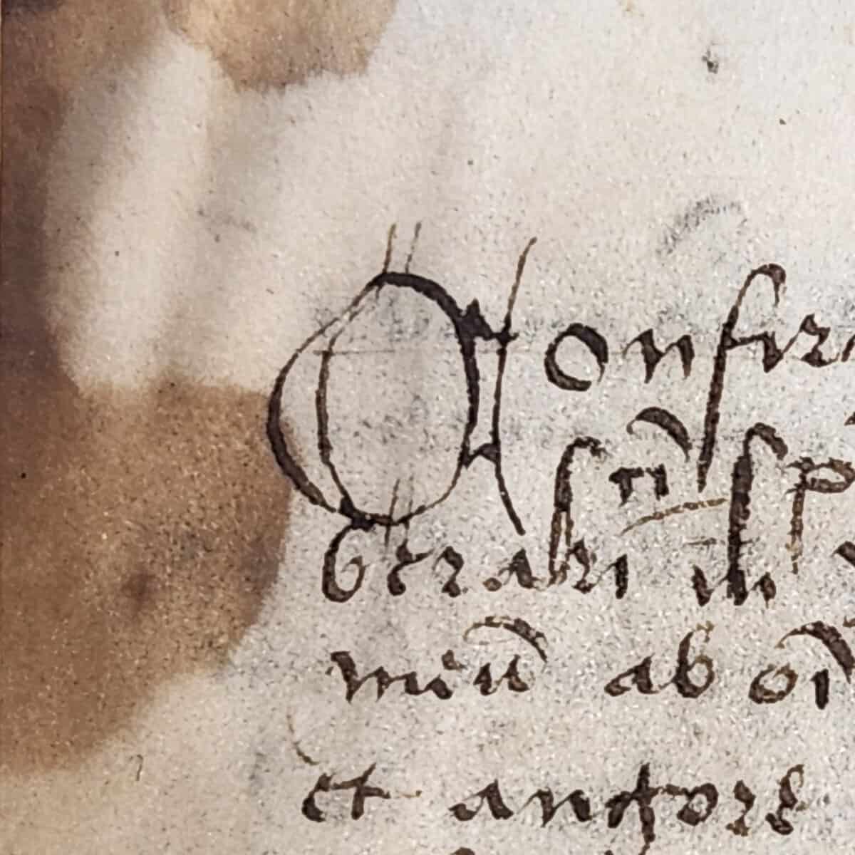
If medieval scribes knew one thing, it was the importance of fancy letters. Surviving manuscripts are decorated with gold, filigree, intricate paintings, and more methods to make the words as beautiful as possible. One type of decoration was versals: letters that are drawn rather than being made with normal pen strokes (which are called calligraphed letters). You’re probably familiar with these, even if you haven’t heard the term –– if you’ve ever seen a medieval book where one letter took up half of the page, or was filled with drawings, that was probably a versal. However, those super fancy caps aren’t the only way to do versals. The University of Iowa’s 15th century Book of Hours from Utrecht shows many different ways to spruce up or tone down drawn letters.
Level 1: Know the basic
Q of O calligraphy on fly-leafA Versal O
On the blank pages at the very beginning and end of the book of hours (called fly leaves), readers added in prayers and scriptural excerpts of their own. Here we find the least fancy versals. Fortunately for us, these give a good demonstration of the difference between versals and calligraphed letters. All of the letters were clearly drawn with the same pen, so it’s easier to see the techniques used to form the different types. In the versal O, for example, the writer had to draw the sides with two separate pen strokes, which created some empty space inside the letter. The calligraphed Q has no such gaps.
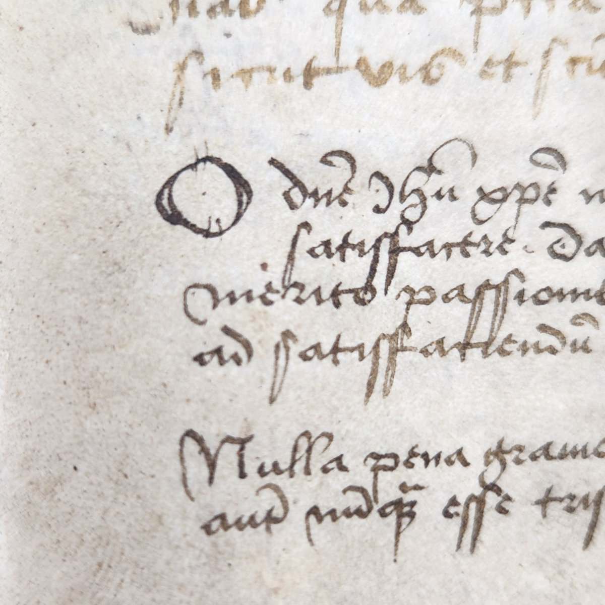
Level 2: Color, color, everywhere!
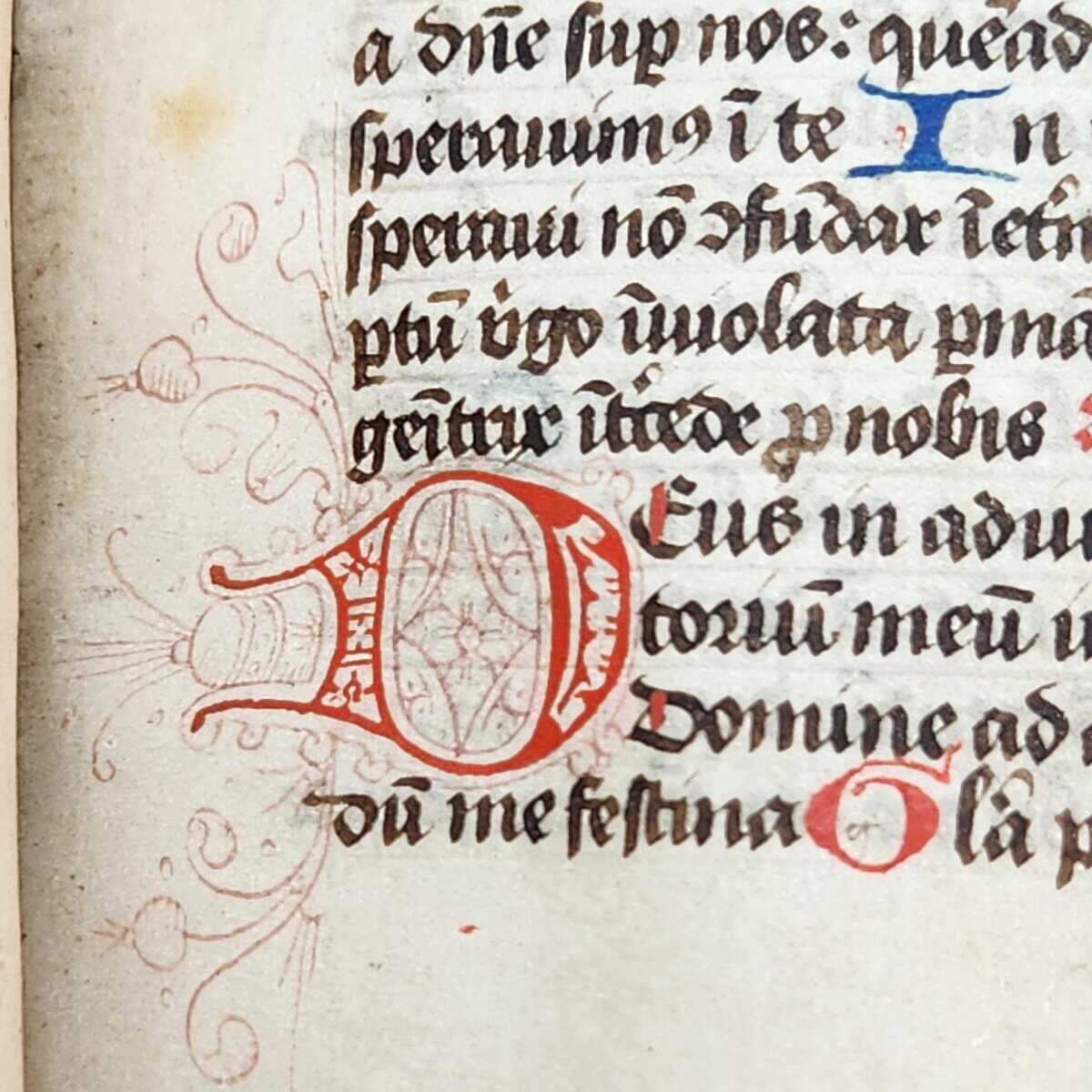
Within the actual book of hours, the simplest versals look pretty similar to those in the book’s fly leaves. The main difference is the use of color; the scribes used vibrant red and blue pigments to fill in any gaps in the letters. They’re also very small. They fit right in with the rest of the lines of text; they’re just a bit wider than the normal calligraphed letters.
Level 3: Mind the gaps (and swirls, and leaves)
When the versals get a bit bigger, they shift the rest of the text block to accommodate them. These larger letters also have a lot more empty space to fill in, so to elevate the level of fanciness, the scribes played with that space and filled the letters with fun shapes.
Those fine lines around the letter are called filigree. This is where the really intricate art starts to come in. Here, the scribes have filigreed swirling foliage and other shapes around some of the large versals.
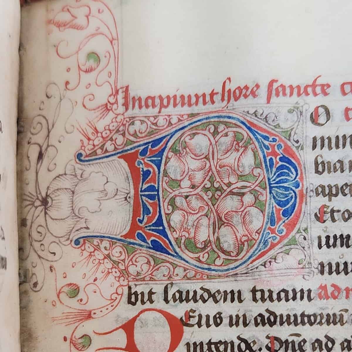
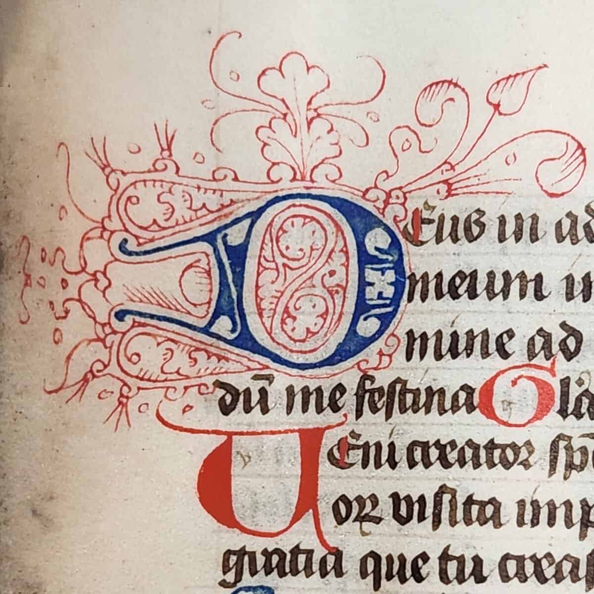
Level 4: Color me impressed!
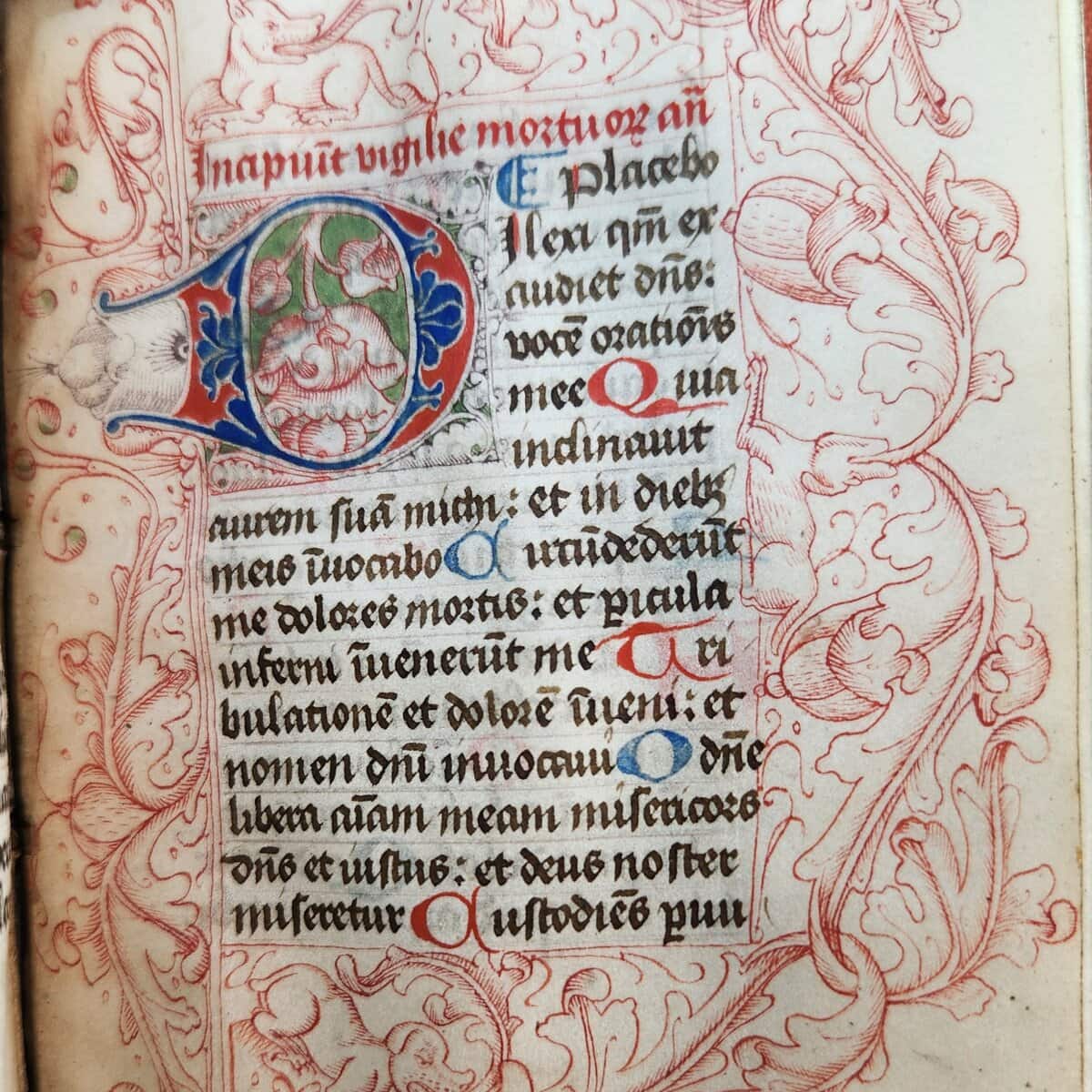
The pinnacle of fancy versals puts all of the previous techniques together and then adds some more. The scribes pulled out all the stops for these letters; they even brought out a green pigment seen nowhere else in the book, and they designed both the text block and the border around the letter.
So, what purpose does all this decoration serve? Much of it was practical. In breaking up the text block and highlighting specific words, these letters guide the reader through the book and draw attention towards the subjects that the scribe found most important. The three most ornate versals each indicate the beginning of a different section of the book: the first marks the starting page for the Hours of the Virgin (folio 15r), the next marks the start of the Hours of the Cross (folio 52r), and the final one marks the beginning of the Seven Penitential Psalms (folio 87r). Their size, their ornate borders, and their unique colors would make them relatively easy to find when skimming through the book.
Notably, two of these sections use the same word from the same verse: the versal letter is the D in Domine from Psalm 50:17 of the Vulgate (numbered Psalm 51:15 in the New King James Version): “Domine, labia mea aperies, et os meum annuntiabit laudem tuam.” [O Lord, open my lips, and my mouth shall show forth your praise.”] The other versal is the beginning of Psalm 114:1 in the Vulgate (Psalm 116:1 in NKJV): “Dilexi, quoniam exaudiet Dominus vocem orationis meae.” [“I love the LORD, because He has heard My voice and my supplications.”]
Of course, another reason for the decoration was aesthetic because to make a book beautiful is a testament to both the artist’s skill and their dedication to beauty for the glory of God. In a way, the two purposes were the same: to make a book practical was to make it beautiful, which was also to make it holy.