The following is written by Museum Studies Intern Joy Curry
If medieval scribes knew one thing, it was the importance of fancy letters. Surviving manuscripts are decorated with gold, filigree, intricate paintings, and more methods to make the words as beautiful as possible. One type of decoration was versals: letters that are drawn rather than being made with normal pen strokes (which are called calligraphed letters). You’re probably familiar with these, even if you haven’t heard the term –– if you’ve ever seen a medieval book where one letter took up half of the page, or was filled with drawings, that was probably a versal. However, those super fancy caps aren’t the only way to do versals. The University of Iowa’s 15th century Book of Hours from Utrecht shows many different ways to spruce up or tone down drawn letters.
Level 1: Know the basic
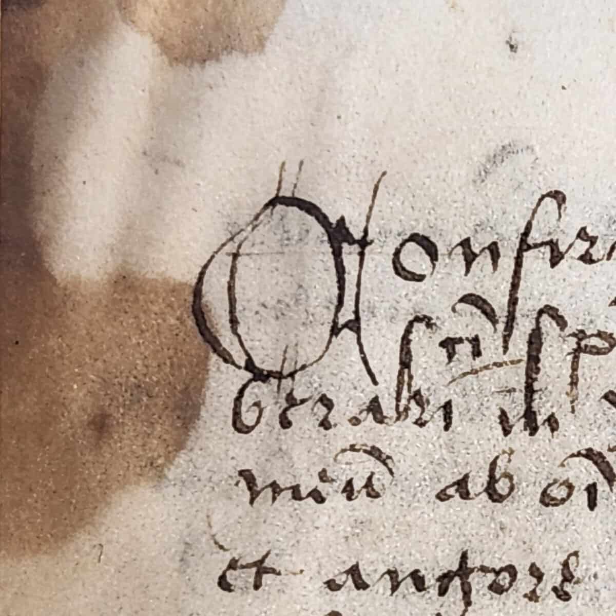
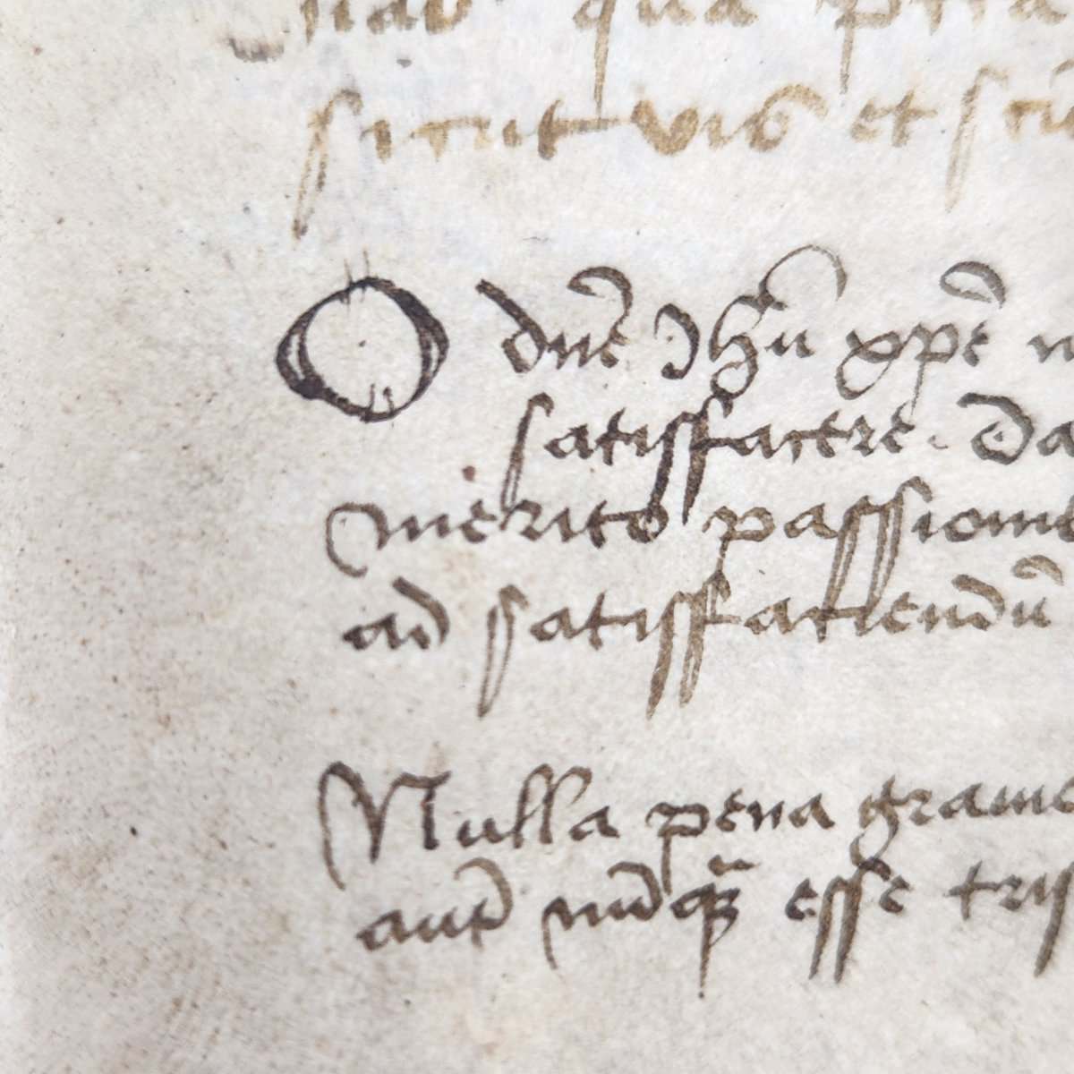
On the blank pages at the very beginning and end of the book of hours (called fly leaves), readers added in prayers and scriptural excerpts of their own. Here we find the least fancy versals. Fortunately for us, these give a good demonstration of the difference between versals and calligraphed letters. All of the letters were clearly drawn with the same pen, so it’s easier to see the techniques used to form the different types. In the versal O, for example, the writer had to draw the sides with two separate pen strokes, which created some empty space inside the letter. The calligraphed Q has no such gaps.
Level 2: Color, color, everywhere!
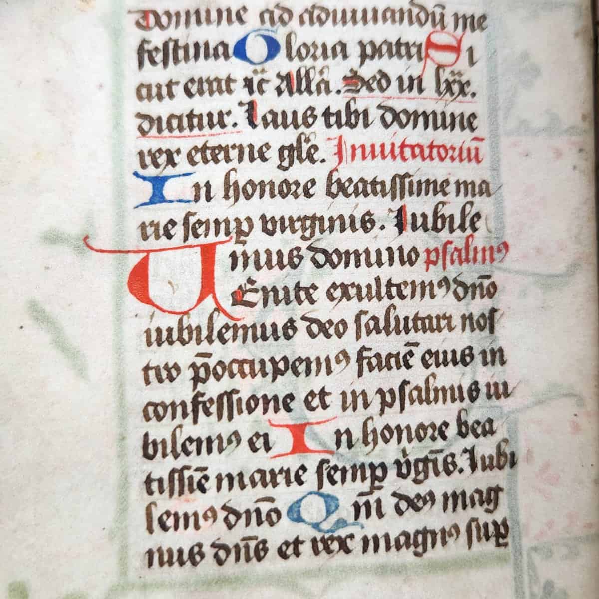
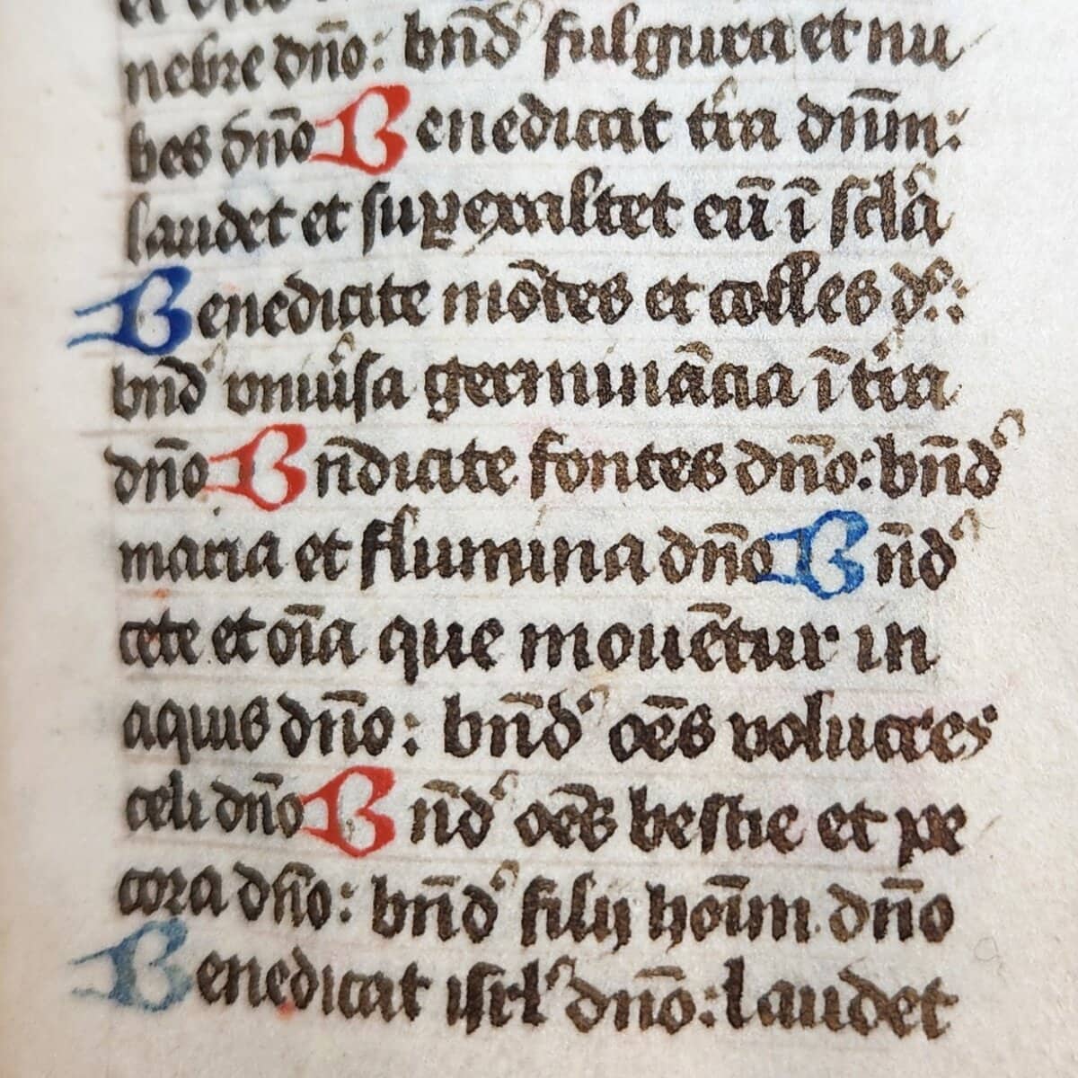
Within the actual book of hours, the simplest versals look pretty similar to those in the book’s fly leaves. The main difference is the use of color; the scribes used vibrant red and blue pigments to fill in any gaps in the letters. They’re also very small. They fit right in with the rest of the lines of text; they’re just a bit wider than the normal calligraphed letters.
Level 3: Mind the gaps (and swirls, and leaves)
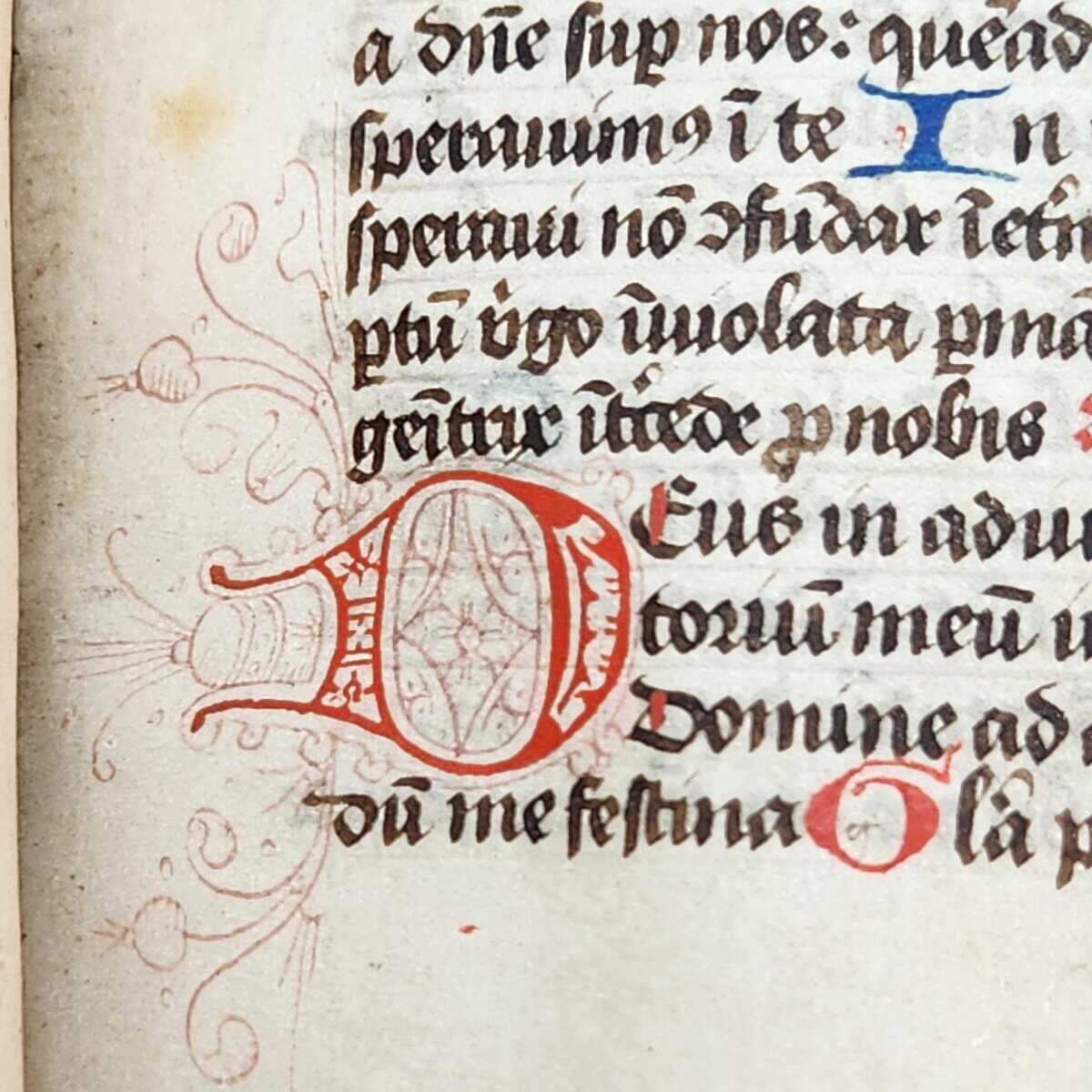
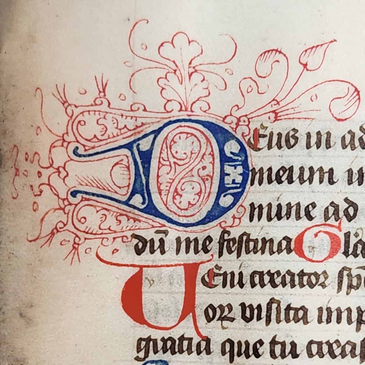
When the versals get a bit bigger, they shift the rest of the text block to accommodate them. These larger letters also have a lot more empty space to fill in, so to elevate the level of fanciness, the scribes played with that space and filled the letters with fun shapes.
Those fine lines around the letter are called filigree. This is where the really intricate art starts to come in. Here, the scribes have filigreed swirling foliage and other shapes around some of the large versals.
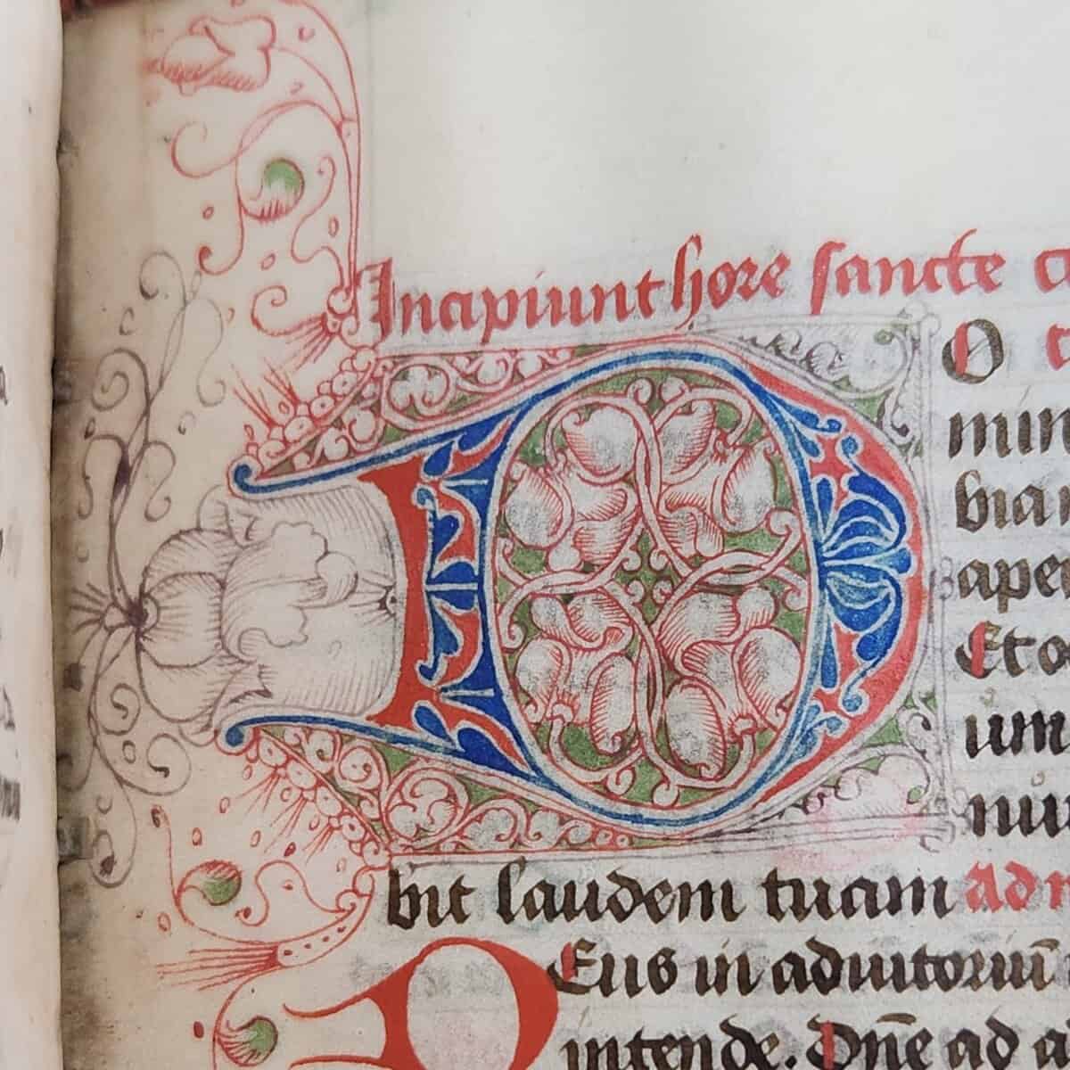
Level 4: Color me impressed!
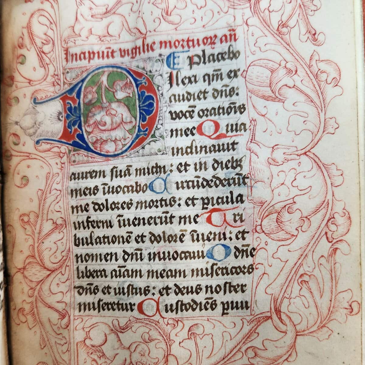

The pinnacle of fancy versals puts all of the previous techniques together and then adds some more. The scribes pulled out all the stops for these letters; they even brought out a green pigment seen nowhere else in the book, and they designed both the text block and the border around the letter.
So, what purpose does all this decoration serve? Much of it was practical. In breaking up the text block and highlighting specific words, these letters guide the reader through the book and draw attention towards the subjects that the scribe found most important. The three most ornate versals each indicate the beginning of a different section of the book: the first marks the starting page for the Hours of the Virgin (folio 15r), the next marks the start of the Hours of the Cross (folio 52r), and the final one marks the beginning of the Seven Penitential Psalms (folio 87r). Their size, their ornate borders, and their unique colors would make them relatively easy to find when skimming through the book.
Notably, two of these sections use the same word from the same verse: the versal letter is the D in Domine from Psalm 50:17 of the Vulgate (numbered Psalm 51:15 in the New King James Version): “Domine, labia mea aperies, et os meum annuntiabit laudem tuam.” [O Lord, open my lips, and my mouth shall show forth your praise.”] The other versal is the beginning of Psalm 114:1 in the Vulgate (Psalm 116:1 in NKJV): “Dilexi, quoniam exaudiet Dominus vocem orationis meae.” [“I love the LORD, because He has heard My voice and my supplications.”]
Of course, another reason for the decoration was aesthetic because to make a book beautiful is a testament to both the artist’s skill and their dedication to beauty for the glory of God. In a way, the two purposes were the same: to make a book practical was to make it beautiful, which was also to make it holy.