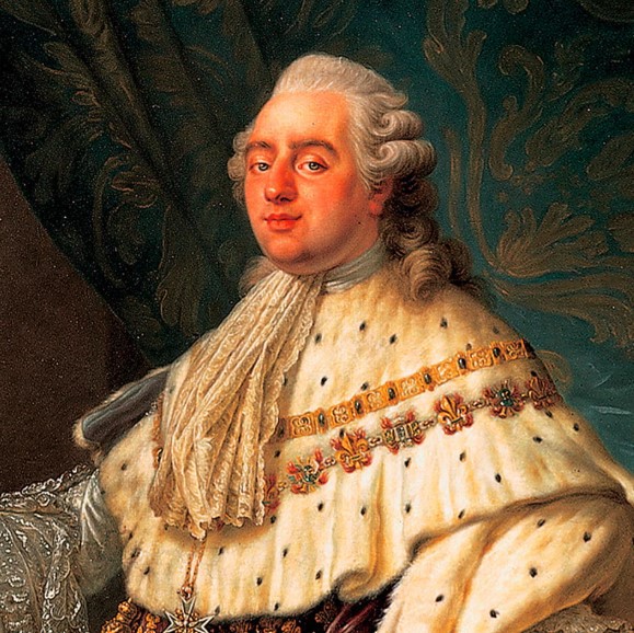
The following is written by Libraries student employee Brianna Bowers. The few short months from the fall of 1792 to January 1793, in which heated debate and a final vote decided that Louis XVI would be guillotined, held centuries of progress. Our world would not be recognizable without the French Revolution. The University of IowaContinue reading “A king by any other name would die as duly, or the top 10 nicknames of Louis XVI”
Author Archives: Elizabeth Riordan
Stepping into the bustling world of Bleak House’s first readers
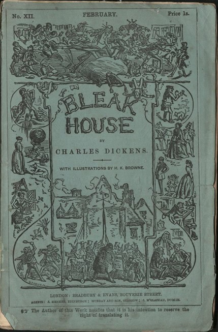
“From the Classroom” is a series that features some of the great work and research from students who visit Special Collections and Archives at the University of Iowa Libraries. Below is a blog by Casie Minot from Dr. Jennifer Burek Pierce’s class “Reading Culture History & Research in Media” (SLIS:5600:0EXW). Minot explores the paratext ofContinue reading “Stepping into the bustling world of Bleak House’s first readers”
Versals from a 15th-century Book of Hours, in order of increasing fanciness
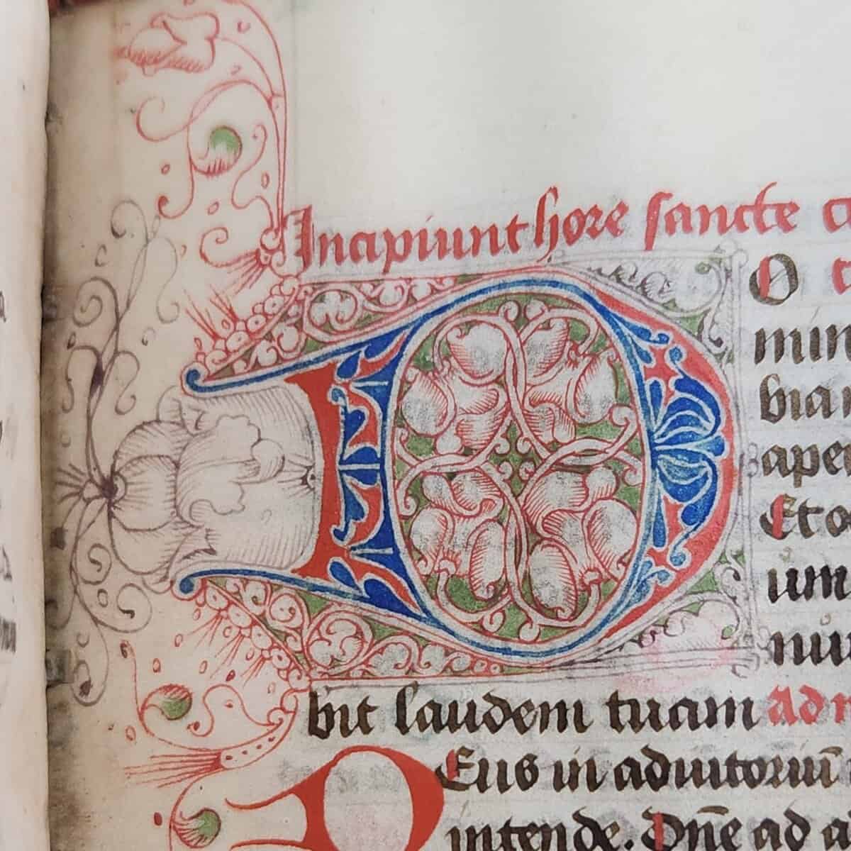
The following is written by Museum Studies Intern Joy Curry If medieval scribes knew one thing, it was the importance of fancy letters. Surviving manuscripts are decorated with gold, filigree, intricate paintings, and more methods to make the words as beautiful as possible. One type of decoration was versals: letters that are drawn rather thanContinue reading “Versals from a 15th-century Book of Hours, in order of increasing fanciness”
Beware of marginal monsters
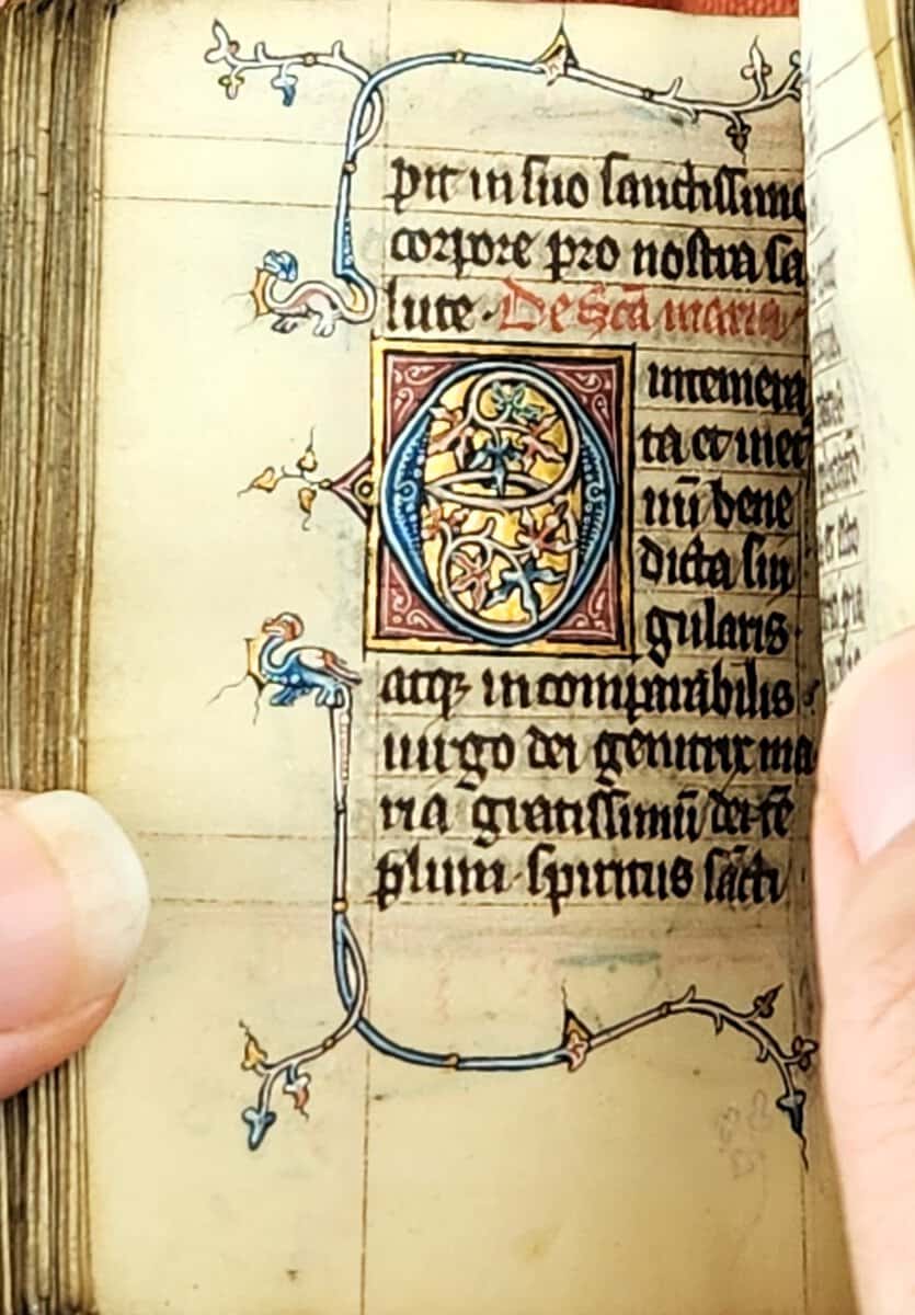
The following is written by Museum Studies Intern Joy Curry. This 14th-century book of hours may be tiny, but it is jam-packed with beasts, ranging from fish to lions to feathered dragons. It’s a marvel that so much of the art has survived, especially since the book is missing 19 miniatures. Fortunately for us, theContinue reading “Beware of marginal monsters”
Welcome Isabel Cazares

We are happy to welcome Isabel Cazares as our new instruction and outreach librarian. In this position, Isabel will be working with both the University of Iowa Libraries and the Stanley Museum of Art to increase visibility and usability of our deep and distinctive art collections through object-based learning in the classroom. Isabel comes toContinue reading “Welcome Isabel Cazares”
Voices from the stacks: Corita Kent

The following is written by Olson Graduate Research Assistant, Kaylee Swinford. Corita Kent was an American artist, educator, activist, and former religious sister. With a rebellious spirit, Corita was a pioneering designer, who produced a body of work for over three decades combining themes of spirituality, hope, peace, and acceptance. Inspired by the popular PopContinue reading “Voices from the stacks: Corita Kent”
Remembering Frank Paluka
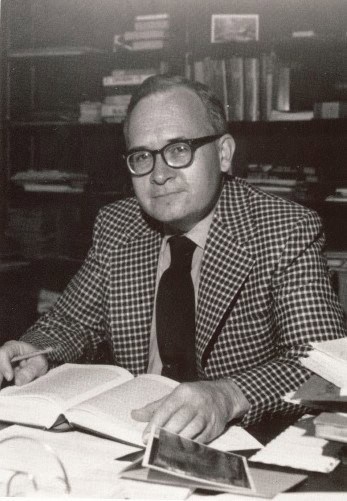
We are saddened to announce the Feb. 15, 2025, passing of Frank Paluka, former director of Special Collections at the University of Iowa Libraries. Frank joined Special Collections in 1961, becoming the head of the department in 1962. He remained in this position until March of 1986. Under Frank’s direction, Special Collections’ holdings of rareContinue reading “Remembering Frank Paluka”
Language of flowers speaks volumes

The following is written by museum intern student Joy Curry. Valentine’s Day is, among other things, a common time to give and receive flowers. If you visited a florist this last holiday, you might have seen some explanations on what flowers mean. You may have heard of the symbolism attached to different colors of rosesContinue reading “Language of flowers speaks volumes”
Voices from the Stacks: Phillip G. Hubbard

The following is written by Olson Graduate Research Assistant Anne Moore. Phillip G. Hubbard was an engineering professor, administrator, civil rights champion, and distinguished member of the University of Iowa community. He was the first Black professor at the university and spent more than 40 years advocating for students and providing counsel to sixContinue reading “Voices from the Stacks: Phillip G. Hubbard”
New acquisition, Neue Jugend, imparts Dada history
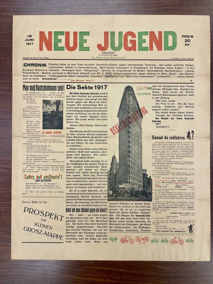
The following is written by curator Timothy Shipe Among the International Dada Archive’s latest acquisitions are several issues of the Berlin journal Neue Jugend, founded in early 1914 by two student poets, Heinz Barger and Friedrich Hollaender. Neue Jugend is a telling example of how the Berlin dadaists managed to elude wartime government censorship. TheContinue reading “New acquisition, Neue Jugend, imparts Dada history”