As I prepared to start my Public Digital Humanities capstone project, I began to reflect on the work I had done throughout the certificate and saw an opportunity to bring my work full circle. When I started the certificate, I learned technical skills not taught in my history coursework and began to see how they could improve my investigation of historical questions and imagery of the trends I saw in the documents. Through a Digital Studio Summer Fellowship, I learned best practices for digitizing records and how to map using GIS software. I took these skills and began mapping data on New Deal sites in Iowa and overlayed census data. While I had never imagined, I would be mapping and georeferencing points when I started my Ph.D. program in history. These skills allowed me to approach my work in a new way and gain a deeper understanding of space and the trends in my data. By the end of the summer, I had several maps which overlayed census data, community details, and New Deal project information. These maps marked over four hundred project sites of the National Youth Administration and over ninety Civilian Conservation Corps camps in Iowa. While these maps assisted my understanding of how the programs I study existed on the ground, they were overly detailed and just looked like tons of points on a state map. These maps showed the scale of the program but were too busy to communicate the actual work done by the programs. After culling helpful information for my thesis and further archival research from these maps, such as the distribution of programs across urban and rural spaces or variations in project type, I left these maps alone for some time.
During the capstone, I am returning to these data-rich maps and taking on perhaps the more challenging aspect of the certificate: making digital work exciting and accessible to the public. Working with studio staff, I am peeling back the layers of data I mapped as I learned the technical skills to refine these maps into digestible chunks. By cleaning up the maps and allowing users to control the amount of data they see, I am making a resource for presentations and sharing for the public to interact within museum spaces and online. My goal is to have a base Storymap that I can use to tell the general history of the New Deal projects I study in Iowa, which is adjustable to focus on specific communities while also showing the larger scale of the programs.
First and foremost – I cannot begin to discuss this project without thanking Nikki White MLIS and Stephanie Blalock PhD MLIS for their incredible mentorship, support and instruction over this past summer semester.
The genesis for this project began with the title – The Midwest is Easy to See. I was inspired by the Whitney Museum’s inaugural exhibition America is Hard to See, which was displayed at their newly constructed Renzo Piano building. That 2015 exhibition recognized the impossibility of exhibiting what has come to be labeled under (or, perhaps, “subsumed” or “obscured” by) the category of “American art.” However, the exhibition never left the museum’s traditional gallery spaces. It did not explicitly interrogate the spatial politics of physical setting, namely the “white cube.” Similarly, the Midwest is commonly conceived of as “fly-over territory” whose rich histories, diversity and cultures are rarely engaged in the face of metropolitan aesthetics. What would “American Art” with material histories in the state of Iowa have to say about the spatial politics of Midwestern lives?
Engaging a project on “spatial politics” took an altogether different tone (can technology have tone? if music can…) with the COVID19 pandemic. What was once a technological re-imagination by choice became a technological necessity. What I once considered a creative alternative to institutionalized art exhibition quickly became an industry standard – at least for a time. What will become of digital exhibitions when art museum visits are possible again? Have museums truly embraced the creative potential that digital exhibition affords?
Like many of my peers, the impact of COVID19 and the (im)possibility of community within/outside/beyond/tangent to technology became a primary sticking point. This summer, I personally came to the realization that my need for community as I work through a project was much greater than previously acknowledged. I sorely missed the opportunity to be physically located in the Studio; visiting the cubicles of others in order to exchange assistance and advice. Similarly, but beyond my own personal experience, the mere presence of technology does little to create opportunities for engagement and exploration. Our class discussions and my own meetings with my mentor Nikki White were most fruitful when discussing what purposeful engagement and meaningful argumentation looked like beyond the “bells and whistles” of new media and genre-bending. Like any good question, it lead to minimal answers and infinitely more questions.
My summer project as part of the Digital Studio aimed to compile and present information about the US immigration and visa system that will serve as a a backdrop to my research on how immigrants understand and navigate the restrictions attached to visa statuses. You can read more about this in my previous post. As part of this process, I spent time familiarizing myself with the complexities of the visa system and the data available from the US Department of State to analyze trends over time and patterns in the countries immigrants come from. I also spent a lot of time learning about visualizations and communicating research findings.
The more I learned about visas, the more complex and complicated they became. To demonstrate just how confusing this system can be let me share with you an example of the visa categories that could potentially apply to a person working on a ship in US waters. If you are a deckhand working on a sea vessel in the US, you need a D visa meant for crew members that allows you to stay in the US for up to 29 days. However, if you are working on a vessel that left from a foreign port and will stay in US waters for more than 29 days, you need to apply for a B1 visa meant for visitors on business. If you are a working on a fishing vessel, you need to apply for an H2 visa as a temporary worker. Let’s say you need to enter the US so that you can reach the ship you want to work on – in that case, you need to apply for a C1 transit visa in addition to the D visa for crew members. You get the point – it is complicated!
This fellowship opportunity allowed me time to think about how I would communicate information about this complex and convoluted system to a broad audience, including academics, who may or may not be familiar with the intricacies of the US immigration system, as well as the general public. I spent a lot of time learning and thinking about visualizations. In particular, I learned a lot from Visualize This. I realized very quickly that you cannot throw all the information at the wall and say you have done a visualization. An informational and impactful visualization does not just present all the information available, but tells a story or makes an argument. A good visualization contains no more than two or three key points that an audience will take away with them. I am hoping to take these lessons with me and continue to work on this visualization project, which I will be part of my dissertation and a journal submission.
My experience as a fellow at the Digital Studio has been transformative in two significant ways. First, I am grateful that the interdisciplinary approach of this fellowship – it exposed me to a wide range of theoretical approaches and methods, and the ingenuity and creativity of the projects pursued by other fellows expanded my understanding of what research looks like. Second, it was eye-opening to see how research can be presented outside the narrow confines of journal articles and book chapters, and this experience has expanded my own thinking about what public-facing and public-engaged scholarship can look like.
At the summer’s start, my scholarship was, as was everyone’s, utterly unmoored by the abrupt and brutal rise of the pandemic. In addition to the impact Covid-19 had on the day-to-day logistics of my project—conducting and recording interviews, chief among them—it also profoundly impacted the scope and scale of what I was seeking in the first place, and the kind of story I wanted to tell.
In these times, back home for the first time in months, I listened as radio, as a medium, changed shape from a form of entertainment to a necessary lifeline connecting each of us in our separate isolation tanks to one another across vast and impenetrable distances, the likes of which I had not known in my lifetime.
While social media connects us, it’s rarely a successful vehicle for narrative. On someone’s Instagram account you see the still image: the takeaway, the moral, the lesson once its already been hard-earned, but what radio offers is the opportunity to “listen in” on the journey as it hitches and stalls, the lesson as it coalesces. It’s the sound of the ignition as it catches, the seatbelt buckling on route to pursue a new lead; or the sound of a throat being hesitantly cleared during an interview, the clink of crystal, the crackle of fire or the static of wind interrupting someone’s silence or punctuating their point that keeps me listening—the sound of where we are in space and time, and the insight into how it is that we were able to arrive that most compels me to pursue and consume podcasts and radio documentaries.
When radio was first becoming a household medium, it was often called the voice of God. I think of this analogy, now, not as a description of the sound, but as a way of capturing what it must have been like to be thrust into a universally shared experience all at once, and all across the world—one that irrevocably binds us to one another, though one we necessarily experience alone.
I was inspired to go back to Western Kentucky to interview coal miners in part because of the song Paradise by John Prine, a song and a songwriter solely responsible for keeping that town in the America cultural lexicon now decades since its destruction. Prine wrote about Kentucky because it was his ancestral home, though he grew up in the suburbs of Chicago. He listened to the stories of Paradise fondly remembered by his father and grandfather, he listened to folk and country on the radio, and managed to remain tethered to this place he had only ever really known in childhood. This listening, this fixed attention, didn’t only preserve the memories of Kentucky in John’s mind, it literally allowed him to retain his accent, the modes of expression that marked him as belonging to a very specific place, as having lived in a unique and bygone time.
John Prine was killed by Covid-19 in April. So much loss. So many gone too soon. So many utterly preventable deaths. I mention Prine not because I believe he should be singled out to be grieved, but because I look at the prospect of returning to Iowa, I consider the fact that the institution has chosen to allow its thousands of students to return, and I think about the implicit narrative behind that choice, and every institutional choice to return to business as usual during a pandemic from which people, artists, loved ones, people, continue to die every day. The narrative, if you pare it down to its most essential basis, is this: that the elderly, the ill, the poor, and the immuno-compromised do not deserve to live. That they are not valuable citizens of this country, or, at least, not valuable enough to merit saving.
If you keep following that narrative to its logical conclusion, it sounds very familiar. It sounds like it ends at a very old lesson I am shocked and horrified to watch my school and my nation repeat.
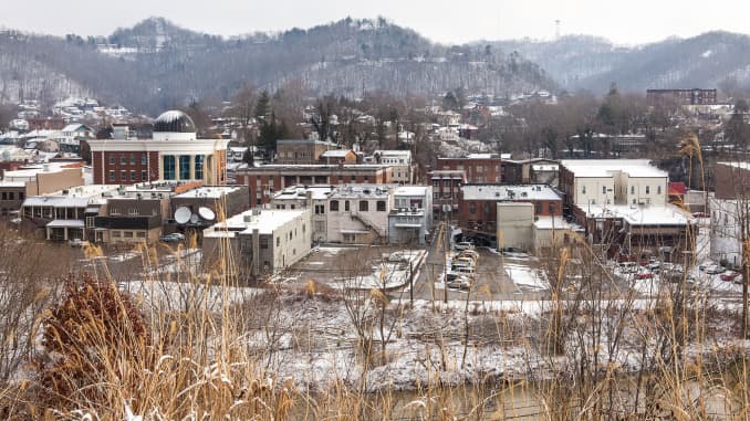
When Peabody Coal “hauled” the small town of Paradise, Kentucky away, I hadn’t been born yet.
But my life and the lives of all Kentuckians are often landmarked by loss–in many cases, before we’re born. The folks that come into being in coal country come into this world with a very specific deficit, are unwitting inheritors of a homeland that has been hollowed out by the very industry that has sustained our livelihoods for as long as our grandparents can remember.
It’s a paradox, and an old one. At the start of this project, I was trying to answer for myself—what makes this story urgent? Why tell the story of Paradise, a town now decades lost to history? Why now?
Earlier this month, I drove a colleague from his one bedroom apartment in Iowa City to his Grandma’s house in Huntington, West Virginia. Huntington’s a coal town that sits on the banks of the Ohio river, bordered by Ohio to the west, and Kentucky to the south. We passed the plant, mountain after man made mountain of black rock, and my colleague whistled and said, “Goddamn, you’d think they’d run out of the stuff.” I laughed, “Well, yeah, I think you just summed up nonrenewable resources in a nutshell. They are. They did.”
It’s funny, but I’ve rarely seen “the stuff” first hand. My mom tells a story of growing up against the train tracks in western Kentucky, picking up hunks of coal in her backyard as a girl, stray rocks that had bounced from train cars, and believing this was how it must be made—that coal literally fell from the sky.
Once me and my colleague parted, I made my crooked, diagonal way back to western Kentucky, and to home. My route took me through the Appalachians. It had rained heavily in Huntington the day before I left—a flash flood—and the sky hung low with the aftermath of storm, fog rising from the far-off peaks like smoke.
Ashland Kentucky sits two miles south of the border. It’s the first town you hit when you cross the state line. If you’re coming, as I was, from I 64-W, you’d know it because just before you pass the Ashland exit on the right, you pass Hell on the left.
The Catlettsburg Oil Refinery occupies seven hundred acres of hill and valley, strategically positioned at the banks of the Ohio and Big Sandy River in order to access the Huntington Tri-State Port, which, as the primary means of export for the twin fossil fuel industries, Coal and Oil, makes it the largest inland port in the United States.
I’ve honestly thought of the refinery as the devil’s city since my mom gave it that name when I was a little girl. Looking out over those alien, glittering, smoke-stack flames from the backseat, I asked her—shocked—where we could possibly have ended up. Most of the objects that magnify or multiply in the viewpoint of childhood shrink as you age—but not this place. If anything, it was bigger than I remembered.
To be from Kentucky is to make your peace with paradox. Interviewing old timers about this landscape we share, the only home they’ve ever known, I often think about that Mark Twain quote—“I want to be in Kentucky when the end of the world comes, because it’s always 20 years behind.” From the vantage of the nation, this is a backwards place—stuck outside of time.
A retired coal miner I spoke to, who worked on the strip mine that took Paradise’s place, told me he had retired after thirty years of brutal labor (the effects of which he continues to suffer), but that if you accounted for, as he did, the weekends, overtime, the break-neck pace he and his team set in order to attempt to keep up with the insatiable demand, the ever-rising quotas enforced by his supervisor, by Peabody, and by the nation, he probably worked something much more like forty years. Rural and poor, the fruits of an industrializing culture rarely trickled down to these parts. But for America’s metropolises, gleaming along the East and West coasts, the urban centers ushering in the Dawn of a New Age, ushering in the future, were able to do so because in Kentucky we were stripping our past for the fuel and the heat, for the means to keep the lights burning in places we would never see.
I know a poet from Ashland—or used to—a boy I met when I was nineteen at a writer’s retreat in Hindman, Kentucky. After three intensive weeks workshopping each other’s heartbreaks and traumas, swapping dishwashing shifts and pulls of bourbon on the front porch of a sleeping cabin, we said our goodbyes. I hadn’t seen him since. Last thing I knew he was living in Lexington, a city I had to drive through to get home. At the exit for Ashland, I got, as my Papaw would say, a wild hair, and I reached out.
“Hey… I’m a hundred miles away. Busy?”
He wasn’t.
We walked along a small portion of the city’s newest green initiative, a 12-mile bike path called the Legacy Trail—parts of which are scenic (groves of yellow wildflowers and muddy streams preserved by the University of Kentucky’s agricultural department), but much of which is industrial (grey and beige concrete, vacant slabs, buildings advertising office space). To account for the disparity, the poet pointed out small anachronisms, a drag of sidewalk that ended, abruptly at the base of a dogwood tree, a gaggle of geese that backed up traffic at a nearby intersection. We talked and we walked and we asked and tried to answer,
“So, what’s new?”
In the seven years since I’d seen the poet, I’d graduated college, he’d finished his Master’s, we’d found and lost jobs, found and lost love, but from these separate spheres, at times thousands of miles apart, we’d both witnessed what felt like a steep and steady decline in hope. We no longer shared only the markings of the same home. We had become marked as a generation, as a nation, by the authoritarian, xenophobic, racist, climate-change-denying administration that had risen to power in the years since we last laid eyes on one another, last wrote poems in the woods. And we found ourselves, again, swapping stories of trauma. Some intimate, the deteriorating health of our family members paired with the exorbitant cost of their treatment. Some distant, asylum seekers imprisoned in internment camps at the country’s south-western border. And we talked, as I rarely do now, about Kentucky from the inside looking out.
Born and raised in Ashland, the poet had never not known the realities of the coal industry firsthand. He never experienced the distance most of us take for granted in our desperation to get food on the table and keep the lights on, the distance between what it takes, and literally what is taken, to keep the lights on.
Living in Iowa City, especially during an election year, I am often asked to speak for my state. Why do we, a place and a people ravaged by environmental devastation, by an opioid epidemic, by poverty and pre-existing conditions, vote against our own interests?
Undeniably, it’s a paradox. But it’s not without logic if you consider the most fundamental premise by which many Kentuckians live—you make a living by sacrificing your home. No distance between the devil’s city and Paradise.
If I am able to make an archive for a buried place, it’s possible that distance between the consumers and those consumed will become a little more visible for the rest of us too.
At the beginning of my Digital Studio Summer Fellowship, I felt a bit lost. My dissertation—an animal history of Chicago centered on the ways human-animal relationships drove urbanization at the turn of the century—seemed clear enough. Then COVID-19 threw a major pathogenic wrench into my research plans, as I was to have spent the spring and summer conducting archival research in Chicago. When I applied to the program, I pitched an elaborate map of animal-centric businesses in the city supplied by this archival research. But I was trapped at home away from these libraries and archives. Desperate times called for pandemic-anxiety fueled reading.
I came across the 1872 Equine Influenza Epizootic and knew I had found something important. Horses, quite literally, ran Chicago in the late nineteenth century. But when nearly all of them fell sick in the fall of 1872, Chicago’s cabs, omnibuses, streetcars, and construction equipment halted. Men, women, and children walked. Companies purchased oxen to deliver goods and luggage between railroad depots. Even dogs were put to work. Newspaper coverage of the outbreak provided lists of livery stables and streetcar barns, virus case numbers in each of these spaces, as well as narratives of particularly sick horses and proprietors in denial. But this story was fragmented. Printed on different pages of the newspaper across nearly a month in the fall of 1872, this data was also rife with errors and inconsistent reporting. By scouring the newspapers and cross-referencing addresses with city directories and fire insurance maps, I collected the key names, addresses, and case counts of the epizootic. Though much clearer, this data was still just words and numbers on a page.
With the Studio’s help—especially GIS Specialist and exemplary human Jay Bowen—I was able to turn words-on-a-page into a digital map that was both interactive and informative. In retracing streetcar lines and animating icons, we underscore the movement of animal labor in the city. This illustrated one of the most important facts about the epizootic: it spread quickly because horses move. By plotting Chicago’s transportation barns and stables with a feature that lets the viewer see symptoms and cases over time by barn, we reveal how the disease spread throughout the geography of the city and emphasize the pervasiveness of animal bodies. Ironically, the 1872 Equine Influenza Epizootic shut down Chicago, but it is precisely through this shutdown that we can understand how the interconnected networks of horse-powered transportation functioned. Visually representing this data through a digital map has helped me explain the breakdown of this network as well as reveal its scope.
During a recent meeting with Jay, I realized that we have made a map that did not exist before. To do so may have required four different historical maps, three historical directories, hundreds of newspaper pages, a new-old address converter from 1909, several old histories of Chicago, dozens of emails to various archives, plus Microsoft Excel, QGIS, GitHub, Atom, ProCreate, and now Illustrator. But we made a map of knowledge that did not exist in a singular form prior to this moment—and that feels pretty spectacular.
In a wholly unexpected turn of events, my Digital Studio summer not only helped me develop an incredible project—it helped me figure out what I want to do after graduation. But for that, you’ll have to watch the video below.
Writing in 1931, the great doctor and humanitarian Albert Schweitzer said that pain ‘is a more terrible lord of mankind than even death himself.’ Since then, medical technology to treat pain has developed from anesthetics to analgesics, the latter known colloquially as “painkillers”, suggesting that pain is something to be killed rather than (as previous generations saw it) to be endured. Pain has become an important topic within the historiography of experience and the emotions, as shown by the proliferation of historical analyses of medical and physiological constructions related to suffering or the remedies that prevent and treat it. Pain, therefore, does not just have a body – it also has a history.
But what is pain?
This is a question I’ve continually returned to over the past eight weeks. When engaging with my primary and secondary sources, I’ve come to understand that pain is something that is always experienced subjectively and contextually, so it eludes a timeless definition. It’s important to highlight and understand the central role that culture plays in providing ways to experience, express, and understand pain, as it is through society’s norms and values that pain is culturally obtained and placed. Thus, pain is not just a physical experience: it is an embodied experience to which meaning is attached through culturally validated and rhetorical artifacts, including societal classifications and norms, codified identities, racial and gendered hierarchies, and even moral taboos. With no single and universally accepted meaning of pain, people in pain appeal to different value systems to frame their suffering with meaning – attempting to make sense of what they feel and to explain these feelings within a coherent worldview.
In reflecting upon my summer in the Studio, I would say that the most meaningful lesson when working on this project has been to understand that pain involves both those who bear it and those who bear witness to it, including not only the social scientists who are central to the examination and analysis of suffering but also the historian and writer, who in this instance, is central to the contemporary discussion of pain and therefore plays an essential role in bringing it to the fore of social consciousness. In moving forward, in terms of conducting research, writing the pieces for the book, but especially when creating the interactive website, this is the point I want to give the most importance to. That the mere observation of a phenomenon inevitably changes that phenomenon, and so we need to be aware and skeptical of our place in the narrative and the beliefs we bring into the discussion. How to open a space of freedom and generosity when engaging with the historical characters of my sources is something very important to me, and learning how to do the same when creating an interactive website is something I’ve had the opportunity to reflect on during my summer digital fellowship, and it’s something I am very grateful for.
In the following video, I share a fragment of a piece I’ve written during my summer fellowship: https://www.dropbox.com/s/339fsu8fdzw0td7/Ana%20Mendieta.mov?dl=0
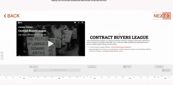
There is a question I’ve continually returned to over the past eight weeks. What is the relationship between the past and the present? When someone thinks of reparations, the first question that might come to mind could be, what is Black America owed? However, throughout my summer fellowship, I found how one answers the former question directly impacts how one answers the latter. This seemingly innocuous question drives the digital research project I pitched to the Digital Scholarship & Publishing Studio at the beginning of 2020. Little did I know, while I posed the query in the context of Black reparations, the question would take on newfound significance in the wake of a pandemic that disproportionately harms Black, Brown, and Indigenous communities, alongside a renewed sense of urgency concerning police brutality and anti-Black violence in the United States, but also globally, in the wake of the murder of George Floyd, Breonna Taylor, and Tony McDade. How we perceive the past and the present, as either distant foes or closely connected twins, dramatically influences how we understand the reason a virus can discriminate, or what might appear to be a “new” problem is actually something most Black communities see as the fabric of their lived experience—par excellence for the United States. Indeed, our sense of time, and its relationship to racial (in)justice, is a valuable space to (re)think how our present racial disparities blossom out of the fertile soil of the past.
Contemplating reparations through the lens of time drew me to Ta-Nehisi Coates’ essay “The Case for Reparations.” He plays with time and draws upon it as a resource to open up the debate over reparations. His article sparked a national conversation over Black restitution not seen in over a decade when it was published in 2014 that continues to this day. At the start of the summer, I set out to create a non-chronological/non-linear timeline that mirrors the timeline jumping in Coates’ prose. As he narrates a case for reparations, he moves about the timeline of reparations, jumping from 1923, to 1968, back to 1783, and up to 2001. The movement of going forward and backward invites an alternative approach to the relationship between the past and the present. My project, tentatively titled Disrupting the Reparations Timeline, functions as a temporal guide through Coates’ article, hopefully equipping a user with a different perspective on the connection between the problems of our past, and the problems of our present, while also learning more about the history of anti-Black violence in the United States.
With only a week left of my summer fellowship, I am now putting the finishing touches on a website complete with an introduction page for the timeline and an extensive resources page if someone wants to learn even more about the histories covered in the timeline. At the beginning of my journey, I was anxious about all of the possibilities. I vacillated between nervousness that creating the non-chronological timeline I envisioned would be too complicated to not doing “enough” over eight weeks of summer. In the end, I have completed a 1.0 version of my digital project I am excited to refine and test as I look ahead towards what the life of my digital project might entail.
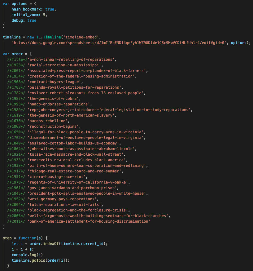
Here is a peek into the code Nikki and I used to instruct the Timeline.js platform to sequence the events in the timeline in a non-chronological format.
The biggest obstacle I overcame involved configuring a way to use the Timeline.js platform to sequence a non-chronological timeline. If you remember from my earlier post, I was in the reasonably daunting position of combing through hours of JavaScript tutorials and trying to figure out a way around this problem. With the help of my tremendous Studio contact, Nikki White, we devised a way to instruct the timeline to move along an order I manually entered into the code. At first, we both assumed it was going to be a pretty arduous and messy process. However, we managed to find a relatively easy and slick fix.
Click the GIF above to get a sneak peek into how Disrupting the Reparations Timeline works.
Timeline.js has a particular functionality that allows you to create a unique “id” or URL for each event on the timeline. We created a simple function that asks the timeline to recognize its place in the timeline, and when a user clicks the “NEXT” or “BACK” buttons, the timeline either moves one step forward or backward. Then, we stored the desired order of events (as they appear in Coates’ essay in a non-chronological fashion) in what is called an “array” that essentially houses the entire sequence. When someone clicks the navigation button, they are essentially moving forward or backward in that array. It took a great deal of time, research, and creativity to come up with this solution. In the end, Nikki helped me create a non-linear timeline that catapults a user forward and backward with the click of a button.
In reflecting upon my summer in the Studio, the experience taught me a great deal about adopting a digital humanities framework that thinks about the back-end as much as the front-end. I came into the fellowship overly concerned with the front-end—what the website might look like, how the timeline would function, and what a user would gain from playing on the site. However, I quickly learned, starting from the back-end is a far more fruitful way to make sure the front-end of the project holds up. In other words, it was through the process of having to create a JavaScript function for the timeline, to coding in HTML each element of the website, I gained a newfound appreciation for a holistic approach to digital humanities project development. I’m incredibly thankful to Nikki for demoing almost every aspect of the back-end of my project, walking me through each step, and answering all of my questions, so I could leave this summer with a thorough understanding of why my project works. I started the fellowship thinking that Nikki and I would form a partnership where I played in my sandbox, and she played in hers. I quickly learned that a collaboration, where we both played in the same sandbox, taught us both a lot more.
I feel incredibly fortunate and privileged I had the opportunity to work with the Studio and create Disrupting the Reparations Timeline. Learning how to create functions and basic website styling through code was an experience I was certainly not prepared for, but one I am happy I got. I was challenged and pushed out of my comfort zone. Through my research, I gained an even more nuanced understanding of the political history of reparations in the United States and gained a new perspective on how digital spaces can aid or hinder subversive/disruptive representations of anti-Black violence. The process of having to code around a problem—the prevalence of a linear/chronological sensibility towards time—taught me just as much about the racial/colonial ideologies that undergird public literacies around time, as it did about the potential digital tools can play in leveraging alternative spaces for understanding, outside the realm of Western/Eurocentric notions of time. The Summer Fellowship through the Studio provided a profound space to make mistakes, troubleshoot, and try out new things. Having eight weeks to play in a digital humanities sandbox fostered a low-risk environment with a high payout. Regardless if I ended up with a “finished” product or not, I gained valuable insight into my research program and my potential future endeavors in the public digital humanities.
Cheers, until next time!
– Andrew Boge
If you would like to get in touch about this project, please email me: andrew-boge@uiowa.edu
For my summer digital fellowship, I proposed to work on my research – “gender differences in imprisonment with an analysis of state-level and overtime data.” In this blog posting, I would like to share my experiences and lessons throughout my summer digital fellowship.
(1) Consistent work with emotional support:
This summer digital fellowship enabled me to work on my research consistently.
Nikki White – my mentor – checked on me regularly and spent a lot of time to find adequate resources for me. With all support, I was able to work on my research more effectively throughout this summer. Also, given that I worked from home in the pandemic, it was helpful to see other students and talk to them every week!
(2) Thinking outside the box:
Throughout the fellowship, I was excited to learn about other fellow graduate students’ works. Their works were fascinating not only because of their brilliant topics but also visualization of their research ideas and findings. Also, we had guest speakers from various disciplines every week, in which I got to learn about digital project management, issues and tips for collaboration, and digital work repositories.
(3) Continuing my work after the fellowship:
With all the support, I was able to collect data, analyze them, and figure out what and how to visualize them. For the next steps, I plan to continue to work on my research and disseminate the findings through a journal publication and a conference presentation. To be more specific, my co-workers and I plan to complete a manuscript in the Fall of 2020. In the following year, I will present this work at regional and national criminology conferences.
Humanities scholars traditionally explain their arguments through text written form,and they use visual effects as evidence to support the written argument. Nathan Yau argues that data visualization in digital humanities transforms the presentation of scholarly arguments by giving scholars the room to make visual arguments [1].
Elizabeth L. Eisensteinquoted in Stephan Tanaka’s article explains that “all view of historyhas been fundamentally shaped by the way records are duplicated, knowledge transmitted, and information stored and retrieved” [2].
The above arguments have attracted my attention throughout the fellowship experience. During my map-making process, I reflect a lot on how my map makes an argument. I think about the ways my sources and the way I analyze and present them affect the presentation and outlook of the migration history in Southern Africa the digital. On data visualization in humanities, the major questions are that what purpose does it serve? Many would think that data visualization adds aesthetics to a document and provides illustrative examples. However, thinking about digital visualization as a platform to make a visual scholarly argument strengthens the argument on the usefulness of the DH in transforming humanist studies [3].
My practical experience with map-making affirms that it is very possible to make a visual and interactive argument. Presenting data in a different form comes with another benefit, it permits me to think or see the information in new ways that improve how I articulate and study migration. When if completed the initial stages of my map which was attaching migration data to specific geographical flows I started realizing some important factors I would have not thought about had the data not been visually presented. Seeing the migration flows against ethnic boundaries that ran against political boundaries led me to think about migration routes that connected ethnic boundaries, separate from mainstream migration routes. Thinking about migration routes led me into thinking about the ways Africans created routes from their original precolonial routing systems which were separate from the well-known routes created by the colonial government in satisfying their needs. Paying attention to routes will better y understanding of migration networks and patterns in the Southern African region.
My major takeaway goes back to Elizabeth Eisenstein’s own reflection that, the way information is presented affects the way we analyze the information [4]. Having the data presented in two different ways offers two different variables of analyzing the data which leaves the scholar more rounded than before. This mapping project has led me to ask more questions about an area of study that many would consider over-exploited. It, therefore, gives more room for me to have a clear focus and contribute to new original arguments that continues to shape the history of migration in Southern Africa. The direction I am taking is going to be very important in making a case for my prospectus.
The most exciting path of the fellowship experience was the weekly classes we had, I met new people and made friends. I learned about project management and ways to put myself out there after creatingDigital projects. I have also been able to seriously think about royalties and respect for born-digital projects.
References
[1] Yau Nathan, Visualize This: The Flowing Data Guide to Design, Visualization, and Statistics, John Wiley and Sons Incorporated publishers, Indianapolis, 2011.
[2] Tanaka Stefan, “Pasts in a Digital Age”, in Writing History in a Digital Age, edited by Jack Dougherty and Kristen Nawrotzki, Open review, 2012,p.1.
[3] Yau Nathan, Visualize This: The Flowing Data Guide to Design, Visualization, and Statistics, John Wiley and Sons Incorporated publishers, Indianapolis, 2011.
[4]Tanaka Stefan, “Pasts in a Digital Age”, in Writing History in a Digital Age, edited by Jack Dougherty and Kristen Nawrotzki, Open review, 2012, p.1.


_116902_sc.jpg)