Intro
This summer I began work on a publishing project called Rampage Party Press, which I’ll spend the next year developing as my thesis project to complete an MFA in Book Arts. Before this program, I received an MFA from the Iowa Writers’ Workshop, where I studied poetry. In so many ways, Rampage Party Press is the culmination of my last five years of study and work, and I’m very grateful for the time, funding, and support that the Digital Scholarship and Publishing Fellowship offered me this summer. I have long-term goals of starting my own publishing house, but for now, Rampage Party Press will be an online poetry magazine with accompanying handprinted broadsides (basically just a fancy word for poster).
Part One
Before I get down to business, I’m going to dedicate part one of this blog post to some of my more general/abstract thoughts on poetry. If you’d rather read about what I did this summer, you can skip to part two! Here I go!
*Ira Glass voice*
The word poetry comes from the Greek word “poiesis” – which means “to make”. Poetry began as an oral form – it was spoken or sung. We have no actual way of knowing how long humans have been making (speaking/singing/chanting) poetry, because there is no physical evidence for sound, duh. But perhaps, as poet Tracie Morris argues, poetry was the beginning of human utterance, perhaps poetry came first. I think this must be true, at least in the ways that language is inherently metaphor, inherently a suggestion of the actual thing, so to utter a word is to make a symbol.
We obviously still sometimes experience poetry as an oral art form – at poetry readings, in video performances, maybe when reading a poem out loud to ourselves, etc.! Poetry has always been an expansive art form, and now more than ever we have poets making amazing video work, digital poetry, performance poetry, and other multi-modal presentations of their poems. I can’t get into all that here, maybe a blog post/thesis/PhD project for someone else.
For this post, I’ll be focusing on the visual life of poetry, because today poetry is an art form typically represented in written language on a page (paper or screen). And when represented on a page, a poem shifts to a literary and visual art form, no longer necessarily an oral performance, but essentially the script for one.
“Form is never more than an extension of content.” –Charles Olson
It’s important to consider how got to this place of poetry on a page. It was through human advancements in technology, through humans making things! We learned how to make pigments out of minerals and rocks, we developed written language, we made papyrus scrolls then parchment then paper, ever advancing printing technologies, desktop word processors, the internet, and way more that I’m neglecting here. Poetry has changed alongside, through, and because of human technologies, and will continue to do so. I find this exciting and important!
A poem’s visual presence – through line breaks, stanza breaks, white space, type orientation, or lack thereof, etc. – has massive impact on the reader’s interpretation of the poem. And even if a particular poem isn’t so concerned with the visual, the vehicle that the poem is in matters too: the dimensions of the page, the typeface, physical vs. digital, the color of the paper/ink, all of these things impact the experience of the poem.
Putting a poem on a broadside that is meant to be in the world flat, hung on a wall or passed around, instead of bound up and closed up in a 5×8 inch paperback book – draws attention to the poem’s visual and material life and expands our understanding of what a poem is and can do.
PART TWO
*End Ira Glass voice*
On the Rampage Party Press website, I will feature a new poet every two months or so, 4-6 poems each, one of which I will print as a limited-edition letterpress broadside. At this point, you might be wondering what handprinted broadsides have to do with digital publishing! I’ll get to that in a moment. First, a quick note about the online magazine.
Online magazine
Like I said in the intro, I might print physical copies of the magazine, but I’ve known since the beginning that I want a web presence. A website can reach much broader readership than small editions of broadsides or small editions of physical magazines. Building the website has been the most intimidating part of this summer for me. I knew that the website needed to be carefully designed to handle the formal demands of poetry. Too often, I read poems in an online magazine, and if I’m on my phone or my web browser is small, whatever, the lines of the poem get cut in the wrong spots, stanza breaks become less clear – the whole visual of the poem gets distorted. This doesn’t matter if you’re reading a news article or something, but as I’ve already completely convinced you guys, poetry is a visual art form – so this is like the equivalent of a movie being 10% blurry or an abstract painting being displayed sideways. I’m still in the very beginning stages of laying out the website, so I’m not ready to show images here, but I am excited to keep working on it.
Letterpress broadsides
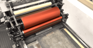
Back to the broadsides and how they are some sort of digital publishing! I handprint on a Vandercook SP15, here’s my favorite one at North Hall:


You can read more about Vandercook printing presses here.
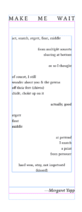
I typically start by designing a broadside in InDesign, in which I digitally typeset the poem. For this post, I’ll use my latest completed print as an example. This is the digital mockup of my poem, “Make Me Wait”.

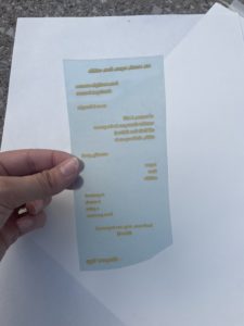
The digital file is then turned into a film negative, which is placed on a photopolymer plate, and through a process of heat and light exposure, we get a photopolymer printing plate, the type is raised and everything else has melted away. Sometimes I make my own photopolymer plates, we have an exposure unit at North Hall, but this summer I had them made by the great folks at Boxcar Press. Here is one of the photopolymer plates I used for “Make Me Wait”:

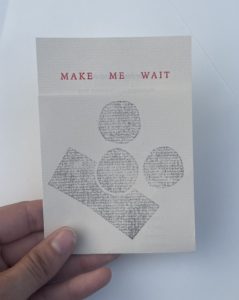
Now we have a flexible plastic plate that I can use on the Vandercook! The yellow part is the text, backwards here, and is raised higher than the blue plastic, so that the type shows up when inked and impressed on paper. Here’s the finished product:


I do handset metal type sometimes, but designing digitally and using photopolymer plates saves me a lot of time (and grief), and makes it much easier to print future editions without having to reset the text letter by letter. Photopolymer also allows me to use typefaces that I might not have access to in metal, to be super particular about size, to incorporate handwriting, and long-term: to not have to store metal type if I end up having my own press one day.
For “Make Me Wait”, I wanted to use photopolymer instead of metal type because I wanted to use Iowan Old Style for the font, because that’s the font I used in my book Green for Luck (EastOver Press, 2024). So this broadside uses the same font at the same size in the same dimensions as my book! Iowan Old Style was created by John Downer, who lives here in Iowa City, and as far as I know it has never been cast in metal.
A lot of my work could simply be done with a digital printer, which is probably what I’ll have to switch to once I lose access to the North Hall studios, but there are a lot of reasons to handprint. I can’t run a lot of handmade papers through a digital printer. On a Vandercook, I can handprint on paper with any dimensions – I save all the scraps I can and print greeting cards, zines, etc. In some ways…it’s more cost effective…maybe? And if for no other reason: I love the impression in the paper, it’s very glamorous to me.
For “Make Me Wait”, I wanted to handprint rather than digital print for a few reasons. This is a poem about letterpress, so it made sense conceptually to actually letterpress it. I also wanted to use a reduction linoleum process for the image, also for conceptual reasons, to play with the notion of time and effort, of repeated but changed image.

Lastly, of course I love the process. I don’t think anyone does letterpress printing if they don’t love the process: the ability to play with the language of a particular poem as literal material, metal or plate, to work with the machine as a collaborator, to not know exactly how it’s going to turn out, to learn as I go.
Other design thoughts that went into “Make Me Wait”:
- I initially wanted to use newsprint, as this is what poetry broadsides would historically be printed on. But this broadside was printed for the Fine Press Association Keepsake Print Exchange, which has requirements on paper thickness, and newsprint was too thin. So I ended up going with a thin-ish paper I had laying around that is a similar color to newsprint. I thrifted this paper from Crowded Closet in Iowa City.
- I also initially wanted to print in red and black for the type, because these are the two colors that printers have historically printed in, all the way back to Egyptian papyri! I did use red for the title, but straight black ended up being too dense, and showed through to the other side, so I ended up using gray for the poem.
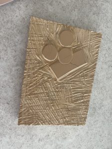
- The repeated image was made using a reduction linoleum process, and is a discombobulated traffic light (make me wait!). After printing the gray image on the front of the print, I carved away most of the block, leaving just one circle, that I re-printed in yellow on the inside of the print.
- The fold is another play with time, pause, the form being an extension of the content. Those few seconds of a reader unfolding the print to be able to read the poem is just about that: making them wait.
CONCLUSION
So as I’ve established, and completely convinced you, poems obviously don’t exist only orally, but they also don’t have to be 12 point times new roman on a computer screen and then printed in black ink on white paper bound in a 5×8 inch book – they can and should be so much more than that!
This is my Rampage Party plan for now. I’m open to and prepared for it to change as I keep chugging, as it has changed over the last eight weeks during this fellowship!
Thanks so much for reading, and I hope you’ll check back in with Rampage Party Press soon…website incoming.
