By Christine Blaumueller, PhD
originally published in the Scientific and Research Communication Core newsletter
Graphical abstracts are used by some publishers such as Lancet and Elsevier, and some journals now request them. Graphical abstracts can help attract audiences to a paper and may be promoted on publisher’s social media or websites.
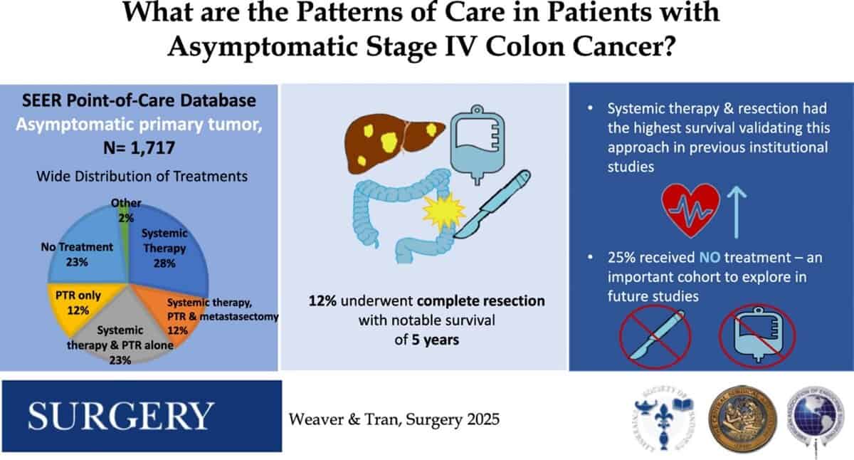
Sample graphical abstract
Weaver, L., Tran, C. G., Kahl, A. R., Troester, A., Mishra, A., Prakash, A., Brauer, D., Charlton, M. E., Hassan, I., & Goffredo, P. (2025). Patterns of care in patients with asymptomatic stage IV colon cancer: A population-based analysis. Surgery, 184, 109408. Advance online publication. https://doi.org/10.1016/j.surg.2025.109408
A graphical abstract is a single visual representation that summarizes the most important parts of a study, and it is intended to pique the reader’s interest. As an overview figure for a manuscript, it should be distinct from the other figures and, like a written abstract, it should quickly convey the take-home message. Graphical abstracts are typically designed to accompany journal articles, in which case they provide an opportunity to improve on the abstract by utilizing images. However, graphical abstracts can also serve other purposes. For example, they can be generated to use on a conference poster, enhance a lab website, or share a scientific message on social media.
Below, we briefly summarize some of the key points to consider when generating a graphical abstract. Most of these ideas are illustrated in this video1 from BioRender, and they are also discussed in greater detail in several resources2–5. Note that BioRender provides a library of templates for graphical abstracts; these can be a great starting point. Programs other than BioRender that can be used to generate graphical abstracts include Canva, Microsoft PowerPoint, and Adobe Illustrator2.
Layout and story flow: focus on the key message
- Keep graphical abstracts simple and concise.
- Avoid including distracting information. Clutter (visual or textual) can overwhelm a reader.
- Keep the focus on the main points you wish to convey.
- Present the information in a logical order.
- Be sure to start at the beginning of your “story” and make the flow intuitive. For example,
- if the story is about a linear process, follow the order we naturally use to read information on a page, i.e., from left to right and from top to bottom;
- if multiple outcomes are possible, use branching; and
- if a circular process is described (e.g., a life cycle), make the path circular and clockwise.
- Get input on the flow of your graphical abstract early on.
- Give a colleague a draft and have them mark up the copy to show how they absorb the information.
- Ask them to show you both where in the image they start and what path their eyes follow; this will help you identify any distractions and other points of confusion as you refine your graphical abstract.
- Be sure to start at the beginning of your “story” and make the flow intuitive. For example,
Color: keep in mind the associations a reader might make
- Use color judiciously and consistently to highlight the important features (e.g., “main characters”) of a story and to create associations that allow for a cohesive and logical flow of information. For example,
- readers tend to associate warm colors like red with “villains,” so use these to represent dangerous agents (e.g., cancer cells or inflammation);
- readers tend to associate cool colors like blue with “heroes” so use these to highlight positive agents (e.g., healthy cells or anti-inflammatory agents); and
- readers will expect green to indicate GFP—be sure not to disappoint them.
- Limit your color palette.
- Too many colors will distract readers and defeat the purpose of the graphical abstract.
- Use colors that are color-blind safe.
- Common graphics resources like those available in BioRender and the Adobe suite enable you to test this.
Highlights: make it easy to spot relevant differences
- Format contextual, repeating elements consistently.
- Make them the same color, height, and shape, and place them in the same relative position wherever they appear.
- Align repeating elements horizontally or vertically using guidelines or an alignment tool.
- Highlight the elements that change as appropriate for your design.
- Make sure that contrast is good, using:
- transparency to dim “background elements,” i.e., the contextual information that needs to be included but isn’t the focus (usually 50% transparency works well); and
- bright colors for the elements that change, to distinguish them from any dimmed background.
- If the point is that the shape and/or size of an element changes, depict these differences by using distinct shapes and sizes.
- If the point is that an element shifts to a new place, depict it in its new position.
- Make sure that contrast is good, using:
Other considerations
- Tailor your graphical abstract to your target audience and to where it will be posted.
- Know your audience.
- Consider what this audience will need to know.
- Be sure to comply with your publisher’s requirements.
- These may vary depending on where the graphical abstract will be posted.
- See example of guidelines from Elsevier3.
- Get feedback not only early in the process of designing your graphic abstract, but at multiple stages.
It may feel daunting to design a graphical abstract but don’t be afraid to get started. Once you do, you might have fun—and you might even come up with new ideas for your project in the process!
If you need help with graphical abstracts, you can contact your Hardin Library for the Health Sciences librarian or the SERCC team.
Resources:
- Top 4 design tips: Designing Graphical Abstracts, Shiz Aoki, video in the bioRender Learning Hub
- What is a Graphical Abstract and Why Do I Need One for My Paper? Kerry Stricker, from Springer Nature Research Solutions, May 26, 2023
- Graphical Abstract, from the Elsevier Author Tools & Resources Pages
- 5 Tips for Creating a Graphical Abstract, Catherine Zettel Nalan, from Springer Nature Research Solutions, December 12, 2023
- Points of View: The Overview Figure, Bang Wong, Nature Methods 8, 365 (2011).