In the 1920s and 30s, the public health nurse or “field nurse” was an important figure on many Native American reservations. These healthcare workers were hired to provide health education and preventative medicine to Native communities. Their work was also supposed to serve the federal government’s larger-scale policies toward Native people, and many of their everyday practices grew out of the longstanding policy of forcible assimilation and suppression of Native cultures. However, it’s also possible to see how Native patients and their families made health decisions by looking at the records field nurses left.
By the early 1930s, each nurse was sending a report to her supervisors every month. This consisted of a narrative description of her work and a two-page statistical report. My project this summer involves interpreting and visualizing the data from these forms. They include statistics that reflect the scope of health problems in Native communities at the time, such as the devastating prevalence of tuberculosis. They also track the visitors to the nurses’ offices and the sources from which nurses learned about new cases; these statistics can show Native patients’ and families’ agency in seeking out a particular kind of health care.
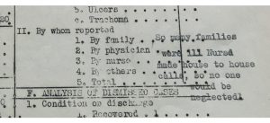
My first step has been to create a spreadsheet in Excel to contain the data from the statistical reports. I started with the nearly 800 reports from 1934, a pivotal year in Native American history, when the Indian Reorganization Act shifted federal policy toward tolerance of Native cultures. I’ve done quite a bit of data entry, and I’ve also had to consider questions of data cleaning. As it turns out, many nurses had idiosyncratic ways of filling out the statistical forms. Instead of a numerical entry, some nurses included textual answers (like “most” or “some”), added categories, included confusing marginal notes, or simply filled fields with check marks.
I found these record-keeping quirks a little frustrating, but I also realized that they reflect the frustration of the original writers. The statistical form offered an inadequate reflection of the wide scope of their work, as their notes and narratives explain. Under what field in the form’s “analysis of time” would you enter the hours spent stranded in a blizzard with patients, running a car’s engine for warmth and burning all its fuel before help arrived? How to quantify the nonstop nursing required during an epidemic or the way in which news of each new case arrived? Furthermore, the form doesn’t reflect the neighborly tasks that helped to build rapport between patients and caregivers. There’s no category for, say, treating a local family’s sick horse.
Image: Wilhelmine Hohnsbeen’s report from February 1932, during a flu epidemic at the Blackfeet Reservation. This section of the form asks for the number of new cases reported by patients’ families, a physician, and so on, but Hohnsbeen included a textual explanation of the emergency instead.
This initial challenge has offered me a new way to look at my dissertation topic and at the way nurses’ experiences diverged from official expectations. I have included an additional field in my spreadsheet to keep track of the way each nurse adapted her statistical forms, as well as entering the statistics themselves. I’ve also been familiarizing myself with Excel’s Pivot Tables feature. I’m using it to compare different statistical categories and using Pivot Charts to create visualizations for those relationships. Now that I’ve entered a significant amount of data, I’m looking forward to spending more time on these tools and seeing what new patterns emerge.
-Laurel Sanders

