As you might recall from my previous post, I have been working on a prototype tool to visualize spacewalk patterns that occur in short term Mars habitat simulations.
My work so far
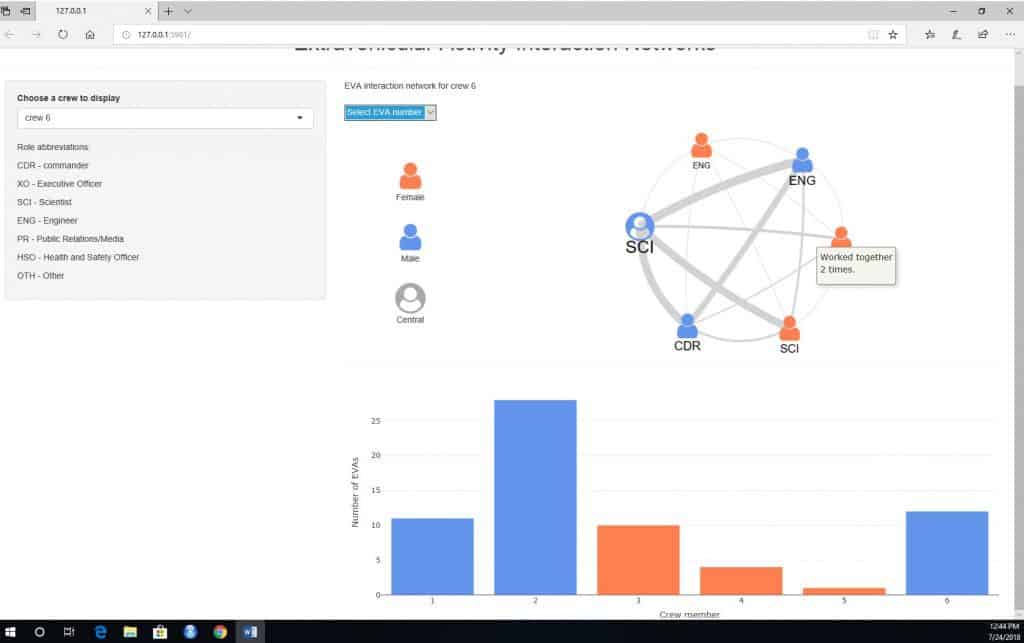
I used R packages shiny, visnetwork, and plotly to create an interactive web application for data exploration. Here is how it looks now:
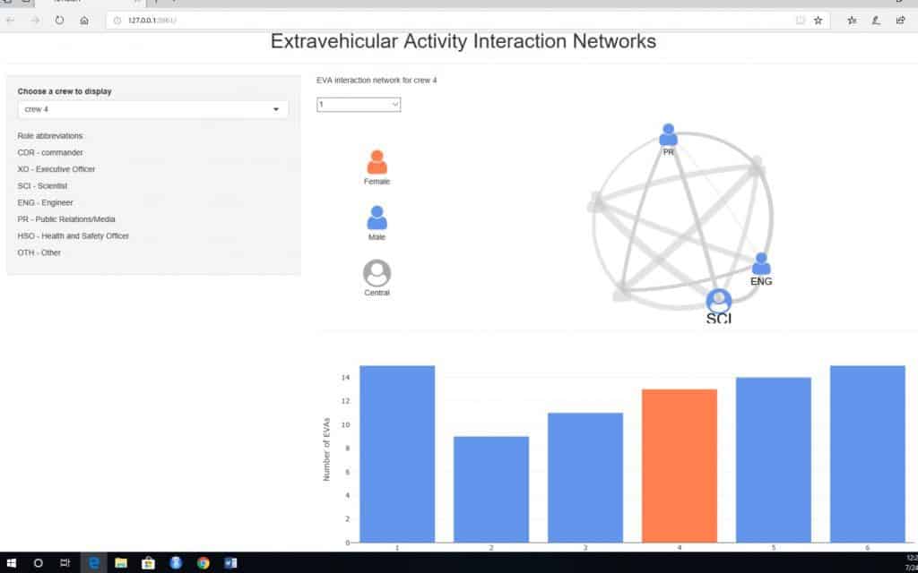
The main drop down menu selects a crew to display. A network graph shows who worked with whom on extravehicular activities (EVAs). Each node is a crew member, and the size of a tie represents how many times these people worked together on an EVA. A bar chart in the bottom right corner shows the total number of EVAs that a crew member participated in.
A user can also select a single EVA to see which crew members worked together.
This simple app functions well, but I want to tweak its appearance: put role abbreviations to the bottom left corner, make sure that the interface is displayed properly both on computers’ and phones’ screens, have a unified theme for different elements of the app. Also, I want to connect the network plot with the bar chart: when a user clicks on a node, a bar that corresponds to that node also gets selected.
I want to add more socio-demographic data, such as level of education, previous participation in such simulations, and experience in space industry. I want to enable user to visualize interaction networks by other demographics, not just by gender and role in a crew.
I also plan to add regression models that test whether women are less likely to be central figures than men, controlling for their role in a crew and other demographics.
Things I have learned
It has been a short journey in the Studio, but a fulfilling one. Summer funding allowed me to take a breath, work on my project, and think about my professional and academic future.
I have learned that I like building things and enjoy solving problems. I have used R Shiny for the very first time, and its familiar syntax was painless introduction to the world of interactive visuals.
I come from an interdisciplinary background (journalism-nationalism studies-sociology). As a journalist, I tell stories; and as a researcher, I want to do the same. A well done web application or a well done web page is a more efficient way to communicate one’s scholarship than an academic article. Yes, in academia it is still seen as a supplement rather than a substitute to a peer reviewed publication. And it’s a pity – it takes a lot of time, skills, and effort to create even the simplest visuals. On the other hand, it still is time well spent: by creating a visual story, one gets to know their data very intimately. And the world does not end with academia – it is helpful to leave the ivory tower and engage with the audiences outside of it. Who knows, maybe it will land me a job in this world of scarce tenure track positions.
Inga Popovaite, sociology PhD student


