Exhibits always present opportunities for innovation.
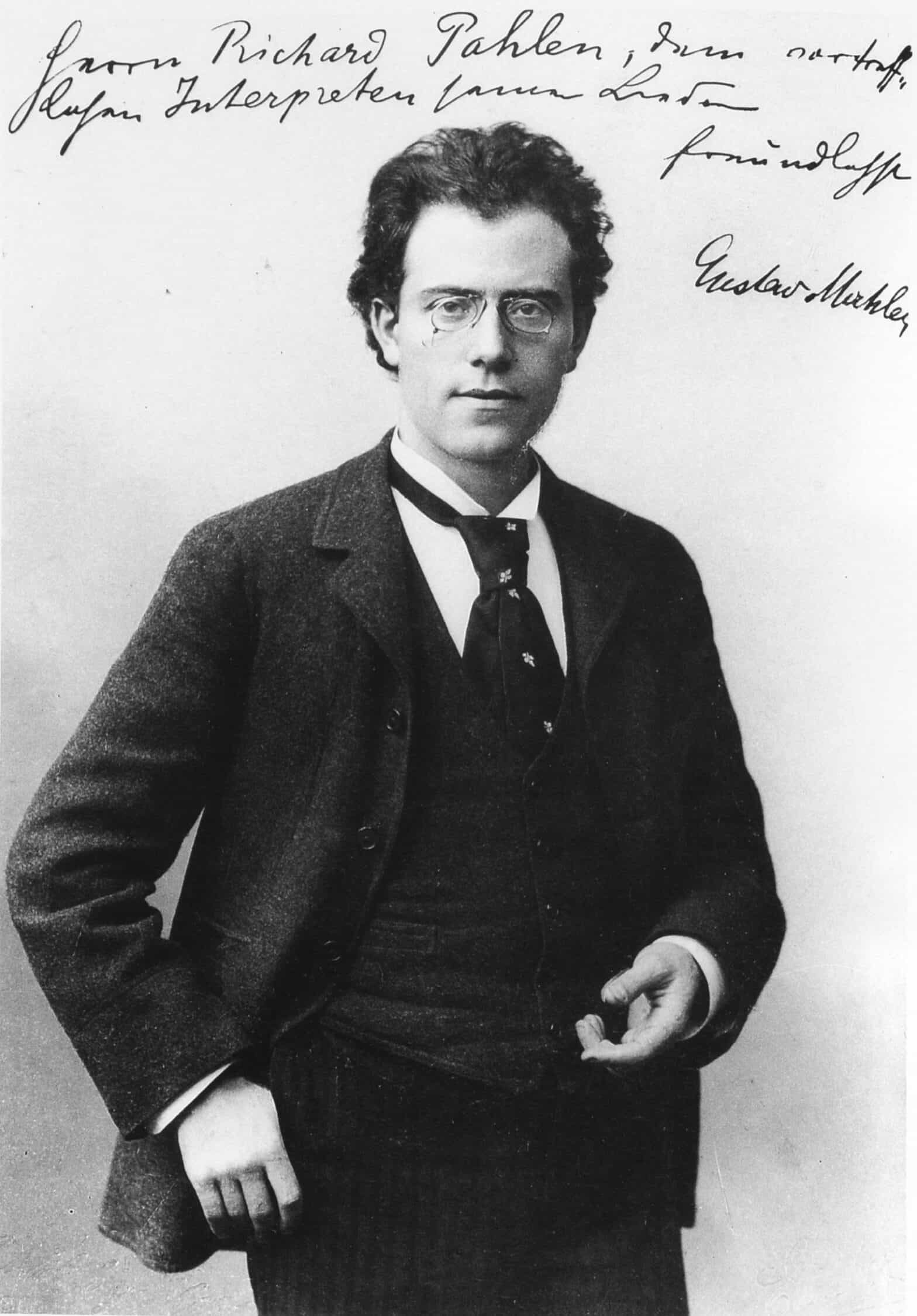
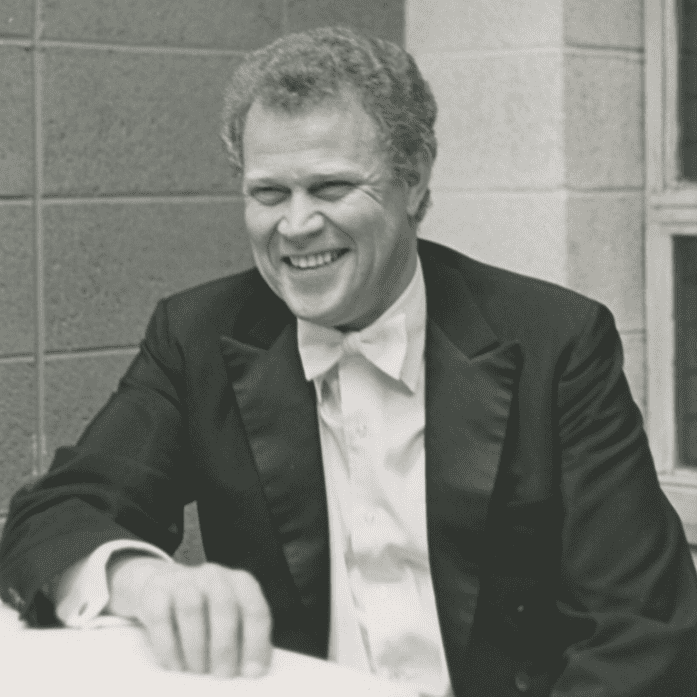
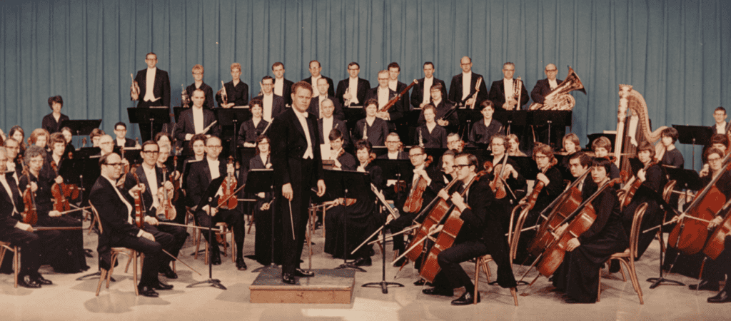
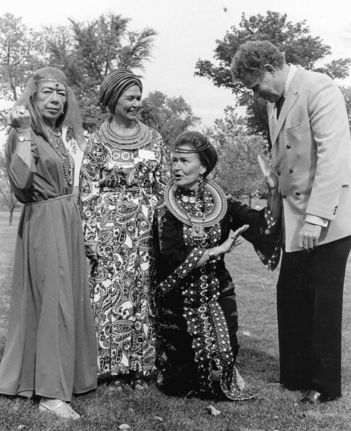
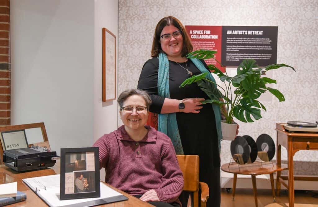
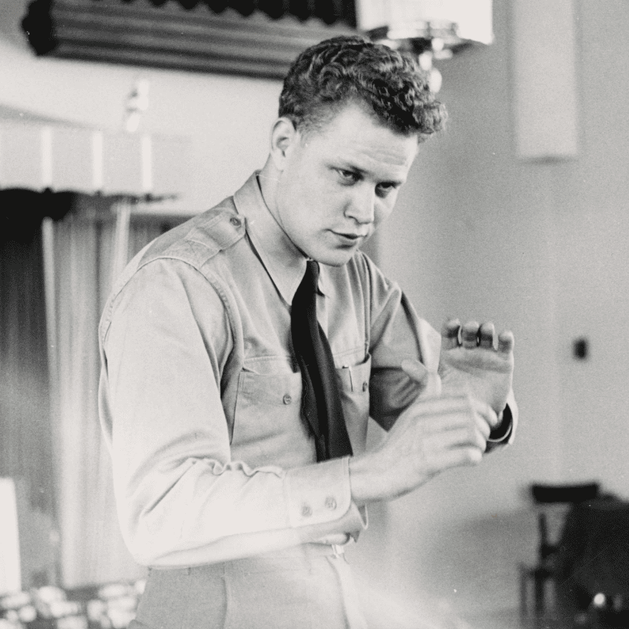
When co-curators Katie Buehner and Sarah Sudadolnik were envisioning the visitor experience for Orchestrating Community: The Public Service of Iowa Conductor James Dixon, an audio interactive was at the heart of it. They wanted guests of their spring 2026 University of Iowa Main Library Gallery exhibition to encounter an immersive space that could feel like James Dixon’s home office: a wallpaper pattern inspired by real designs from his home in Iowa City; a desk accessorized by music scores, photographs from his life, plants, an ashtray, and a coffee cup; a flannel shirt for orchestra rehearsals; and a record player with audio clips of his voice and performances he conducted.
José Jiménez, director of Libraries Information Technology (LIT), knew this record player would require special engineering and was invited to lead its design. After hearing Buehner and Suhadolnik’s idea for an interactive, he was reminded of a project he had seen online involving a mini jukebox that used an RFID (radio frequency identification) reader and tags. He decided to experiment with this idea for the exhibition.
The goal was to embed an RFID reader into a record player, attach pre-programmed RFID tags to real records, and encourage visitors to spin the records on the turntable. This would trigger audio to play through speakers that were connected to a computer hidden near the device.
“I’ve always been a tinkerer, and I’ve always liked solving problems,” says Jiménez, who has worked in information technology at Iowa for over 20 years. “In my day-to-day role, problem-solving usually involves a meeting or a conversation and connecting people to each other. Working on this project for the Main Library Gallery let me go back to my roots a bit, find as simple and efficient a solution to the problem as I could, and let me write a bit of code to boot.”
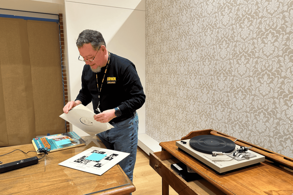
Jiménez originally considered 3D printing the interactive display, which would have been designed to mimic a real record player. After some additional research, he realized the most cost-effective option would be to purchase and retrofit broken technology instead. After incorporating the RFID reader into the existing structure of the record player, Jiménez encountered a challenge.
“The reader could not find the tags,” he says. “There was too much metal in the way. We had to disassemble the record player, cut away some of the metal, and recreate the platter using other materials so the signals would not be blocked.”
Bill Voss, exhibit preparator and a conservator technician in Conservation and Collections Care, helped solve this issue by recreating the entire platter out of plexiglass and matboard. “Without this, the project would not have worked,” says Jiménez.
Collaboration with other colleagues ensured the interactive worked sustainably and matched the exhibit’s design aesthetic.
Will Brown, LIT support consultant, made the project sustainable for the exhibit’s five-month run.
“He provided the platform and the hardware,” says Jiménez. “Will made sure I had all the information and infrastructure I needed to make this a truly hands-off, robust system to power the interactive. I just added the software on top of that to play the audio when the RFID tags were recognized.”
The RFID tags were attached to real records and hidden beneath custom labels crafted by Lauren Coghlan, creative coordinator and graphic designer for the exhibit. Labels for each record were different and all inspired by retro design trends.

“Being able to pick up a record from the rack, place it on the record player, and listen—as James Dixon might have—to the performance or radio interview in the audio allowed visitors to step back in time and be in the moment,” says Jiménez.
The audio interactive was one of the highlights of the exhibition, connecting visitors with archival audio and new oral history interviews related to James Dixon’s life and career. These sound clips, edited by Buehner, will remain available online.

___
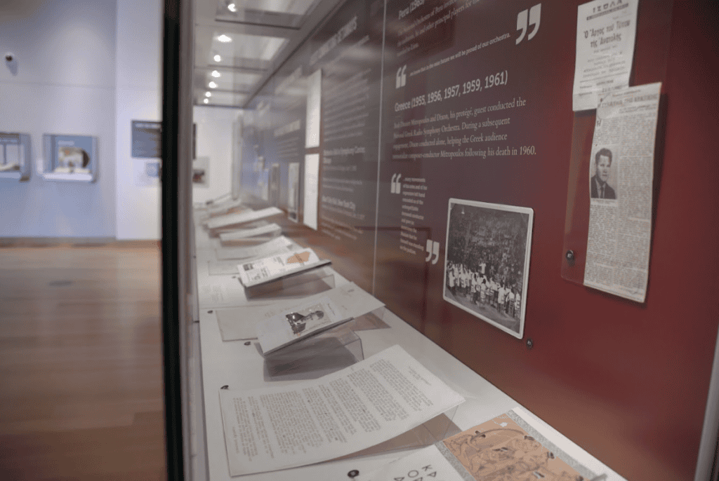
Orchestrating Community: The Public Service of Iowa Conductor James Dixon was on display in the Main Library Gallery at the University of Iowa Libraries from Jan. 2 –June 26, 2026. The exhibition was curated by Sarah Suhadolnik, assistant professor of instruction at the UI School of Music, and Katie Buehner, director of the Rita Benton Music Library.