In recent years, digital humanists have been at the forefront of challenging data’s supposed neutrality. Lisa Gitelman and Virginia Jackson have suggested that the discourse of objectivity that often surrounds conversations about data-drive research is not only reductive, but also unlikely to encourage future scholarship and more rigorous debate. They suggest instead that data be thought of as “situated and historically specific,” and that we recognize that “it comes from somewhere and is the result of ongoing changes to . . . conditions that are at once material, social, and ethical” (4). Indeed, just as words encode strings of meaning which can be ambiguous and open to interpretation, so too are numbers and databases invested with a rhetorical significance that must be tested and scrutinized. Information and the means by which it is assembled, organized, and presented must not be thought of in terms of self-evidence or a set of givens; rather, knowledge and the methods by which it is retrieved and made accessible should be open to interpretation.
Only recently have scholars begun to seriously explore the assumptions embedded in data visualization and graphical display. Johanna Drucker invites digital humanists to “take on the challenge of developing graphical expressions rooted in and appropriate to interpretative activity.” She takes issue with “realist” models of data visualization which appear to be motivated by the assumption that graphical displays and user interfaces show the phenomenon itself, rather than an interpretable representation of it. “Data,” she writes, “pass themselves off as mere descriptions of a priori conditions,” in turn foreclosing important discussions of ambiguity and uncertainty that could open up meaningful scholarly debate. Writing in 2011, Drucker felt that data visualizations concealed the very phenomena they were meant to expose. Meaningful insights were hidden behind an apparently “objective” digital representation, and more than five years later, I am left wondering the extent to which scholars of the digital have seriously confronted these problems.
At the same time, I’m equally interested in thinking about what existing visualizations can reveal about my own data. Rather than build a project from the ground up, how can I leverage, hijack, or appropriate the already-important work done by others in an effort to make it “fit” with my own data. Of course, such an open source or peer-to-peer mentality depends upon a number of important factors, not least among them being the ability to negotiate permissions for modifying someone else’s code. If all goes to plan, though, fitting data into existing visualizations can actually reveal unknowns without sacrificing the kind of interrogations Drucker images as being so essential to Digital Humanities Scholarship. At the very least, it has taught me how to creatively redeploy existing technologies and manipulate graphical representations for my own ends.
My project, Mapping Whitman’s Correspondence, is in many ways concerned with visualizing Whitman’s social network as it emerged in place and time. Importantly, the code I used to animate the trajectory of sent and received messages was adapted from a radically different project motivated by very different research objectives. University of Iowa professor Caglar Koylu actually wrote the code as part of his own scholarship on immigration patterns in Europe and the United States, and he was gracious enough to allow me to tinker with it in order to see what the code might reveal about my own data.
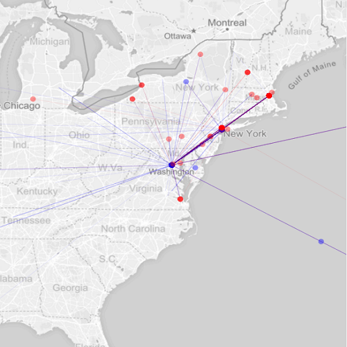
While my initial prototype utilized geocoding methods in order to visualize the flow of letters, much important information was nevertheless lost in the process. The correspondents themselves are most obviously absent from the visualization, and more nuanced data like the content of the letters, as well as frequent topics of conversation, were subordinated to an aesthetically pleasing though informationally limited animation.
Only recently have I started to focus more of my attention on thematic concerns, such as the often unacknowledged intersection of the poet’s public and private writing activity. What types of connections would I find between his letters and his most famous work, like Leaves of Grass. Are the boundaries separating public and private as rigidly maintained as we often believe? To explore these questions further, I began identifying all letters which contained references to Whitman’s poetry, prose, or journalistic activity. The more I worked with these documents, and the more I sensed the interconnections between them, it became clear to me that a more interactive interface was essential for helping users navigate the often overwhelming amount of data contained within the correspondence network.

I opted for what’s known as a concept map. In this iteration, the object consists of three parts: a table of “names” in the center, a list of “themes” on the left, and a cluster of “perspectives” on the right. Initially, I positioned individual correspondents in the middle, and the nodes which extended on either side contained references to Whitman’s writings. At first, this made the most sense to me in that the project is about the correspondence, so why not highlight the actual writers by situating them in the center of the “map.” After having met with digital humanities librarian Stephanie Blalock, though, it became clear to me that, while useful, what I had proposed was essentially a glorified finding aid. For example, users could very easily see what Whitman’s doctor friend, Richard Maurice Bucke, was most interested in talking about, but such discoveries revealed little else about the correspondence network.
What if I changed things up a bit? What would the concept map look like if I foregrounded gender as opposed to individual writers? What could this reveal about the nature of Whitman’s correspondence? Not only that, but what could this reveal about archival practice more generally, a potentially generative inquiry seeing as how all of my data is assembled from The Walt Whitman Archive. Perhaps I could begin to make inferences about the gendered nature of archival research, curation, and preservation in Whitman studies.
In the image above, you can see that I repositioned “themes” and “perspectives” in the middle of the map, with female correspondents now located on the left, and male correspondents on the right. While informative, doing so is not without its problems, and it is here where I return to Drucker’s observation regarding the assumptions embedded in visualizations themselves. Indeed, while the concept map does inherently preserve the notion of gender as a binary construct, it is also useful for conceptualizing the gendered identities that undergird epistolary activity. But whereas Drucker might consider digital repackaging to be fundamentally “at odds with humanistic method[s]” of interpretation and analysis, I see it as opening a dialogue where none might otherwise exist. If, as I believe, Whitman’s poetry and prose can be thought of as existing within a shared network of public and private activity, then it is important to consider the ways in which factors such as race, gender, and class contribute to such production.
Works Cited
Drucker, Johanna. “Humanities Approaches to Graphical Display.” Digital Humanities Quarterly, vol.
5, no. 1, 2011. Web. 3 July 2017.
Gitelman, Lisa and Virginia Jackson. “Introduction.” “Raw Data” Is an Oxymoron. Cambridge: MIT
Press, 2013, pp. 1-14.