Social safety nets consist of several programs that help maintain the wellbeing of society members and protect people during times of hardship. The US social safety net gives individual states a lot of autonomy in administering safety net programs. This leads to considerable variation in the level and breadth of assistance provided in one state to the next. Current research examining the variation in US safety net benefits has a limited understanding of how state benefits are shaped by geographically close or ideologically similar states. There is also more to be learned about the consequences that result from this variation.
For my Studio fellowship project, I am working to address some of these gaps in the research by identifying and visualizing patterns of provision across a range of social safety net programs. To do so, I am using the Social Safety Net Policy Dataset. This unique dataset provides comparable measures of ten social safety net programs across the 50 US states from 1994 to 2014.[1] These measures include the generosity of benefits (the value of the assistance recipients receive on average) and the inclusiveness of receipt (the proportion of the potentially needy population that receive assistance).
I am currently working on conceptualizing and exploring visualization options to effectively convey overtime patterns of provision across the US states. Since many of the research questions I wish to answer with the aid of these visualizations revolve around understanding how state-to-state variation in provision matters, I first want to develop visuals that can concisely capture this variation overtime.
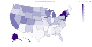
I started my fellowship with the most coding experience in Stata. While I am still using its statistical analysis and data cleaning features, I found Stata’s visualization capabilities to be too limited for my project and began looking at other software options, including GeoDa and R. After attending a visualization workshop in R during the first week of my fellowship, I decided to further explore the mapping and other visualization tools in R. The learning curve in R has been rather steep to start, so I anticipate spending a fair amount of time this summer refining my coding skills in the software. During the first three weeks of my fellowship, I developed in R a choropleth map of the generosity level of cash assistance benefits by state in 2014. Prior to the fellowship, I had created similar choropleth maps in Stata, but this initial version of the map as developed in R has more capabilities than my previous maps. For example, users of this new map can hover their cursor over a state and learn the exact generosity level of cash assistance benefits in that state. I was not able to include this interactive feature in Stata. You can see this feature in use in the image below.
 Moving forward this summer, I hope to create an animated (e.g. a GIF image) version of the choropleth map which strings to together a series of choropleth maps to depict the overtime variation for each safety net program. In addition, I would like to explore possible options for visualizing other aspects of my research (e.g. regression results), including the social disparities associated with the variation in US safety net programs and different patterns of provision diffusion.
– KaLeigh White
References
[1] Bruch, Sarah K., Marcia K. Meyers, and Janet C. Gornick. 2018. “The Consequences of Decentralization: Inequality in Safety Net Provision in the Post–Welfare Reform Era.” Social Service Review 92(1):3–35.
