My project creates the visualization of people’s ‘cognitive structures’ (or mental map) using survey responses. Using a network analysis, this project classifies cultural groups that are identifiable based on the cognitive structure of adolescents’ life goals in the U.S. and Korea. By comparing groups of individuals who share similar cognitive structures both within a country and between countries, this research demonstrates cross-cultural similarities and differences in terms of how individuals structure their life goals. By finding ways to effectively visualize the similarities and differences among cognitive structures of life goals, I will be able to better communicate the importance of our research project to an interdisciplinary audience from the sociology of culture, cross-cultural psychology, and literature on culture and cognition.
Specifically, given the findings on groups of individuals who share similar cognitive structures, which I generated by network analysis, I explore R packages, which would help me to visualize each cognitive structure in a way that gives me more options than automatically generated graphs can provide. The primary goal is to find the best way for me to make the graphs of cognitive structures simpler and easier for readers to understand.
Here, I want to share some of the graphs that I have generated. I visualize the patterns of a cognitive structure of fourteen life goal indicators. Lines correspond to the correlations between life goals, where thicker lines represent a stronger correlation. Sizes of nodes indicate the PageRank, which is proportional to the degrees of the nodes of the graph. Colors of the nodes demonstrate several dimensions of life goals.
(a) (b)
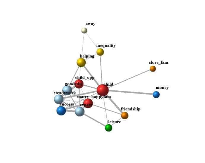
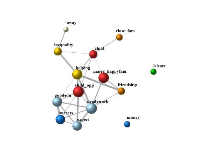
The two graphs represent two different structures of life goals that were found among the U.S. adolescents. In an omnivore model (a), all life goal items are related to each other, while ‘child’ (one of the red nodes) is located at the center of this cognitive structure. In a particular model (b), the correlations among red nodes (family), blue or light blue nodes (achievement and development) and yellow nodes (society) share a similar pattern with the model (a), whereas the green node indicating ‘leisure’ and one of the blue nodes representing ‘money’ appears to be isolated. Overall, indicators are positively correlated with each other, which makes a weak negative correlation (or weak positive correlation close to 0) important to be noted.
By focusing on these weak correlations and isolates, my next goal at the Digital Scholarship & Publishing Studio would be developing the visual argument of my projects: explaining the characteristics of each cognitive structure, discussing the similarities and differences between cognitive structures, and developing theoretical explanations for the findings. In so doing, I will keep exploring various versions of visualization and also find ways to demonstrate the main findings.
Ji Hye Kim (Ph.D. student, Sociology)