Thanks to the Studio Summer Fellowship, I have had a deeply meaningful scholarly experience and learned four lessons about digital work in the academy.
Lesson 1: Value Process Over Product
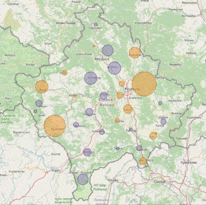
My intention at the start of this summer was to build a map that visualized the recent history of the public higher education system in Kosovo. The digital product has become a reality, but that was not the greatest accomplishment of this journey. This experience protected my time to conduct research deeply, with invaluable dedicated hours to focus on process over product. As a result of this experience, I explored these data in a closer, richer way than ever before. By learning cartographic methods, I spotted trends that no table or graph generated from these data previously helped me to see. Most importantly, I developed confidence as a scholar, which will enhance my research and teaching.
Lesson 2: Welcome Creativity
When I began the project, I had an idea in my mind of how the completed map should look. After the first few weeks, the initial visualization started to resemble the image in my head, but the story that the data told lacked boldness. My Studio mentor, GIS Specialist Jay Bowen, suggested that instead of sticking with just the choropleth map, we could experiment with a creative representation of the data using proportional circles. After deviating from the initial vision, one of the important trends that was too subtle in the first draft became clear and compelling in the final version.

Lesson 3: Expect the Unexpected
During the weekly Fellows class, Dr. Stephanie Blalock asked us to reflect upon what surprised us during this experience. For me, the surprise was the accumulation of moments where I braced in anticipation of rough technological challenges but encountered support instead of roadblocks. These moments of relief outnumbered instances where I faced unexpected challenges. For example, I was really surprised when a rough map of Kosovo and all its municipalities appeared on my monitor for the first time after just a week. I thought that generating an image would take all summer! In the weeks that followed, each little map detail afforded the opportunity for custom design, and I had not expected that tailoring the map would involve just a bit of HTML or JavaScript, rather than some complicated procedure using the QGIS map-making software. The collective surprise of all these little a-ha moments made the experience immensely more satisfying, demystified the technology, and made the challenges that did emerge seem miniscule.
Lesson 4: Design with the Future in Mind
In reaching the final stage of the summer project timeline, the map does a decent job showing what is happening with public higher education but not why. Thus, the project cannot end in its current state. Realizing that I am running out of protected summer work time, I have made design choices that are suitable for scholarly presentation of data when our class of Studio Fellows presents at the 2021 Jakobsen Conference and that can accommodate future features about quality assurance policies in Kosovo when I am able to return to the project as a Public Digital Humanities Certificate capstone.

If you would like to get in touch with me about this research, the best way to reach me is by email at nicholas-stroup@uiowa.edu.
–Nicholas Stroup
