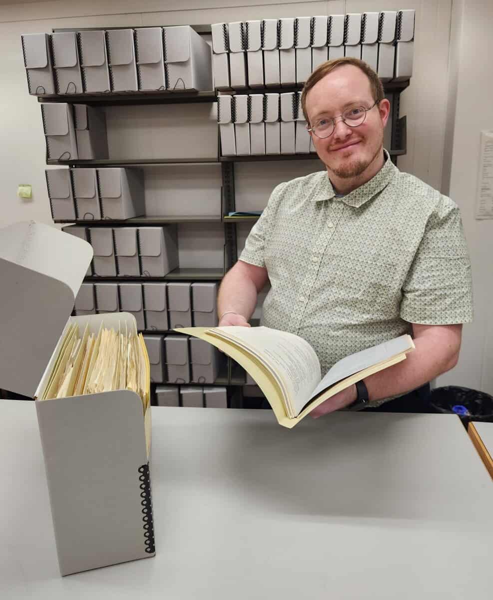
This series features the work and research of UI students. The following is written by Whitney Jensen, an undergraduate student worker at Special Collections and Archives.
Do you have an interest in the vast collection of Civil War documents found in Special Collections and Archives at the University of Iowa but unsure where to begin? Fret not; our student worker Whitney has compiled a list of the 10 most accessible items, from diaries that rode in the breast pockets of soldiers as they marched into battle to letters sent between loved ones over the course of the war. Follow along for a (by no means exhaustive) summary of some fascinating historical finds as told by soldiers across the United States!
10) Diaries of George C. Burmeister
Inside box 3 of the Civil War Collection are the diaries of a man named George C. Burmeister from 1861 through 1864. Burmeister was working as a schoolteacher near Muscatine when the war began, after which he served in the 35th Iowa Infantry. The handwriting in these is clearer than many other diaries in the collection, making them a nice reference for those who feel more inclined towards reading the real, historical documents rather than transcripts.
9) Diaries of Turner S. Bailey
In box 10 of the same collection lives another interesting item. There are three diaries of a man named Turner S. Bailey, who served in Company A of the 3rd Iowa Infantry from 1861 to 1863. Alongside the physical diaries, there is a summative write-up which helps with comprehension of the events described within. It is important to note that the actual handwriting in these diaries is small, faded cursive, making it difficult to read. If you’re up for the challenge, this folder contains a great deal of information on one soldier’s time in the war (including a description of the battle in which he lost his right hand).
8) Letters of Samuel Fisk
Box two of the Civil War Collection has a folder of particular interest, containing the work of a man named Samuel Fiske, who wrote under the pseudonym Dunn Browne in order to submit over 90 letters detailing his experiences serving in the Civil War. The collection has 13 of those letters, ranging from 1843 to 1876. They have been evaluated and organized into a clear inventory, making their contents a little more accessible to those who want to try and read some beautifully complex cursive.
7) Letters of Charles Arad Gates
Let’s look next at the letters of a man named Charles Arad Gates, alongside a thorough summary and description of their contents. These 39 letters range from September 1861 to December 1863, describing his experiences serving in the Battery B of the 1st New York Light Artillery. They are unique in the fact that Gates used illustrated stationary and drew maps of the battery’s camps as well as some battlefields they fought on. He also wrote a thorough letter describing two days of battle on the Fourth of July. Though there is not a direct transcript for each individual letter, the summary will prove helpful to anyone attempting to parse through them.
6) Sterns Family Papers
This is a unique collection as it contains both photographs and letters from the Sterns family at the time of the Civil War. There are correspondences of a man named Thomas Rescum Sterns, who joined the army the year prior and served as a corporal in Company F, Regiment 29 of the Wisconsin Volunteers. Folder 15, which houses a large chunk of Thomas’s letters, contains both the original papers as well as typed transcripts, and the handwriting is quite accessible. In a separate box are the photos, all labeled with the names of those pictured on the reverse side. There is also a photo album with personal pictures of several members of the family (the book is in poor shape, but the photos themselves look great). Not only are pictures a highly accessible item for those who benefit from a more visual style of learning, but having the original copies with contextual writing on the backs creates an additional layer of immersion that cannot be overlooked. This collection provides a fascinating glance into the impact that the Civil War had on families at the time.
5) John Warner Hiatt Materials
Box 8 of the Civil War Collection contains the letters of a man named John Warner Hiatt, written between 1862 and 1863 during his service in the 28th Regiment, Company F of Tama County, Iowa. These letters are a particularly shining point of reference, as they have been compiled by Hiatt’s great-great-grandson, David Balding, and transcribed into a 100-page booklet that depicts the man’s wartime experiences in great detail. The final letter in the collection, dated May 20, 1863, was written by Hiatt from a field hospital after suffering a life-threatening injury in the Battle of Champion Hill. He would die 18 days later on June 7. While it is a large volume of writing to parse through, these letters are a solemn reminder of the thousands of men who did not live to see the war’s end.
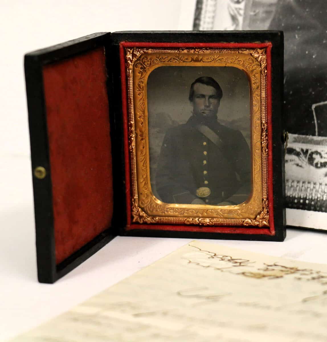
4) Items of Ephraim Weaver
Looking for some materials that don’t involve pages and pages of writing? Look no further than the items of a soldier named Ephraim Weaver, housed in box 4 of the Civil War Collection. While there is a letter to his parents included, Weaver also kept a tintype photograph of himself and a $10 bill from the Confederacy. If you’d like to get your hands on some real-life relics from this moment in history (other than the letters and diaries), this is a great place to start.
3) Civil War Relics
Keeping on the theme of non-letter items, box 5 of the same collection also has some neat items to explore. There are a handful of miscellaneous maps and other wartime paraphernalia, but the most fascinating thing is a box labeled “Civil War Relics Dug from Southern Battlefield and Campsites.” It contains a part of a fork, a .58 caliber round, two carbine cartridges, among a few other objects. Though no additional context is given as to what battlefields they come from, these items allow you to handle fragments of history.
2) Diary of Joseph Child
One of the most accessible items in this whole collection is the writing of a man named Joseph Child, who served in Company K of the 26th Iowa Infantry. His diaries, which cover the span of nearly four whole years, have been transcribed word-for-word onto a typed document. This makes all the information that Child provides about battles and troop movements approachable for research. It’s a great first look into this vast collection; the only downside being that the physical diary itself is not present in the folder.
1) Dairy of Sewell Van Alstine
Not only does this collection contain the original leather diary of this Illinois infantryman, but a fully typed transcript as well as a digitized version that can be accessed via InfoHawk+ for you to pour over at home. He wrote in his diary almost every day from September 1863 to October 1864, even if to simply report on the weather. The writing style is short and summative, becoming more descriptive once his regiment begins engaging in combat with the rebels. Van Alstine keeps thorough track of every man’s death that he learns of, takes notes on the sermons he hears in camp, and maintains a ledger of expenses and mail (both sent and received) in the back. There is even some poetry, such as pieces titled “Friendships Parting Pledge” and “Unloved.” This diary contains just about everything one might wish to know about a soldier’s day-to-day life during the war and is expansive yet easy to comprehend. If you’re going to start anywhere in this vast collection, let it be here.
If these select few items have piqued your interest, there’s still lots more to see. Come visit us in Special Collections and Archives on the third floor of the Main Library, where you can leaf through Civil War documents of the Midwest until your thumbs fall off. We hope to see you there!