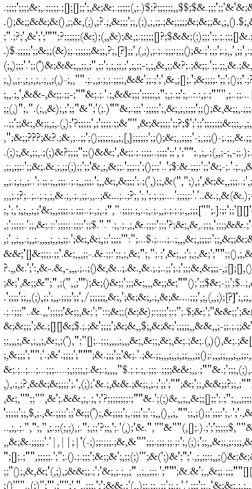
Here is a snapshot of Whitman’s correspondence as it is represented by punctuation only. To achieve this effect, I ran a python script which moved all of these elements into a separate .txt file. This was an important step when considering the character count of these documents. Word counts alone could exceed upwards of 300,000, and Microsoft Word was simply not equipped to handle calculations on such a large scale. Removing just the commas (18,000 in the correspondence alone) it would take nearly 30 minutes, sometimes longer.
When it comes to corpus analysis, scholars have tended to focus on stylistic or linguistic patterns in an author’s work. Punctuation is often excluded from these conversations, yet it is not entirely clear as to why this is the case. Periods, commas, hyphens, etc., are meaningful units of expression, and they can typically serve as a kind of signature by which to identify an author’s more nuanced expression. Not only that, but they can tell us important things about the social, cultural, and historical conditions under and through which a text was produced.
All too often, though, these elements of language are the first things to go when using digital software to analyze big data. The tutorials that I have found often view punctuation as entirely expendable units of expression. The same is true of stopwords, or those elements of language which most programs seem to categorize as “nonessential.” Here, I am thinking of the ways in which word clouds are generated according to a “weighted” vocabulary the program deems more important than others. Moreover, the same appears true in most sentiment analyses which pull data from a lexicon containing “significant” words with clear positive and negative connotations.
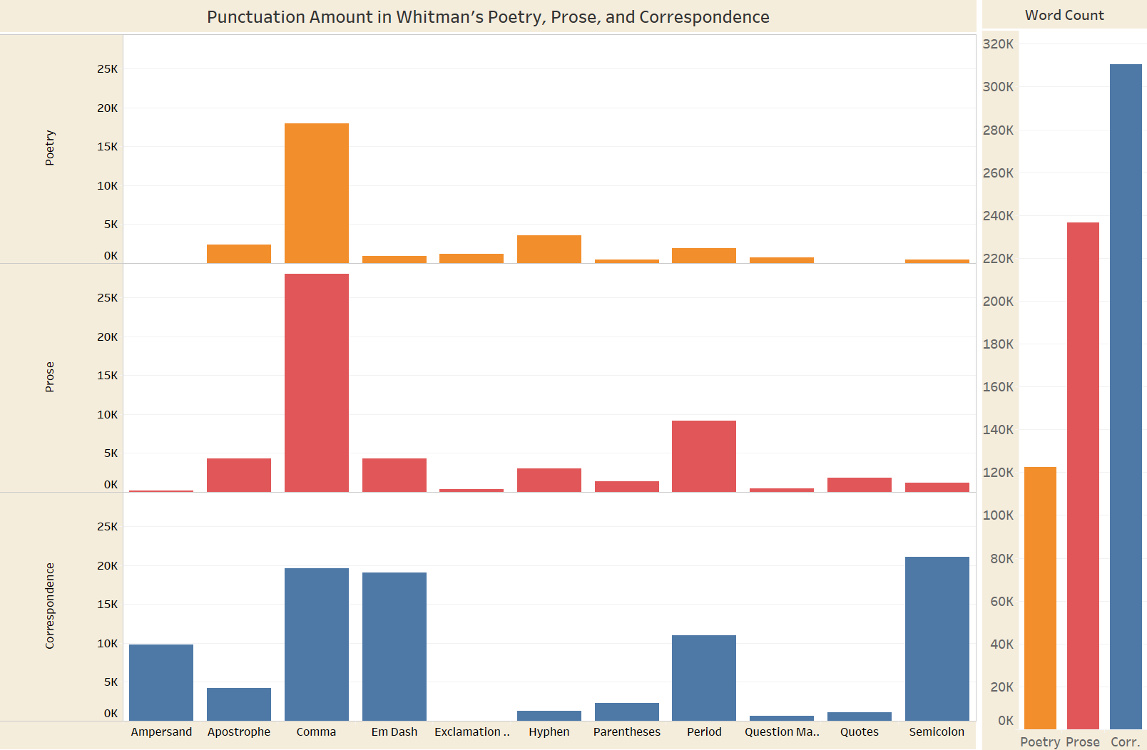
For these last few weeks of the summer fellowship, I have been exploring those marginal aspects of language which are often either forgotten or intentionally excluded from most datasets. It was my feeling that a computational analysis of Whitman’s punctuation offers important insights into the ways in which different media formats influenced his work. The comma, for example, serves many functions: it organizes parts of a list, joins together different ideas, and it can even act as a surrogate for other words.
As revealed in the graph, the comma is among Whitman’s most-used punctuation. By itself this is perhaps not a revelatory statement. I’d bet that the comma is probably the most-used punctuation mark in the entire English language. How exactly Whitman employs it in his poetry, prose, and correspondence is worth investigating further. The same goes for other punctuation marks. In Whitman’s correspondence, an increase in em dash usage is particularly noteworthy. Working as a research assistant for the Walt Whitman Archive, much of what I do consists of transcribing and encoding these messages. What I have found is that postal cards in the nineteenth century, even more so than traditional “letters,” contain a tremendous amount of em dashes. A number of reasons can explain this, but the most compelling to me is the smaller physical size of these messages. The materiality of the message itself is just as important as the content these writers are attempting to communicate. In Whitman’s prose, too, we begin to see an increase in em dash usage. It would be interesting to see whether or not the emergence of the postal card in the mid to late nineteenth century had any significant impact on Whitman’s postbellum writing. Continuing this project, I will try to incorporate some temporal dimension that could help track such developments.
When I meet someone, our introduction typically goes something like this:
What do you do?
I teach college literature and I’m a graduate student. Oh, what do you study?
Victorian Literature Oh, like Jane Austen, and stuff?
…sure.
There is always more we can say about ourselves, our interests, and our work. If I decide that I want to go into greater depth, I might specify to this person that—while I love Austen’s novels—the literature I study typically comes later in the century than Austen’s. In fact, I am currently writing a dissertation that examines late-nineteenth century British literature that deal with issues of social reform and resistance. And if I’m feeling really chatty, I might add that my dissertation uses literary cartography and geocriticism to look at places where particular communities lived, where they were forced to move, and how literary accounts correspond with these maps.
… but I digress.
The point is, in many circles of academia, we’re asked to clearly define our disciplines or areas of expertise: late-nineteenth-century British literature, twentieth-century American history of baseball, biochemical engineering, etc. We often have titles, categories, or topics that delineate our “areas” into nice and neat sound bites. I’ve quickly found that is less true of our work in the digital humanities (DH). What are the digital humanities? Or, better yet, how am I defining DH? When Clifford A. Lynch, Executive Director of the Coalition for Networked Information (CNI), was asked how he would define “digital scholarship?” his response was seemingly evasive, but honest:
“Digital scholarship is an incredibly awkward term that people have come up with to describe a complex group of developments. The phrase is really, at some basic level, nonsensical. After all, scholarship is scholarship” (10).
Even though I know this—that scholarship is scholarship—I’ve still struggled with my relationship with the digital humanities as I work within “the field,” but still feel outside of it. I turn back to the continuous question that many before me have posed: What does it mean to work in the digital humanities?¹
As I look around this morning, sitting at one computer of many in the Digital Scholarship and Publishing Studio (DSPS), I assume that behind many of the screens my summer fellowship colleagues are busy coding or revising code that they’ve been working on this summer. This seems like the obvious addition to make something digital… get to coding. (Keep in mind I say this with about the same amount of “coding knowledge” as my pet terrier.) I’ve sat in on conversations about “coding concerns,” like: when to write new code, and when to use what’s available; when to take a coding break and focus on thematic and theoretical concerns; and which types of coding are sustainable and transferable across platforms. And yet, the truth is, I don’t code! Sure, I was exhilarated when I figured out how to create a hanging indent in html (as demonstrated in my earlier post); I wanted my bibliographic entries appear in correct MLA format in Omeka.² However, I don’t code and I don’t program; I read, I research, and I analyze.
Fig. 1, Screen shot of record entry in Omeka
My work became “digital” when I applied for assistance to create a map of where characters lived and traveled in William Morris’s utopian romance, News from Nowhere. Then when several of my colleagues assisted with this endeavor,³ my project expanded to analyze the literary cartography and geography of several authors and their work in my dissertation. Most of my time on the “digital” side of things has been simple data entry. I’m working with Neatline (as a plug-in for Omeka), and after I finished importing my first batch of records from an excel spreadsheet (in csv format), I’ve simply been revising records in Omeka and adding new ones (fig. 1).
For a while, I felt self-conscious about this perceived gap between my assumptions about DH and my own skills and my project. I wondered if my records and maps would reveal anything useful and hoped that this wasn’t all a waste of time. I shared my concerns with White, my point person in DSPS, embarrassed to admit my uncertainty and expose my potential for failure. However, she reassured me that almost everyone feels this way at some point, regardless of their expertise: “Working in the digital humanities is about figuring out how to ask the right questions and who to ask.” Basically, it means asking questions all the time to everyone who will listen and being ready to learn.
How is this different from “non-digital” scholarship? It isn’t, really. As a DH project, my work this summer has demanded my attention to process (how and why I enter certain records) and my desperate reliance on others.4 Now these demands have been digital-specific—in that I am working with online platforms and plug-ins, and working with a digital librarian (shout out, Nikki!)—but they are not specific to digital work generally. All scholarship requires diligent consideration of process and—although many of us in the humanities try to deny it—scholarship is a collaborative endeavor. As Lynch says, “scholarship is scholarship,” and the tools we use don’t change that. To say that I work in the digital humanities, doesn’t mean that I am a computer guru or can code with the best of ‘em. All it means (for me), is that I have found useful digital tools (created by someone else and used by many others) to address a research question.
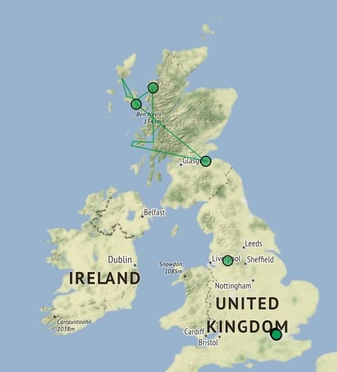
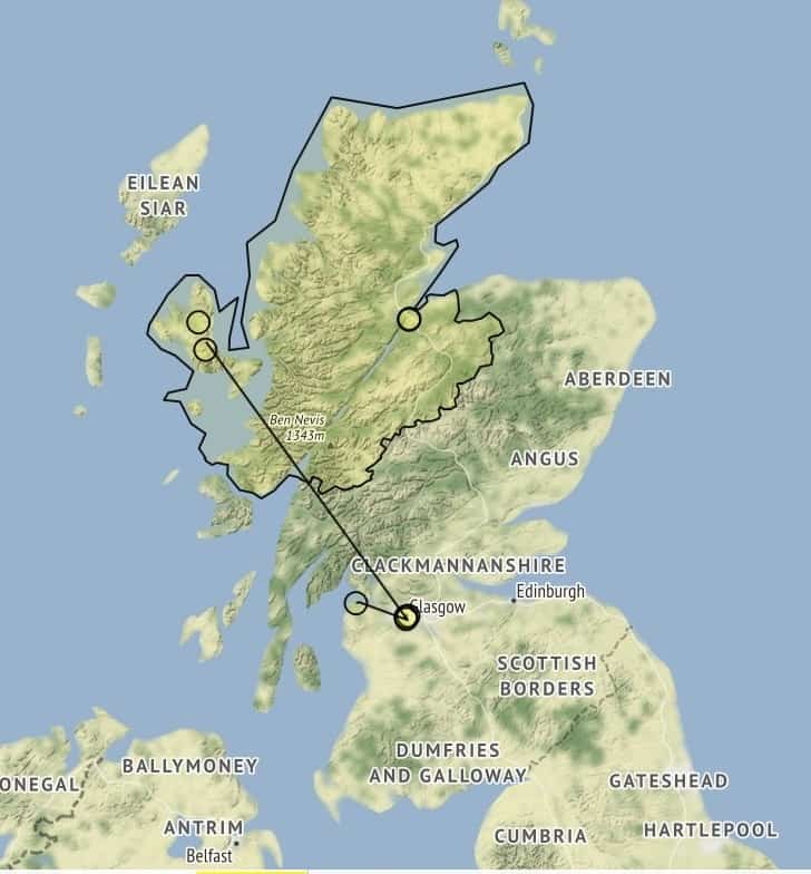
Fig. 2, Neatline exhibit for Mathilde BlindFig. 3, Neatline exhibit for Mary Macpherson
As I study the work of Mathilde Blind and Mary Macpherson, I am thrilled to see that my data reveals a distinction in the Neatline map between the places these authors lived (London and Glasgow) and the northern Highlands they portrayed in their poetry and political discourse (see figures 2 & 3). I am continuing my research in additional Neatline exhibits to address similar discrepancies between how a place is portrayed and how it is experienced. Neatline allows me to demonstrate these points of interest, but it is only one part of my scholarship puzzle. Similarly, the digital humanities can be useful and impactful, but—as I have found—DH is not a helpful or neat category to describe scholarship; it’s messy and ambiguous. Instead, I adopt Lynch’s statement as an adage for our generation of scholars, remembering that while digital tools and techniques can help us answer our questions: “scholarship is scholarship.”
Notes
¹ For additional discourse on what it means to work in the digital humanities see: Edward Ayers, “Does Digital Scholarship Have a Future?” Educause Review, July/August 2013, pp. 24-34.
² K.E. Wetzel, “When to Work Alone, and When to Ask for Help.” University of Iowa Digital Scholarship & Publishing Studio Blog, 13 July 2017.
³ Laura Hayes and Caitlin Simmons are currently working on a larger and more in-depth mapping project on William Morris’s News from Nowhere, for the William Morris Archive (WMA). They are working with Professor Florence Boos, the general editor for WMA; Robert Shepard, GIS specialist with the Digital Scholarship & Publishing Studio; and additional graduate students at the University of Iowa, including Kyle Barton.
4 I am gratefully reliant on my project “point-person,” Nikki White, Digital Humanities Research & Instruction Librarian at the University of Iowa DSPS. She assists with the coding and programing side of things, but more importantly she has been a mentor through the “how and why?” issues of my project (e.g. which platform to use, how to structure my archive, the limitations of any given visualization, etc.), so that I can be intentional with how I enter and store my data—and how I use it in my writing and teaching.
Works Cited
Lynch, Clifford A. “The ‘Digital’ Scholarship Disconnect.” Educause Review, May/June 2014, pp. 10-15.
…evelli penitus dicant nec posse nec opus esse et in omnibus fere rebus mediocritatem esse optimam existiment.
“They say that complete eradication is neither possible nor necessary, and they consider that in nearly all situations that the ‘moderation’ is best” (Cicero, Tusc. 4.46).
In my last few weeks here at the Digital Scholarship & Publishing Studio, this thought kept racing back into my mind: mediocritas. My translation for it, “moderation,” is quite poor. In this context, it refers back to the Peripatetic (and generally Greek) concept of the middle state, the mean between two extremes, or the right amount or degree of anything. Today, we know this concept as the “The Golden Mean,” the balance between an extreme of excess and another of deficiency, especially when it comes to virtues and emotions. A soldier must be moderately angry when he runs towards the battlefield. An orator can only effectively argue for his client in court if he’s impassioned by genuine (and moderate) anger and not feigning it.
At this point, I feel obligated to point out that the speaker in Cicero’s Tusculan Disputations was a Stoic and therefore believed that the complete eradication of emotions was possible. He was arguing against The Golden Mean. Unlike the Peripatetic soldier and orator, the Stoic sage chooses not to feel anger at all. He chooses to feel very little.
I am not a Stoic sage. I am far from it. Within these past few weeks, I’ve felt (probably too much) anger and frustration as well as elation and tranquility. Even though I have been rather emotionally immoderate this past summer, I keep thinking over and over again about The Golden Mean, not in the context of my feelings but of my errors.
“They say that complete eradication is neither possible nor necessary.” Whether it is truly possible to eradicate all emotions, it is truly impossible to get rid of error entirely in my project. But is it necessary to do so? As Humanists, we are already comfortable with disagreement, with having multiple competing theories at once that are all possible. We may side with one theory over another, mix a few together, or not care for them at all. All of this makes finding the “truth” and validating results impossible.
I wasn’t the only one to ask this question. Andrew Piper, in his blog post commenting on the Syuzhet R package debate between Matthew Jockers and Annie Swafford, wrote: “What I’m suggesting is that while validation has a role to play, we need a particularly humanistic form of it… We can’t import the standard model of validation from computer science because we start from the fundamental premise that our objects of study are inherently unstable and dissensual. But we also need some sort of process to arrive at interpretive consensus about the validity of our analysis. We can’t not validate either” (4–5).
There’s still a need for lessening the margin for error as much as possible. There’s still a need to approach the “truth” as closely as we can and to validate results. We need a Golden Mean.
For me, finding this balance was (and currently is) a struggle. I had to especially keep in mind the idea of “finding the right proportion for everything.”
Earlier this year, I encountered this problem for the first time. I was trying to record the lexical richness of Cicero’s speeches over his career. I tried doing this by finding the Mean Word Use and Type-Token Ratio for all of the speeches. However, these methods did not suit my corpus. Cicero’s orations ranges from less than 1,000 words to over 20,000. It’s a very imbalanced corpus, and the results reflected that. The speeches with the most words had a low lexical richness because the longer the speech is, the more Cicero repeats words. That was essentially what the results showed.
In this case, my “Golden Mean” was the Yule’s K function available through the langaugeR package in R. This function tries to account for length when calculating the lexical richness of a work. And in this way, I was able to get more accurate results.
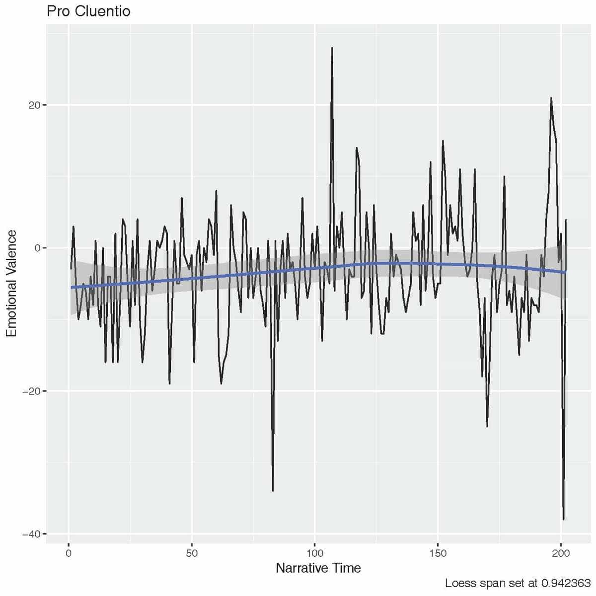
More recently, my struggle had been trying to find the “Golden Mean” for the span of the Loess filter. The same problem came up again: my corpus was imbalanced. This time, it wasn’t only imbalanced in regards to length but in sentiment as well. I’m conducting a sentiment analysis of Cicero’s orations and am trying to find regular patterns in his use of sentiment. So finding the right setting for the filter is crucial. And as you can see from the graph below, changing the span for the filter makes a huge difference:
Red = 0.10, Green = 0.25, Blue = 0.50
Since all of the speeches vary in length and emotional valence, I was very uncomfortable with the idea of having only one setting for all of them. Luckily, I was able to find a Golden Mean for this too. This time it came in the form of the fanCOVA package for R, which can calculate the optimal span of a vector.
And the following graph is the result of that test:
Hopefully now all of my graphs have the “right proportion.” They might not be wholly accurate, but accurate just enough to stimulate good and productive scholarly work and discussion.
But looking down the line, at the future of my project, I am realizing all of the forms that my Golden Mean can take. I need to find a balance between text mining and traditional scholarship, time spent writing scripts and fiddling with my data sets versus time spent writing my dissertation. I will also need to find a better balance between negotium and otium, work and leisure. And I need to learn to tear myself away from the computer to save my eyes from constantly twitching, which they are doing right now as I’m writing this final blog post.
So while the Stoics may not believe in the Golden Mean, I believe that finding the Golden Mean is critical in my work in the Digital Humanities and life in general. Like Plato once wrote:
“For moderation and due proportion are everywhere defined with beauty and virtue” (Plato, Phileb. 64e).
***Finally I would like to extend my gratitude towards everyone at the UIowa Digital Scholarship & Publishing Studio for their great help and for being so welcoming. Thank you, Nikki White, for helping me with Gephi and for teaching me about servers. Thank you, Matthew Butler, for aiding me with my R struggles and for introducing me to Python. Thank you, Stephanie Blalock, for being my “point person” and for helping me to stay on task. Thank you, Leah Gehlsen Morlan, for organizing more things for us fellows than I am even aware of. And finally, thank you, Thomas Keegan, for giving all of us this opportunity. I appreciate all of this immensely.
If you are interested in learning more about the debate over the Syuzhet R package, Eileen Clancey has a storified version of it which is available here.
Hello World! Today, I would like to talk to you about my experience with the Digital Studio summer fellowship. One of my PhD project goals is to educate the public about a promising new process to combust hydrocarbon fuels, specifically natural gas, with little to no side effects on the environment. This project is funded by the NSF and aims to find a solution to global warming. To achieve this goal, I have found a lot of support from the Digital Studio staff. The main goal of our collaborative work is to create a web site that can provide essential general information about pollution and the new process, namely Chemical Looping Combustion (CLC), which I have worked to contribute towards.
Nikki White, a Digital Humanities Librarian in the Digital Scholarship and Publishing Studio, provided me with basic information about creating websites and showed me some of their work. She suggested WordPress as a platform for my work, which the Studio uses for the majority of their websites. There are two versions: WordPress.com, which is hosted online by WordPress, and WordPress.org which can be downloaded and run on a local or self-hosted server. Thus, we had to ask to set up on a library server for me to get access to. The basic functionality of the two versions is the same though the back end does look quite a bit different.
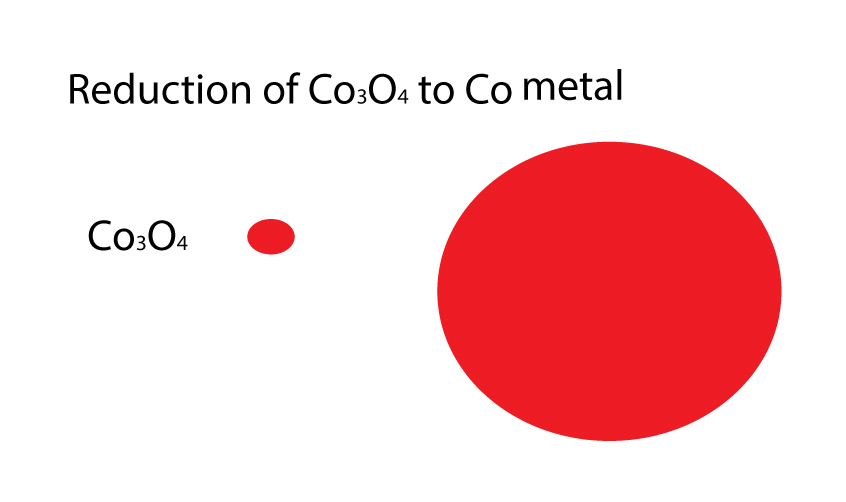
After that Ethan DeGross, a Researcher/Developer at the Digital Scholarship & Publishing Studio, walked me through the process and taught me how to create pages on my website and other details. The big challenge for me was how to create animated figures that describe the reaction kinetic occurring during CLC process. This is one of the most important things that I wanted to include in the website because it can provide a good visual description for non-specialist. As my adviser always said “one figure is better than a thousand words”.
Therefore, after explaining my aim to Ethan, he gave me training on how to use Adobe Illustrator (AI) to create my images and then referred me to Heidi Bartlett, DESIGNER & CREATIVE COORDINATOR in the Digital Scholarship & Publishing Studio, who showed me how to create layers in Adobe Illustrator and then save them for the web (as jpg) and insert them into Photoshop software to create an animated figure. I included here, one of the animated figures, which shows how the cobalt oxide (CO3O4) particle reduced to CoO and then to Co metal by methane. This mechanism of the reaction is called the nucleation growth model. The basic concept of this model assumes that the reduction initiated by forming a nucleus of the reduced phase and those nucleus grow up in the center of the particle keeping the original phase on the particle surface.
Collectively, I had a wonderful experience this summer and I got good training on different software that will help me in my career!
For my first blog post, I did some reflection on Machine Translation instead of talking about my project, so here is a brief description of what I worked on this summer.
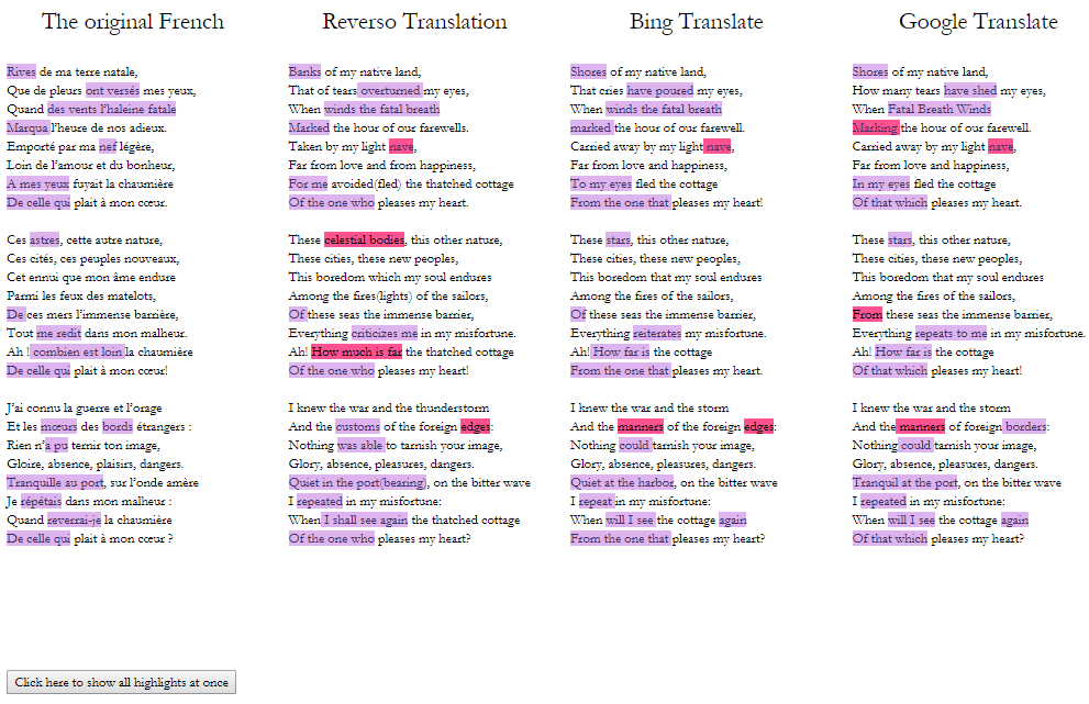
One of my Machine Translation Experiments comparing 3 different online translators; the user can either highlight each set of words at a time and compare it across poems , or highlight all at once (as seen above). The pink color indicates a translation that I believe a human could easily recognize as an incorrect translation, even if they don’t know the original language.
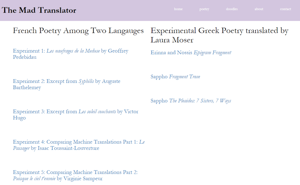
I created my own website, from scratch but using skills I learned from Codecademy and their helpful tutorials, to act as a platform for “digital” translation. I’m not really sure what to call this type of interactive, dynamic text, but because I’ve felt pretty crazy working on my “experiments,” I’ve named the site The Mad Translator.
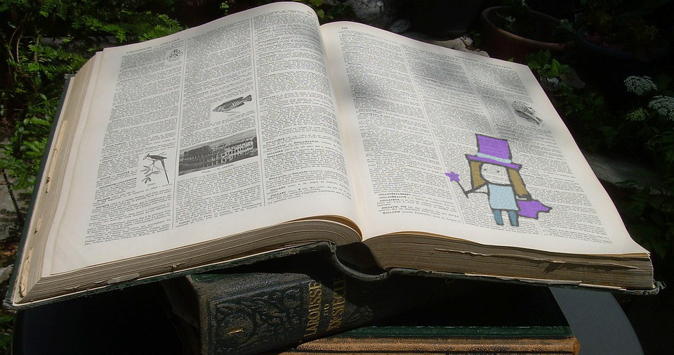
This is what the open tab looks like with my magician logo.
Unlike many of the other fellows here this summer, this project is not in any way related to my thesis/dissertation/assistantship. I had some goals of what I wanted to accomplish in 8 weeks, and with a few adjustments, I would say I met those goals. There’s still a lot more I can do, one thing I hope to continue to work on in the next semester is better integrating relevant translation theory into each page.
This is essentially my “table of contents” which currently has 8 functional pages.
I gained a ton of skills, including learning about javascript, bootstrap, css, html, jquery, website design, and github. I honed some Photoshop skills and learned how to use the program to create animated gifs.
The gif I made with Photoshop for the home page. What if we take translation, which is imagined as “fixed” due to the long tradition of print publishing, and imagine new ways to engage with it?
After the first two weeks, I took a break from learning to code and instead turned back to theory. I read a number of articles on digital literature and translation, and I scoured through countless online journals to observe how they integrate digital features (or not) into their publications. There’s a lot to say about translation in the digital age; on one hand we have machine translation which feels threatening to translators, on the other hand we have an increased capability to interact with text, given that someone is willing to put the time and effort into coding such interactive capabilities.
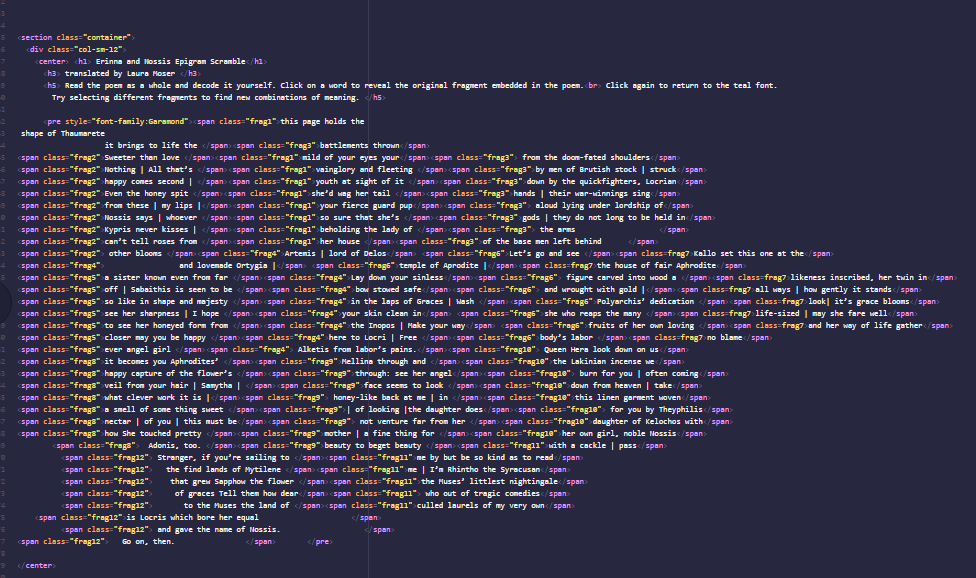
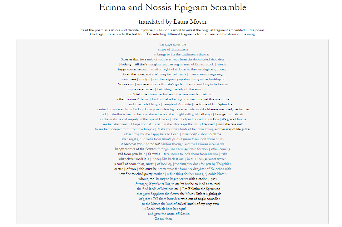
The html code for “Erinna and Nossis Epigram Scramble” (screenshot below) which needed a set shape no matter the zoom/platform and I wanted entire sections to change color when any word within the section is clicked.
In addition to trying to break down the mindset of “equivalency” between an original text and its translation, I included some translations that are innovative in their presentation. I owe infinite thanks to Laura Moser and her wonderfully creative translations from Ancient Greek fragments. I first encountered them on paper and imagined that they could have a strong digital presence.
The above code produces this: all the fragments together load with a blue color, giving the illusion that this one large poem; clicking on any word turns the font color of its entire fragment to black, allowing the user to “decipher” the fragments as scholars of Ancient Greek do. The wide range of fragments collected in this way encourage us to consider what happens when words are taken out of context and mixed with others, which again is often the case with ancient text.
While there may be some shortcuts and more efficient methods to coding each unique page on the website, I did my best working with my level of coding. I coded every single word that is clickable, draggable, highlight-able, changeable, etc. Although I prefer working with prose text in my own translation practice, poetry felt a lot more manageable because I was able to select poems with set lengths.
All the screenshots above are from the current state of the website, which is hosted locally on my hard drive. In the final weeks of the summer, I’m excited to work with Studio Staff to make it go live and accessible to anyone online, at which point the formatting may change from what you see here. The website is pretty basic, but given that I created every page from scratch, I’m very happy with this product as the fellowship draws to a close. I started with very little coding experience and now I feel confident that I can keep adding pages in the future and building up this site. Although I won’t be able to work on this as diligently once the semester starts, I hope to continue adding more pages. Who knows, maybe one day there will be more translation sites like this, or more translators will be interested in encoding their work with digital features, or maybe this website will take off!
Big thanks to the Studio and its staff for making this project possible!
I’m not a “tech” person. Naturally, computers (amongst other software and gadgets) make up a normal part of my day-to-day routines, and while I feel perfectly comfortable “tinkering” around with new gadgets and programs, the language of code and other seemingly mysterious components of the “digital” in academia elude me. No, I study stories; I study fiction, culture, and history.
Currently, I’m working and teaching my way through the PhD program in English literature. My dissertation focuses on fictional characters that don’t seem “fit in” in Victorian society in the last few decades of the 19th century.
So, why am I here? Why am I spending my summer in the Digital Scholarship and Publishing Studio? For help, of course! I’m working with Digital Humanities and Instruction Librarian, Nikki White, to map geographical references and events from the literature I examine in my dissertation. White more than supplements my digital-inadequacies; however, when it comes to structuring and organizing my data for Memory and Metropole (my mapping project), I’m still “tinkering” my way through Omeka and Neatline, trying to figure out what will work best for me. It’s so easy to feel lost in a massive project like this one. Playing with and learning new methods can be time consuming and feel a little counter productive. There are people here to help, but I need to work through some issues on my own. I’m still figuring out when to work through a problem alone and when to ask for help.
So far, I’ve found it helpful to write down goal, questions, and skills that I’m struggling with and share them at my weekly meetings with White. At our first meeting, we figured out what she could do (short term), what we would work on together over the following week or two, what need additional development before being addressed (long term: e.g. navigation, layout), and what I could learn or investigate on my own (e.g. html coding, appearance preferences, short-code, plugins, etc.). This was helpful, but not necessarily in the way I assumed it would be. I think that I am most motivated by the last: what I could–and should–do on my own.
Since then, I’ve been trying to familiarize myself with the shortcodes for Omeka. My current conundrum: I cannot figure out how to link a specific collection in Omeka to a specific description on one of my simple pages titled, “Collection Description.” Nikki suggested that try to find ways (outside the provided codex) to display more information about each collection through the shortcode. Then, rather than trying to link a typed paragraph description to the shortcode for a specific collection, the description world be contained within the collection image and link. With this alteration, I could simply use the general shortcode for all collections, [collection] and the paragraph description would be included on the page. This seemed like the easiest and simplest method. I haven’t sorted this issue out, but at least I have a direction for my tinkering!
I also figured out how to do hanging indents in my Omeka records. This sounds mundane, but I’m a stickler for details and the left indent for all of my citations was driving me a little insane. All I had to do was google html code for hanging indents and look for the one that looked the easiest to imitate. Seems simple and obvious, but it was really helpful to know I could figure out simple tasks like this for myself. Here is an example of the code I used in the “Source” box of my item:
You can adjust the margins to suit your preference. The example I adapted set the margins at 4, but I preferred 1.5 for the smaller displays I use on Omeka and Neatline. Check out the results:
Mathilde, Blind. Mathilde Blind: Late-Victorian Culture and Woman of Letters. University of Virginia, 2016.
The learning curve for this summer fellowship hasn’t been steep in terms of skills (for my project), but it has challenged my methods and learning style. I like investigating new techniques and new skills, but I can’t work on this project alone. I have to ask for advice and help. Touching base regularly with White, my “point-person,” has been a crucial component of my summer work. I try to have clear notes and an agenda for our meetings in the hope that updating my goals and queries will help me stay on track through new aspects of the project–and “tinker” in the most effective direction.
Hello blog readers! I’m Hayder, one of the summer fellows in the UIowa Digital Scholarship & Publishing Studio. I’m working on creating a website to educate people about a new fuel combustion process which is Chemical Looping Combustion (CLC). CLC is a promising method of natural gas combustion to produce energy. This process utilizes the lattice oxygen molecules of metal oxides to combust the natural gas, instead of air, which minimizes the formation of pollutant byproducts such as NO2, N2O, or NO, which form when the reaction occurs in air (e.g., N2 and O2). The CLC process is highly efficient with little to no side effects. Minimizing the formation of pollutant gases could help to solve the global warming issue!
I have been working on this project since Spring 2014 as my main research topic for a PhD in Chemical and Biochemical Engineering. This project is funded by the NSF. One of its objectives is to train the next generation of multidisciplinary scientists and engage with the public. While advances such as CLC for cleaner combustion create opportunities for better living through chemistry, they also mandate that we both train the next generation of multidisciplinary scientists and educate the public. Under this objective, we got involved with the Digital Scholarship & Publishing Studio department to create a website to present some background information about pollution, the CLC process, and our research results in this field.
Thus, I have been involved with the Digital Scholarship & Publishing Studio department to get their help in creating the website and creating animated figures that can explain the outcomes of our investigation. Currently, I am trying to create an animated figure that explains the reduction mechanism of cobalt oxide in the CLC process. The figure below demonstrate the reduction mechanism but without animation.
I’ve been called a “luddite” for over a decade, mostly by myself to pre-empt the comment from others. It’s for good reason—I do, after all, make books by hand. In fact, at the University of Iowa Center for the Book, in which I am an MFA candidate for Book Arts, I make them from scratch: writing my own work, forming sheets of paper, setting and printing movable type, and binding them all into a final book object with thread and needle, and perhaps some glue. So how could I find a foothold for the Digital Scholarship and Publication Studio Summer Fellowship?
It’s true that I am not the most comfortable with technology. Do you know that my parents run the leading computer technology store in my home of Nassau, The Bahamas? Let’s just say the apple fell far, far away from that tree. But through my work at the UICB, I have gained a deeper understanding of how these crafts have shaped our digital world—even just considering the rich depth of book and type history in contemporary digital design language, these disparate realities intersect more than we think. Now more than ever, I’ve been contemplating how to use digital spaces to advance or re-examine or share literature.
In 2009, while finishing up my BFA in Writing at Pratt Institute and navigating the world of handmade books and independent press culture, I began my own small press for Caribbean literature called Poinciana Paper Press. Truthfully, two close friends, and Bahamian writers I admired, wanted to publish their work—one couldn’t find a literary magazine to accept their short story, and the other didn’t want to wait over a year for his poetry collection to see the light of day—and I offered to make limited editions of their work as handmade chapbooks. Thus began my press. I enjoy making beautiful and engaging books, but my true love remains the words that inspire these vessels. I know that I’m biased, but Caribbean literature has the most dynamic range of work out there in the literary landscape, and I want to make it more accessible.
I also love podcasts, which keep me company as I bind many books in the studio. Years ago, I entertained a light bulb moment that explored the possibility of a podcast for Caribbean literature—not in the form of a talk show, but more in the form of authors simply reading their work. “Ah,” I thought. “Maybe in another life where I have the time and skill set to record and edit audio with all that fancy and complicated equipment,” and promptly let the idea collect dust in my “one day” folder. When the opportunity for this fellowship came along, that light bulb flickered back on. What if, with the professional support and guidance from the people in the Digital Scholarship and Publication Studio, I could actually gain these unknown skills to make this dream a reality? After all, I am exploring how to diversify my publishing platforms. I put my straw hat in the ring and I am now thrilled to have the summer to produce my podcast for Caribbean literary voices, Tongues of the Ocean.
Hailing from the fractured physical landscape of the Caribbean and its diaspora, digital spaces like online forums have allowed us to sustain important literary exchanges with one another, building a dynamic community with a range of voices, histories, and experiences. While revered print publications in the region were negotiating how to move into the digital realm, an online-only literary magazine changed the game. Founded by Nicolette Bethel in 2009, tongues of the ocean brought together exciting new work by up-and-coming Caribbean authors in a very accessible way. Though it shared its last issue in 2014, the work by its contributors mark a provocative shift in voice and aesthetic, reflected in their full-length book collections a decade later. When I thought more seriously about making this podcast a reality, I approached Nicolette to ask if the name could live on in this new manifestation, and she graciously agreed. I am thrilled that she will be my first guest on the show, and overwhelmingly grateful to build the podcast upon this significant foundation.
This project is not without another important context. In the mid-20th century, the BBC’s groundbreaking Caribbean Voices broadcast made literature from the colonial Anglophone Caribbean space accessible to listeners far and wide. Giving Caribbean writers a platform through which to share their work, this program marked an important turning point in literary history in the region. I am certainly not the powerhouse of the BBC, and I don’t see myself as having any definitive authority over the Caribbean literary canon by any means; all I can hope for is that I too can successfully use a contemporary tool to share the current literary landscape of my home. Basically, my endgame is this: I just want people to hear Caribbean literature, and to fall in love with it like I do every time I open a book from the region.
So far I have been overwhelmed by the show of support from the Studio, my fellows, and also from writers and creative thinkers in the Caribbean region. Besides Nicolette’s leap of faith, I also have to thank Holly Bynoe from the National Art Gallery of The Bahamas, Nicholas Laughlin from the Bocas Literary Festival, and Deborah Anzinger from NLS Kingston for their encouragement, critical feedback, vital guidance, and willingness to connect me with the tools and people I need to launch this project. Armed with these means, I have been able to spend the first part of this summer ahead of the fellowship thoughtfully fleshing out the mission and structure of the podcast and identifying how to problem-solve my anxieties (which all stem from my inexperience with audio equipment, recording standards, and editing). Also working with Cydne Coleby on branding, Liam Farmer on theme music, and Lisa Benjamin on navigating the legal precautions of this venture, the foundation of the podcast was coming together well before I started the fellowship.
After a week of weighing audio recording possibilities through the Studio, another DSPS fellow, the wonderful Mary Wise, brought to my attention a podcast recording studio on campus, helping a final piece of the foundation to fall into place (and alieving a great portion of my audio-related anxiety). After a test run this week, and with branding coming together by the beginning of July, I should be poised to take the plunge with legit guests by mid-July and will report back on those successes (and inevitable challenges and learning curves) in my final blog post.
In recent years, digital humanists have been at the forefront of challenging data’s supposed neutrality. Lisa Gitelman and Virginia Jackson have suggested that the discourse of objectivity that often surrounds conversations about data-drive research is not only reductive, but also unlikely to encourage future scholarship and more rigorous debate. They suggest instead that data be thought of as “situated and historically specific,” and that we recognize that “it comes from somewhere and is the result of ongoing changes to . . . conditions that are at once material, social, and ethical” (4). Indeed, just as words encode strings of meaning which can be ambiguous and open to interpretation, so too are numbers and databases invested with a rhetorical significance that must be tested and scrutinized. Information and the means by which it is assembled, organized, and presented must not be thought of in terms of self-evidence or a set of givens; rather, knowledge and the methods by which it is retrieved and made accessible should be open to interpretation.
Only recently have scholars begun to seriously explore the assumptions embedded in data visualization and graphical display. Johanna Drucker invites digital humanists to “take on the challenge of developing graphical expressions rooted in and appropriate to interpretative activity.” She takes issue with “realist” models of data visualization which appear to be motivated by the assumption that graphical displays and user interfaces show the phenomenon itself, rather than an interpretable representation of it. “Data,” she writes, “pass themselves off as mere descriptions of a priori conditions,” in turn foreclosing important discussions of ambiguity and uncertainty that could open up meaningful scholarly debate. Writing in 2011, Drucker felt that data visualizations concealed the very phenomena they were meant to expose. Meaningful insights were hidden behind an apparently “objective” digital representation, and more than five years later, I am left wondering the extent to which scholars of the digital have seriously confronted these problems.
At the same time, I’m equally interested in thinking about what existing visualizations can reveal about my own data. Rather than build a project from the ground up, how can I leverage, hijack, or appropriate the already-important work done by others in an effort to make it “fit” with my own data. Of course, such an open source or peer-to-peer mentality depends upon a number of important factors, not least among them being the ability to negotiate permissions for modifying someone else’s code. If all goes to plan, though, fitting data into existing visualizations can actually reveal unknowns without sacrificing the kind of interrogations Drucker images as being so essential to Digital Humanities Scholarship. At the very least, it has taught me how to creatively redeploy existing technologies and manipulate graphical representations for my own ends.
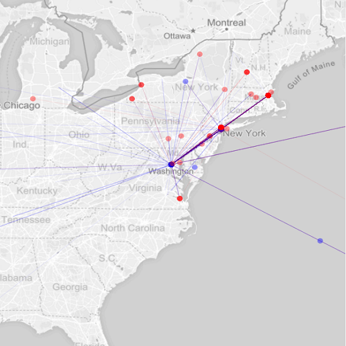
My project, Mapping Whitman’s Correspondence, is in many ways concerned with visualizing Whitman’s social network as it emerged in place and time. Importantly, the code I used to animate the trajectory of sent and received messages was adapted from a radically different project motivated by very different research objectives. University of Iowa professor Caglar Koylu actually wrote the code as part of his own scholarship on immigration patterns in Europe and the United States, and he was gracious enough to allow me to tinker with it in order to see what the code might reveal about my own data.
Messages sent by Whitman are represented by a blue line. Other correspondents are represented by a red line.
While my initial prototype utilized geocoding methods in order to visualize the flow of letters, much important information was nevertheless lost in the process. The correspondents themselves are most obviously absent from the visualization, and more nuanced data like the content of the letters, as well as frequent topics of conversation, were subordinated to an aesthetically pleasing though informationally limited animation.
Only recently have I started to focus more of my attention on thematic concerns, such as the often unacknowledged intersection of the poet’s public and private writing activity. What types of connections would I find between his letters and his most famous work, like Leaves of Grass. Are the boundaries separating public and private as rigidly maintained as we often believe? To explore these questions further, I began identifying all letters which contained references to Whitman’s poetry, prose, or journalistic activity. The more I worked with these documents, and the more I sensed the interconnections between them, it became clear to me that a more interactive interface was essential for helping users navigate the often overwhelming amount of data contained within the correspondence network.
This original source code for this visualization was developed by Chris Willard. You can see it here: http://www.findtheconversation.com/. Also, Aengus Anderson comments on the strengths and limitations of the concept map: http://www.findtheconversation.com/overhauled/. Though I preserved the “binary nodes” for Whitman’s male correspondents, there is no intentional connection between individual writers. Future iterations will experiment with these groupings.
I opted for what’s known as a concept map. In this iteration, the object consists of three parts: a table of “names” in the center, a list of “themes” on the left, and a cluster of “perspectives” on the right. Initially, I positioned individual correspondents in the middle, and the nodes which extended on either side contained references to Whitman’s writings. At first, this made the most sense to me in that the project is about the correspondence, so why not highlight the actual writers by situating them in the center of the “map.” After having met with digital humanities librarian Stephanie Blalock, though, it became clear to me that, while useful, what I had proposed was essentially a glorified finding aid. For example, users could very easily see what Whitman’s doctor friend, Richard Maurice Bucke, was most interested in talking about, but such discoveries revealed little else about the correspondence network.
What if I changed things up a bit? What would the concept map look like if I foregrounded gender as opposed to individual writers? What could this reveal about the nature of Whitman’s correspondence? Not only that, but what could this reveal about archival practice more generally, a potentially generative inquiry seeing as how all of my data is assembled from The Walt Whitman Archive. Perhaps I could begin to make inferences about the gendered nature of archival research, curation, and preservation in Whitman studies.
In the image above, you can see that I repositioned “themes” and “perspectives” in the middle of the map, with female correspondents now located on the left, and male correspondents on the right. While informative, doing so is not without its problems, and it is here where I return to Drucker’s observation regarding the assumptions embedded in visualizations themselves. Indeed, while the concept map does inherently preserve the notion of gender as a binary construct, it is also useful for conceptualizing the gendered identities that undergird epistolary activity. But whereas Drucker might consider digital repackaging to be fundamentally “at odds with humanistic method[s]” of interpretation and analysis, I see it as opening a dialogue where none might otherwise exist. If, as I believe, Whitman’s poetry and prose can be thought of as existing within a shared network of public and private activity, then it is important to consider the ways in which factors such as race, gender, and class contribute to such production.
Works Cited
Drucker, Johanna. “Humanities Approaches to Graphical Display.” Digital HumanitiesQuarterly, vol.
5, no. 1, 2011. Web. 3 July 2017.
Gitelman, Lisa and Virginia Jackson. “Introduction.” “Raw Data” Is an Oxymoron. Cambridge: MIT
Arianna here! I’m another one of the summer fellows working in the Digital Scholarship and Publishing Studio. I’m also a dancer! I’m currently working towards finishing my MFA in Dance Performance this spring.
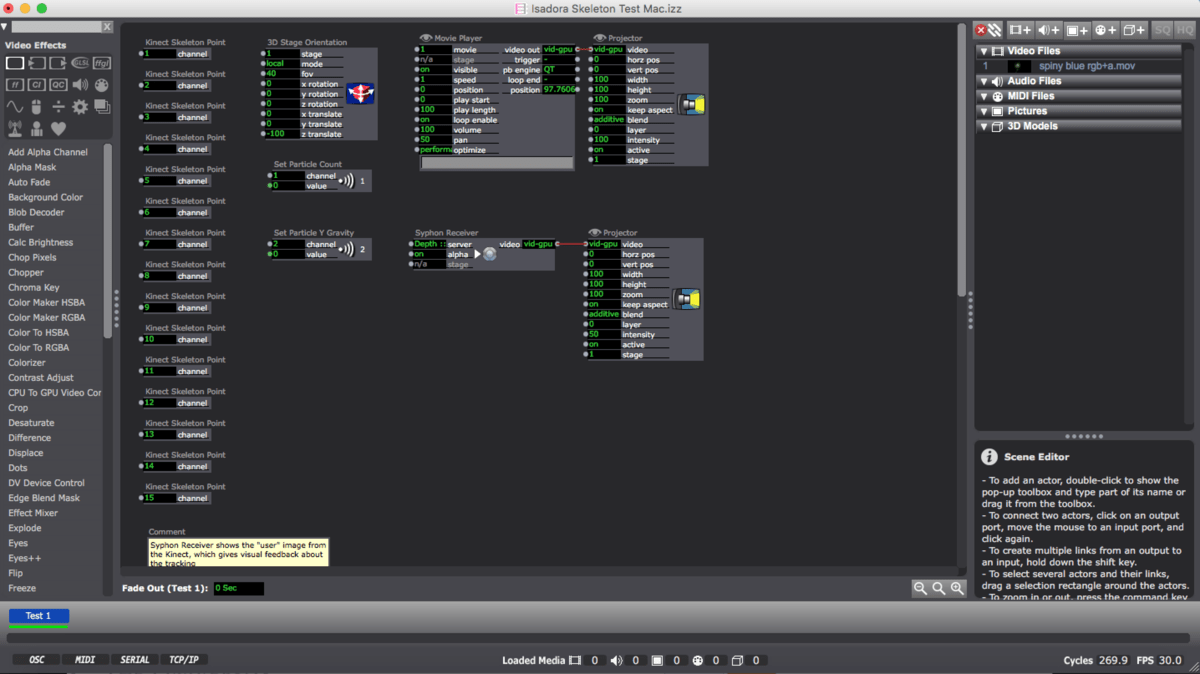
During my first couple weeks in the studio I’ve been exploring some digital media components to incorporate into my dance performance, including some digital interactivity and motion capture work. This requires familiarizing myself with the Kinect motion capture system, digital creative programs like Adobe After Effects and Premier Pro, and, perhaps most importantly, a computer program called Isadora.
In short, Isadora acts as the control unit that drives visual manipulation components in a performance. Within the program, the user connects different modules in order to manipulate components like lighting, special effects, or video imagery that is played on a projection screen. The modules allow information to travel from source to source, and allows the user to transform an experience—similar to the way a stage manager would orchestrate the configuration of lighting, sound and other effects in a theater experience. Here’s an example of a skeletal tracking sample patch within the Isadora program:
Now you’re probably thinking, “That looks like computer programming,” and you’re right. Your next thought is probably (and understandably), “Dance and computer programming? But why?…I don’t get it”. It’s true, these two mediums don’t seem to mix. But there is a growing and evolving following of this marriage of mediums that people have grown to call “digital dance making.”
Without question, the programming aspect of this work has been the most challenging. Maybe frustrating is more accurate word? Okay, I’ll say it: it’s the worst.
Jokes aside, as someone who has very little experience with computer coding and programming, it’s really challenging to trouble shoot issues as they come up. Maybe the most surprising realization has been how many extra programs need to be installed just to simply start running the skeletal tracking and motion capture programs.
But I think I’m getting the hang of things. I’m most excited to start meshing my dance practice into the digital aspects I’ve been working on. I think the motion capture data from my improvisational dance scores is going to be incredible once mixed with the Adobe design components that I’ve been creating.
I’m pretty passionate about this idea of blending artistic mediums, and especially this idea of incorporating anything digital into artistic practice. One of my favorite debates is whether art imitates life, or life imitates art; regardless of the answer, our lives are certainly incredibly influenced by technology—how could this not be true of our art?

 As revealed in the graph, the comma is among Whitman’s most-used punctuation. By itself this is perhaps not a revelatory statement. I’d bet that the comma is probably the most-used punctuation mark in the entire English language. How exactly Whitman employs it in his poetry, prose, and correspondence is worth investigating further. The same goes for other punctuation marks. In Whitman’s correspondence, an increase in em dash usage is particularly noteworthy. Working as a research assistant for the Walt Whitman Archive, much of what I do consists of transcribing and encoding these messages. What I have found is that postal cards in the nineteenth century, even more so than traditional “letters,” contain a tremendous amount of em dashes. A number of reasons can explain this, but the most compelling to me is the smaller physical size of these messages. The materiality of the message itself is just as important as the content these writers are attempting to communicate. In Whitman’s prose, too, we begin to see an increase in em dash usage. It would be interesting to see whether or not the emergence of the postal card in the mid to late nineteenth century had any significant impact on Whitman’s postbellum writing. Continuing this project, I will try to incorporate some temporal dimension that could help track such developments.